
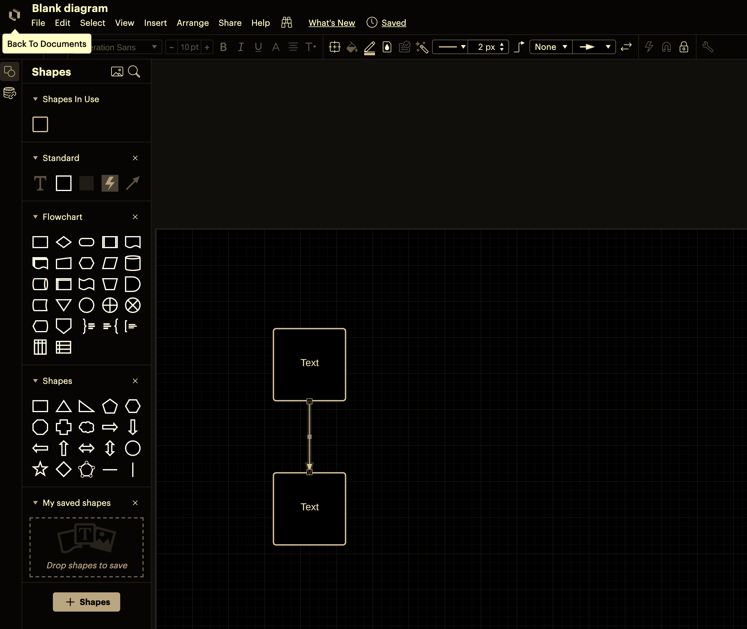
Many of the icons I use as shapes in Lucid are white and I can't make them out clearly with the UI's standard color scheme. 

Is there a "dark mode" for the UI? (specifically the shapes menu?)


Thanks!

Hey Tomo 

Thank you for commenting on the thread and providing good insight as well as constructive criticism. 

Looking forward to seeing your ideas in Lucidchart--Cheers!


I support the addition of a dark mode as well and will be submitting a feature request momentarily. Sounds like there is some demand for this change. Some of the tips mentioned above seem quite helpful as well.


Hi Mitch thanks for your contribution to this thread and for taking time to submit a feature request!


Hi everyone! We have a new space to collect your thoughts and feedback as we work to improve the accessibility of our product. If you have experiences or ideas please feel free to share on this post!


The following idea has been merged into this idea:

All the votes have been transferred into this idea.

The following idea has been merged into this idea:

All the votes have been transferred into this idea.

The following idea has been merged into this idea:

All the votes have been transferred into this idea.

IdeaFuture Consideration

We continue to look for ways to improve the accessibility of our product. While dark mode is not currently on our roadmap, your feedback is valuable and helps us define our backlogs. Thank you! 


The following idea has been merged into this idea:

All the votes have been transferred into this idea.

Just here to bump a 2 y/o thread. Please add this very common feature and help save my eyes!!!


+1


I don’t know if this feature request has died on the vine, but I’d like to express my support for it. @David J102’s suggestion is helpful, but it doesn’t affect the UI elements of Lucid, which is unfortunate.


I am also a user with a vision condition that makes it physically impossible for me to use LucidChart as it stands right now. Please add dark mode - this is an accessibility must, not a nice-to-have as another user has already so succinctly put. The suggested workaround involving modifying the color scheme on charts is also not a good solution from an accessibility perspective, as there are people with the opposite issue, where a darker scheme is impossible for those users to see.


Thank you for your additional feedback!


Such a pity that I can’t use Lucid when I’m sick.

My eyes are highly sensitive at the best of times and so much worse when I’m sick. They burn so much looking at white backgrounds, I can’t work like this.


My developer teams would greatly prefer if they could have an AWS-style dark mode for Lucidcharts.


A lot of the times AWS exports their archtecture diagrams onto dark grey backgrounds anyway. So this is already a fairly standard way of looking at software architecture diagrams around the software engineering world.


Also in general, most of the applications my developers use all support dark mode already. Code IDEs, JIRA, AWS, bitbucket etc… Lucidcharts is one of the few apps in their toolset that does not support dark mode which really stands out and is a complaint they often bring up. They were surprised this fairly standard feature was not already supported.