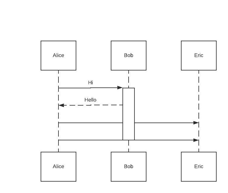
Consider the following markup:
"Alice" -> "Bob": Hi
activate "Bob"
"Alice" <-- "Bob": Hello
"Alice" -> "Eric": Hi
"Alice" -> "Eric": Hello
deactivate "Bob"
Notice how the lines and text labels between Alice and Eric are hidden by the activation effectively making activations unuseable:

