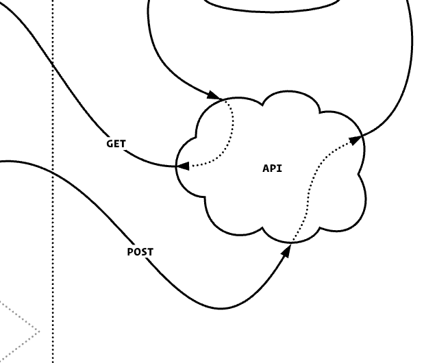
Sometimes the text labels on lines are a bit crowded and hard to read at smaller sizes. Is it possible to add padding around those labels to give it some breathing room?
Not a great example but this is what I’m talking about:

A Lucid account is required to interact with the Community, and your participation is subject to the Supplemental Lucid Community Terms. You may not participate in the Community if you are under age 18. You will be redirected to the Lucid app to create an account.
A Lucid account is required to interact with the Community, and your participation is subject to the Supplemental Lucid Community Terms. You may not participate in the Community if you are under age 18. You will be redirected to the Lucid app to log in.
Enter your E-mail address. We'll send you an e-mail with instructions to reset your password.