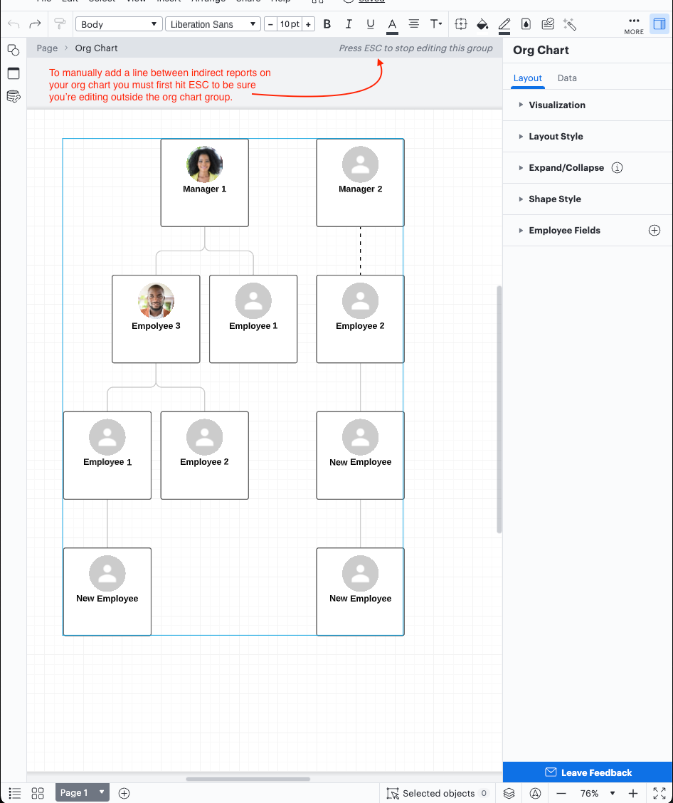
Not all organizations operate with a traditional hierarchy and you may need to customize Lucidchart's default org chart structure to meet your individual needs. For example employees may report to two managers if their role and responsibilities span multiple teams. 

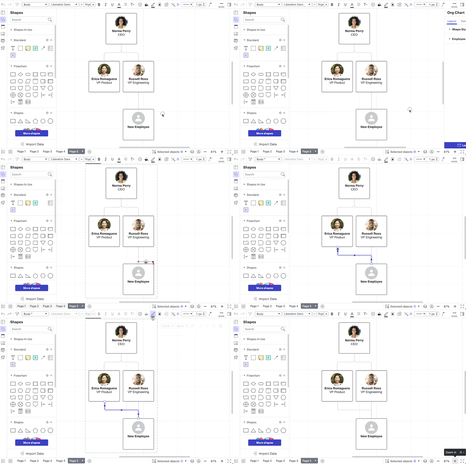
You can represent this in Lucidchart by drawing a line from the employee to the additional manager. This will need to be done outside of the Org Chart editor. If you are currently editing your Org Chart group first press ESC. 
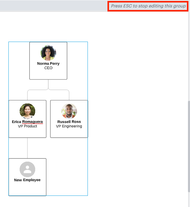
zhPKa676dblNxCiJG90msg.png

Then hover over the employee shape until you see a red dot. 
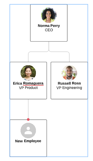
jG4m4Lp5C0Ui6IBhQe4K5w.png

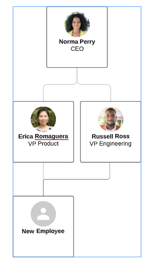
Last drag the line out and connect it to the additional manager. 
Zz9l0EEK_BLADUIOQen3Nw.png


🎉  Voila! Now you have a visual representation of an employee with multiple managers!

For additional org chart tips and tricks check out the resources below:


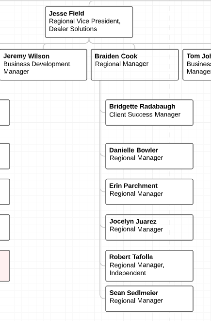
The employees shown under Braiden Cook are actually direct reports to Jesse. But if I place them directly under Jesse it makes the chart much larger than necessary. 


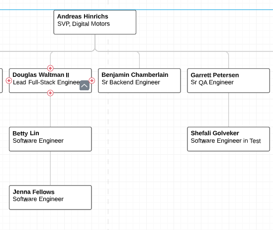
My goal would be to resemble this chart below where it shows Betty isn't a report to Douglas but the line is straight. I would recreate this setup but honestly I don't know how I did it from the start.


Hi Meagan thanks for continuing this thread! I'm not sure I completely understand your desired end result. In your second paragraph you mention you want to show how Betty is not a report to Douglas but in the image Betty's reporting line goes directly to Douglas. Are you saying that you want all of the employees currently reporting into Braiden to be stacked in the same way that Douglas is above Betty who is above Jenna?

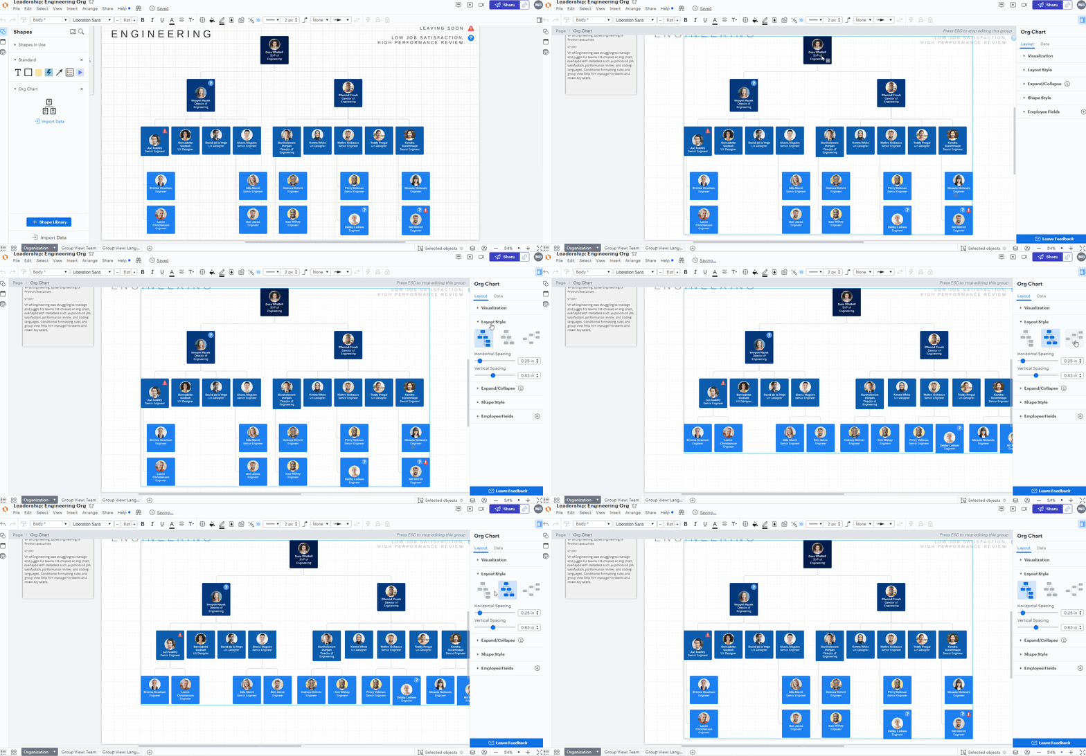
In terms of configuring your org chart layout Lucidchart supports three default options which you can toggle between in the Layout Style tab of the Org Chart panel on the right as shown in the GIF below:

QWNWHanF4v9WV_zyIOATFg.gif

Due to do the logical and hierarchical constraints of an org chart it is not possible to display only certain branches or groups of direct reports vertically while others still expand horizontally. With the vertical layout option only the bottom tier of employees can be stacked vertically in order to prevent crossed or overlapping reporting lines and employee tiles with adjacent employee shapes. In your first example screenshot above this means that it is not possible for only some of Jesse's reports (Jeremy Braiden and Tom) to be horizontal while another portion (Bridgette Danielle Erin Jocelyn Robert Sean) are condensed vertically. Currently that latter group is only able to be stacked vertically as they are technically direct reports to Braiden and are in that bottom tier. 

If you would like to customize your org chart beyond these three options by manually arranging certain groups of employees I recommend creating that group of employees as a separate org chart which you can then manually position and draw appropriate reporting lines with the regular line shape. 

Ultimately if you'd like the ability for customized structures to be supported in Lucidchart our development team would be grateful to receive your ideas and use case details. If you’re willing to share, we’d love to hear more about what you’d like to see in this experience posted in the Product Feedback section of the community - from here, other users can upvote it and add details of their own. For more information on how Lucid manages feedback via this community, take a look at this post.


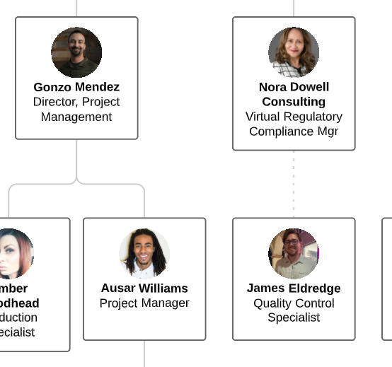
I have imported data from BambooHR in .csv format. I'd like to create a dotted-line report for an individual but when I hover I do not get a "red dot." Instead I get the + and the option to "add new manager" (above) or "add new report" (below). I am in edit mode (as per step 1 above).


What am I missing? I just want to create a dual-reporting structure for one person James below. He should dotted-line report to Nora and solid-line report to Gonzo. Help!


Fixed my own issue!


Hi Craig


Thank you for posting your question in the Lucid Community and I’m happy you were already able to resolve your issue! If you’d like please feel free to share what worked for you in this thread.


For anyone else who would like help drawing a line between an employee and an indirect report - you can do this by manually adding a line between the two employee shapes. To do this you will need to be sure you're editing outside the org chart group (hit ESC) next you can select the line tool from the toolbar and draw a line between employees on your org chart.


How do I get the positions to be on the same level? Regardless of the department.


Like directors at the same level supervisor at the same level assistants at the same level.


Hey Asamoc


Thank you for keeping this conversation going! If you make a copy of an individual employee that you would like to move and paste them outside of the Org Chart you will be able to move it wherever you would like on the diagram. This is a bit of a manual process as you will need to draw your own connecting line as well. 


Hope this helps -- please let me know if you have any other questions! 


When I hover over the employee I do not see a red dot and it won't allow me to drag the line over to another manager.


Hi @clara d thanks for posting in the community! Another user asked a similar question to you - please check out this thread to learn how to make the red dots appear and to draw new lines in an org chart. If you have any additional questions please let us know -- I hope this helps!


Hello! Our Org Charts feature was recently updated and the method to add a line to indicate one employee reporting to two managers has changed. 


Now the quickest way to visualise this is by dragging a line from the 'Standard' shape library and adding it to your org chart. You can easily remove the arrowhead and change the line colour to 'Gray' to match the style of the other lines in your org chart. You can see this in action in the GIF below! 


Hope this helps! Feel free to let us know if you have any questions. Cheers! 🙌


Hi @Leianne C - when I drag a standard line, the connection dot is purple instead of red. Does this matter? I ask because adding this line does not register the second manager as a “manager” (e.g. doesn’t change count of direct reports; doesn’t allow that manager’s level to be collapsible, etc.). Any ideas on how to fix this?? 


Hi @Maxwell J, thanks for continuing this thread! It looks like there has been an update and the connection dot in Lucid is now purple, so that is expected behaviour!  

Unfortunately, this workaround only helps with visually showing the relationship in your Org Chart and does not change/update the linked data. I see that you have gone ahead and created an Idea post for this request (thank you!) 


For anyone reading this thread and is interested in a similar feature, we encourage you upvote the idea post above⬆️and please add any additional details you’d like - this consolidation helps to refine feedback and properly capture the popularity of the request.

Thank you for your request and please feel free to let us know if you have any questions! 


Reply