Hello,
I am working on a project that involves creating a corporate IT technology network diagram. The diagram needs to show the relationships and dependencies between various devices, technologies, and products. There are many products, devices, and complex interconnections involved.
Currently, everything is divided into logical parts, and I have created complete diagrams for each part. My current task is to create a more general overview of the relationships and, most importantly, the dependencies. I tried using Layers by placing each logical block in a separate Layer. Then, I used Actions to toggle different Layers on and off depending on button clicks. However, I am not achieving the desired results and facing additional problems with this approach in Lucid Chart.
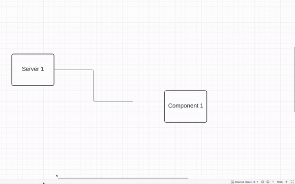
For example, imagine a diagram of a corporate computer network with servers, components, and computers. If one of the servers fails, I need to show which components are affected by this situation by clicking on the server icon. The affected components should change color or show a "red cross" indicating that they are not functioning. I used additional Layers to overlay on top of the main Layer or Layers that replace each other. While it's possible to create such a structure with Layers and Actions, as soon as changes are required, such as resizing components or rearranging them, all interactions break down. This happens because changes in one Layer need to correspondingly reflect in all other Layers; otherwise, the other Layers lose their meaning, and each Layer needs to be manually adjusted.
Also, is there a way to create a linked line between elements in separate layers? For example, I draw a link between the server on one layer and the server in another layer. If I move all elements in one layer, then the line should move along, without losing the logical connection with elements in other layers.
Is there a more intelligent automation in Lucid Chart or another approach to solving such a task?
Thank you for your assistance.