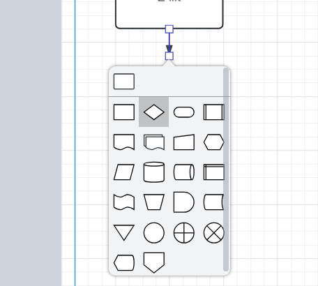
and this hampers productivity. If this is a ‘popup-on-a-popup’ limitation, consider having a checkbox at the top of the new shape popup e.g. ‘show-definitions’, that reformats the popup menu into a scrollable two-column list of ‘icon | definition’.

Best answer by aparrish
Hi, your question seems to be related to how Lucidchart was designed rather than an issue with adding a tooltip to your own projects.
If that is the case, then I invite you to repost this to the Product Feedback section rather than the Product Questions section.
If that is not the case, then you might find these related threads to be of interest:
Amanda
A Lucid or airfocus account is required to interact with the Community, and your participation is subject to the Supplemental Lucid Community Terms. You may not participate in the Community if you are under 18. You will be redirected to the Lucid or airfocus app to log in.
A Lucid or airfocus account is required to interact with the Community, and your participation is subject to the Supplemental Lucid Community Terms. You may not participate in the Community if you are under 18. You will be redirected to the Lucid or airfocus app to log in.
Enter your E-mail address. We'll send you an e-mail with instructions to reset your password.