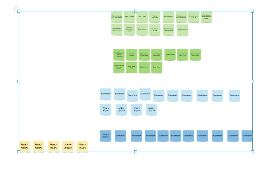
 When I want to select an object (click) all the objects are within a blue rectangle
and treated as if they were grouped. I have not done any group.
How do I get rid of this (automated?) behavior?
I want each post-it not to be a single object at once.
The same behavior occurs in Lucidspack with disaster when other Board users want to move
one posti-it note they move the whole bunch.
Annoying blue line
Best answer by Addie
Hi Wendy
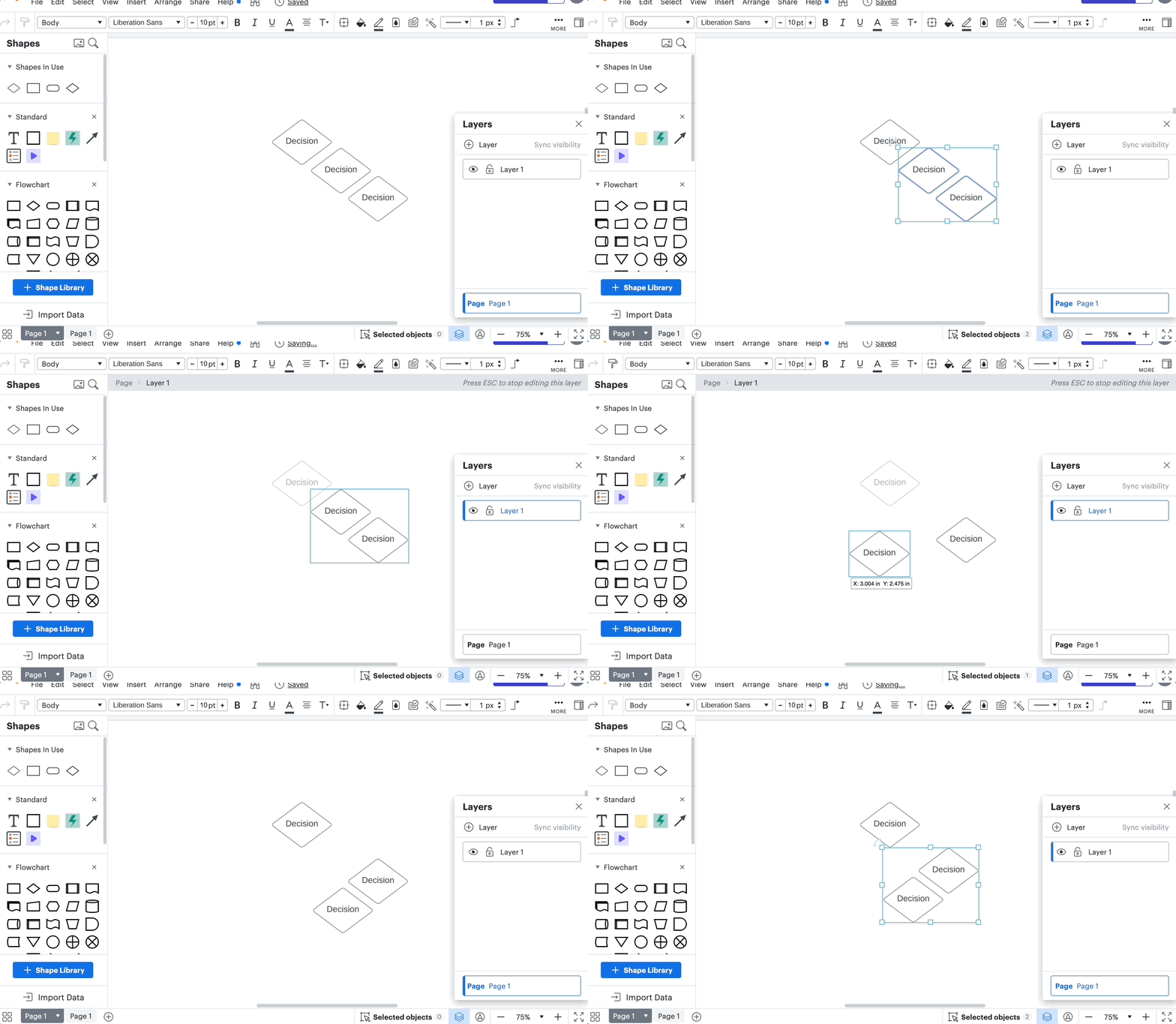
Thank you for posting your question in the Lucid Community! While editing from the main page Lucidchart treats all objects within a layer as collection. If you select a shape in a layer the blue box will appear around all other shapes associated with that layer similar to the functionality of a group.
When you enter the editing mode for that layer the shapes will instead behave individually though the blue selection box for the layer will still be present to indicate the which objects are a part of the layer.

Due to this there is not a way to avoid the blue box when you're working with layers as the blue box outlines the boundaries of the layer you are working within.
I hope this helps! Let me know if you have any questions.
Create an account in the community
A Lucid or airfocus account is required to interact with the Community, and your participation is subject to the Supplemental Lucid Community Terms. You may not participate in the Community if you are under 18. You will be redirected to the Lucid or airfocus app to log in.
Log in to the community
A Lucid or airfocus account is required to interact with the Community, and your participation is subject to the Supplemental Lucid Community Terms. You may not participate in the Community if you are under 18. You will be redirected to the Lucid or airfocus app to log in.
Log in with Lucid Log in with airfocus
Enter your E-mail address. We'll send you an e-mail with instructions to reset your password.


