
Eric R
Lucid support team
November 20, 2023

Visualizing data flow in your organization

  • November 20, 2023
  • 4 replies
  • 338 views

System maps are a great way to visualize the flow of data through your organization's tools and systems. You can add even more comprehensive information to your system map by combining data linking and conditional formatting, for example to show the location the data is stored in and the type of data (e.g. employee data, financial data, customer data, etc.). A great example of this is the “Systems & Data Mapping” template in our template gallery. 
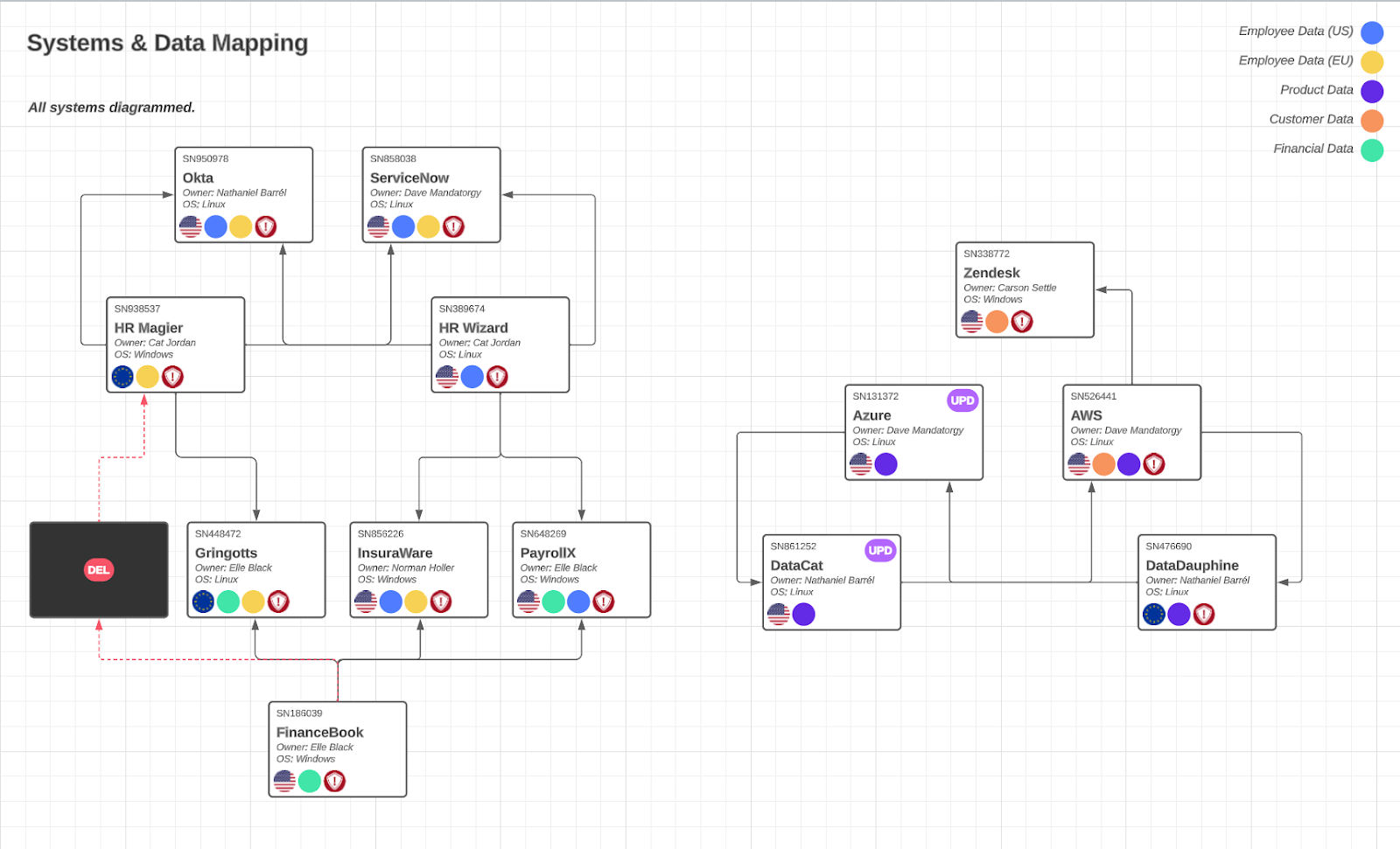
 

pkHV1NwC8X_75JxWvjtBxkJysDogKlqpgarYmyfhTiiYRd39LmMplAtToJcUVbou6qSTQfRRUqFam5crRk-lFQ5fXxaTFj9ie9q-9OqzMjCbKC7Llp1WcdTLZi1nhJFJnm3nqvqOFzEZLbrcjrDyk0E


How do you use Lucid to map your organization’s systems? We’d love to hear some tips and tricks you have found

Comments

November 30, 2023

Absolutely!! System mapping has been a game-changer for us in understanding our organization's data flow. At our company, we've utilized Lucid extensively for mapping our systems, especially with the 'Systems & Data Mapping' template you mentioned.
One key tip I'd share is our approach to data classification. Using conditional formatting in Lucid, we've color-coded various data types like employee, financial, and customer data. This visual representation has made it incredibly easy for our teams to grasp the nature of data flowing through different systems.

Also, we've found immense value in documenting integration points! It’s huge for us to clearly map out how data moves between tools like our CRM, databases, and third-party software. It's proven indispensable during system upgrades and when troubleshooting data discrepancies.

Micah
Lucid community team
May 3, 2024

Hi! I’m Micah from Lucid’s community team. 👋 Jumping in here to share about Lucid’s Data Trusted User Group. This group is made up of knowledgeable users who regularly analyze and visualize data in their work. As part of this group, you’ll have the opportunity to connect directly with Lucid’s product team, gain early access to beta features, and share insights about your needs, shaping the future of Lucid’s data solutions 🎉 You can learn more and request to join here. Thanks!

September 10, 2026

Lucid fan and heavy user for 9 years.
But you’ll hit hard limitations here in case you want to semi-automate this.
Data linking only applies to Shapes, not lines, so you couldn’t encode labels of the lines (data object, middleware, protocol, ports, etc etc.), the integration side will need manual steps.
Data linking to Shapes can get you portfolio signals and the richness depends on your source. We have LeanIX for use case 1 (above data flow diagram) but use case 2 (ad hoc portfolio views on canvas) still work well. I can’t data link directly into LeanXI but into “Excel Live (Beta)” and that Excel is live Odata connected to LeanIX. So semi-live. I prefer Smart Containers which excel is conditional formatting and space optimisation. But do not allow relationships if this is what you want (see limitation above).

Zuzia S
Lucid community team
September 17, 2026

Hi ​@Thomas Stumpp, thank you so much for sharing your experience and breaking down these specific limitations!

Detailed feedback like this helps us understand real-world enterprise workflows. I would recommend sharing this (or upvoting similar requests) in our Product Feedback section. For more information on how Lucid manages feedback via this community, take a look at this post:

Cheers!