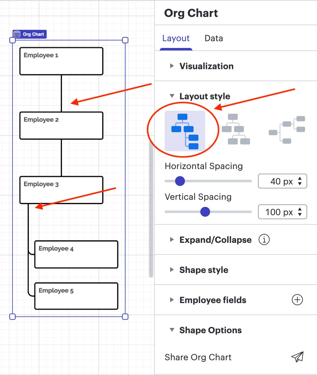
Yes, I can confirm that from the screenshot you have shared, it looks like the layout style you are using is the first one amongst the three options in the Contextual Panel.
The behaviour you are seeing in your screenshot is expected, as one report will be connected to a node through a line placed in the middle, whereas multiple reports with the same manager will be connected to a node through a line placed on the left. The goal here is to specifically differentiate management nodes. Please see the following example:
In this example, Employee 4 and Employee 5 both report to Employee 3, whereas Employee 2 has only one report who is Employee 3.
However, if you do not recall changing this Layout style, I recommend going through Revision history to see if you have mistakenly changed styles yourself or if another user could have edited the document, and if you would like to restore a previous version. As you have a Team subscription, you do have access to this feature. For more information on the Revision history functionality, I suggest going through this Help Center article.
Hi @Nick U, thank you for posting in the Community!
If I understand correctly, you are referring to Layout styles as shown below?:
These can be changed by selecting the entire org chart > in the Contextual panel, three Layout styles can be chosen from, as such:
Unfortunately, it is currently not supported by Lucid to combine different Layout styles in one org chart. A workaround here would be setting up the org chart manually instead of making use of the org chart functionality.
Alternatively, it is possible to combine shape styles by selecting the shapes of your choice on the canvas > selecting the shape style in the Contextual panel.
Other users have expressed interest in seeing such improvements in the Lucid org chart feature, therefore I highly recommend upvoting and commenting on the ideas below:
Additionally, for more tips on the customization of Lucid org charts, I suggest going through this Community post:
Thank you for your feedback, and please let me know if you have any additional questions or concerns!
Thank you for replying...did you happen to look at the screen shot that I posted to IMGUR? It seems like the style changed on my org chart. You will see the connecter changes to the middle of each shape instead of the left side? I have never seen that happen before and wondering who would I do that manually.
Yes, I can confirm that from the screenshot you have shared, it looks like the layout style you are using is the first one amongst the three options in the Contextual Panel.
The behaviour you are seeing in your screenshot is expected, as one report will be connected to a node through a line placed in the middle, whereas multiple reports with the same manager will be connected to a node through a line placed on the left. The goal here is to specifically differentiate management nodes. Please see the following example:
In this example, Employee 4 and Employee 5 both report to Employee 3, whereas Employee 2 has only one report who is Employee 3.
However, if you do not recall changing this Layout style, I recommend going through Revision history to see if you have mistakenly changed styles yourself or if another user could have edited the document, and if you would like to restore a previous version. As you have a Team subscription, you do have access to this feature. For more information on the Revision history functionality, I suggest going through this Help Center article.
A Lucid or airfocus account is required to interact with the Community, and your participation is subject to the
Supplemental Lucid Community Terms.
You may not participate in the Community if you are under 18. You will be redirected to the Lucid or airfocus app to log in.
A Lucid or airfocus account is required to interact with the Community, and your participation is subject to the
Supplemental Lucid Community Terms.
You may not participate in the Community if you are under 18. You will be redirected to the Lucid or airfocus app to log in.



 Your privacy choices


