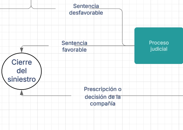
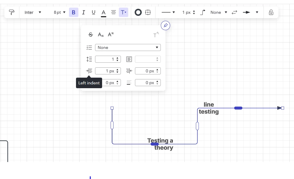
When the text written on the arrows is not a single word but a bit longer, I noticed that the erasing of the line never matches the space of the text but is instead systematically moved to the left (if the arrow is horizontal) or to the side (if the line is vertical) which results in poor aesthetics (see screenshots below). Anyway this can be changed?