
Solved
Org chart lines are different colors and weird formats in Lucidchart
from far looks like that:
see the differences in the colours of the lines?

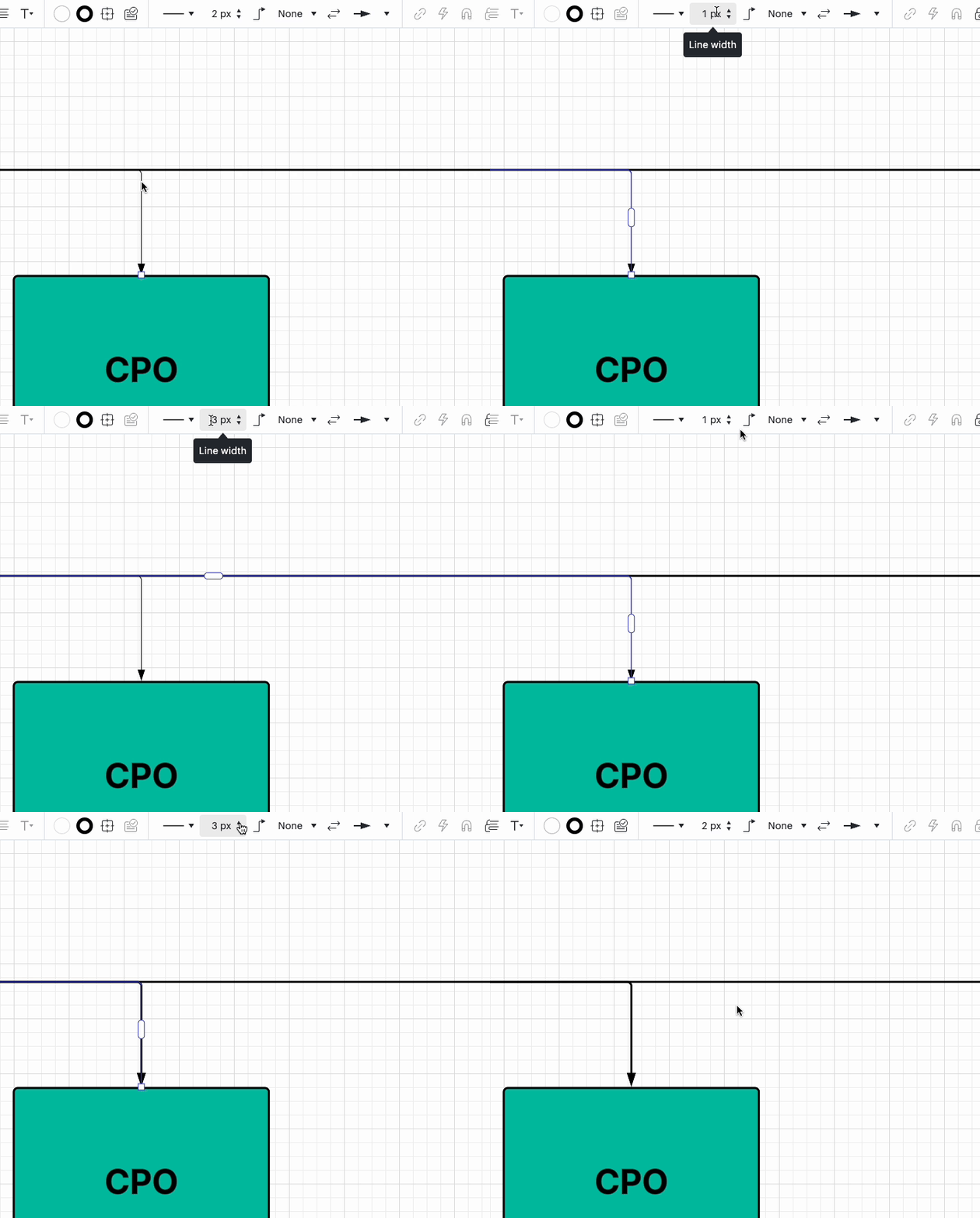
when its near:
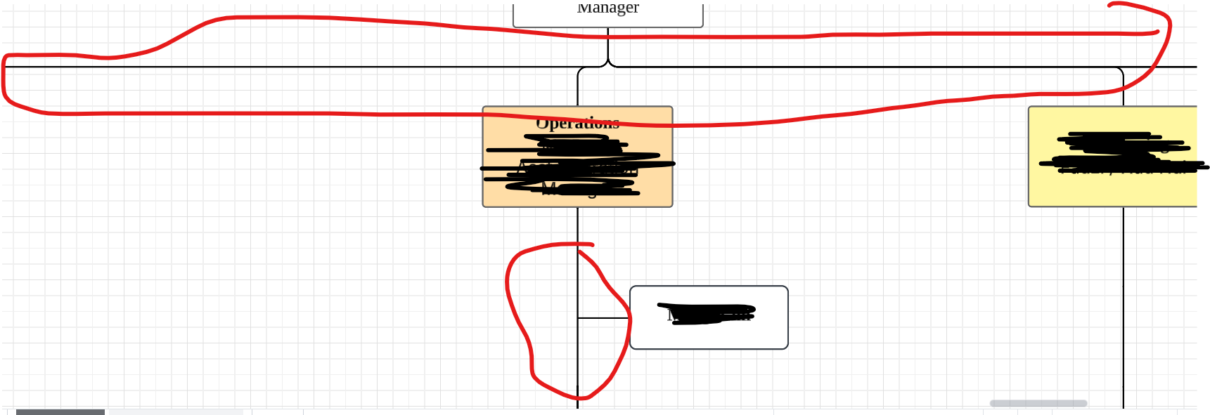
from far looks like that:
see the differences in the colours of the lines?
when its near:
A Lucid or airfocus account is required to interact with the Community, and your participation is subject to the Supplemental Lucid Community Terms. You may not participate in the Community if you are under 18. You will be redirected to the Lucid or airfocus app to log in.
A Lucid or airfocus account is required to interact with the Community, and your participation is subject to the Supplemental Lucid Community Terms. You may not participate in the Community if you are under 18. You will be redirected to the Lucid or airfocus app to log in.
Enter your E-mail address. We'll send you an e-mail with instructions to reset your password.

 Your privacy choices


