
My company frequently creates network maps for our clients. We build our maps by adding shapes from the Cisco and basic networking libraries to our document double-clicking to add text to each shape and connecting them with directional lines.


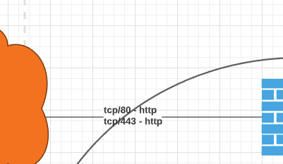
However the lines we connect or manually draw between shapes have a tendency to snap to the wrong place force the wrong layout of the line or worst of all cut right through the text we're trying to present. For example:


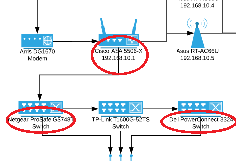
Is there a way to have these lines (circled in red) hidden where they would intersect with a text box? Or change the background color of the shape-attached text box to a solid white and arrange the line behind it?


One of our workarounds can be seen in the TP-Link switch shape at the bottom middle. That line is manually drawn beneath the text and terminated at the shape beneath it. But for the switch shapes on either side bringing the line down lower results in this:


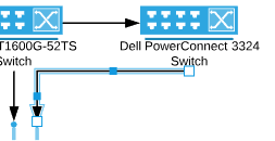
Dragging the small blue square on the horizontal part of the line does nothing until that segment of the line crosses beneath the vertical level that the arrow head is on. I would prefer to have a vertical line down from the switch horizontal over to the middle area and vertical down to the arrow head but this just doesn't seem feasible without redesigning the document. Help!

Can anyone here assist? Thanks in advance!


Hi Infinity! Thanks for bringing this to our attention and sorry for the delayed response. Rather than using the caption space that appears when you double click on the shape I would recommend manually inserting a text box beneath the shape adding your text there and connecting the lines to/from those text boxes. This should resolve both of the issues you highlighted in your screenshots and will hopefully allow you to continue your work. If you are going to be editing or moving these shapes around you may also consider grouping the text box and shape together (using keyboard shortcut Ctrl + G) so they will move together as one unit. Hope this helps and please let me know if you have any questions!


This appears to be a poor workaround for allowing the user to adjust the background of the text in the label that accompanies a shape. If I were to be able to adjust the opacity of the label the z-order of the connecting line relative to the shape wouldn't matter nor would the attachment point.


Hi Casey

Thanks for your feedback! If you'd like to suggest we make this change or any other changes, you can share your ideas directly with our product development team via the Product Feedback space of this community. 


Ya this is pretty much a cop out because this looks like a bug to me.  Take a look at this image.  Why does the text correctly fill over the line but the circle (which is a completely separate object and BEHIND the line) not?  You want me to add a separate object and group it to the line in this instance?  There's no way that's gonna work once I start moving lines and shapes around.


I've filed a feature request for this...we DO need this ability. I solve this by adding a box behind the text snippet attached to the shape. It's this invisible and breaks the second the document anytime we move anything around.

We've had to redesign entire architecture documents to get around this as the data presented is dense and detailed so we *NEED to use the object's Supplied text field. The net result is that some documents gain 100-200% object complexity when we have to add one background colour mask for every text box attached to an object/shape.

Thanks for looking into this!


Hi Jason thanks for continuing this thread and for your feedback! For now the best option is to do as Maison suggested above and group together the shapes (in this case the shape and the box you added behind the text). If there are shapes that you are repeatedly using you can add those grouped shapes to a custom shape library so that you don't have to manually create the two shapes and group them each time. This would also cut down on the number of shapes that are on your document as they will be grouped as a single shape.

For information on creating a custom shape library please refer to our Shape Libraries article. Hope this helps!


I've found that placing a white box (no border) just behind the shape ( cmd + [ ) then grouping it to the parent shape allows for a much easier way to break all overlapping lines and text. This keeps the shape text intact and allows for more control over how much you want your shape to mask what it overlaps.


Hi Curtis


Thanks for sharing this workaround! Super handy!


Reply