Dear Community Members,
I'm seeking assistance regarding a visualisation issue
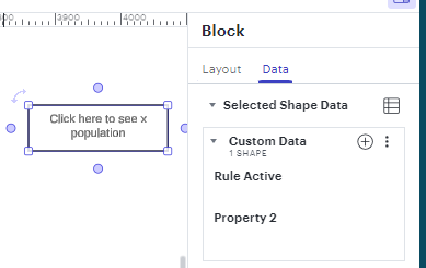
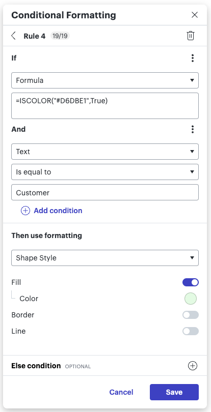
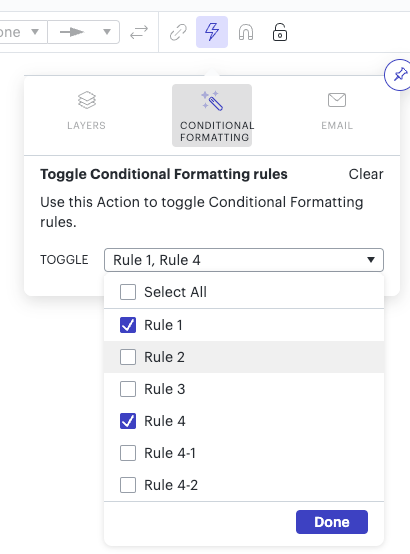
I'm looking for a method to clearly indicate whether a rule is toggled on or off.
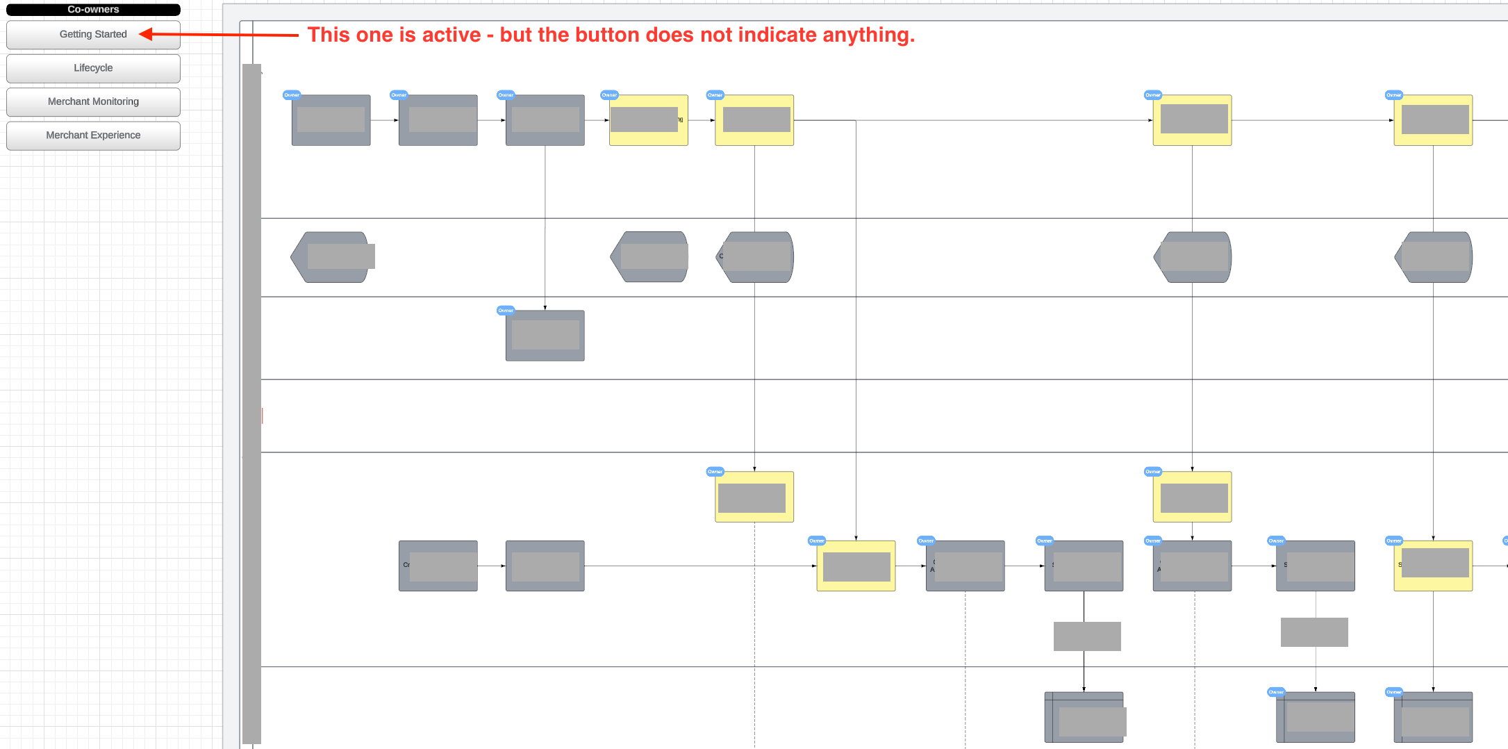
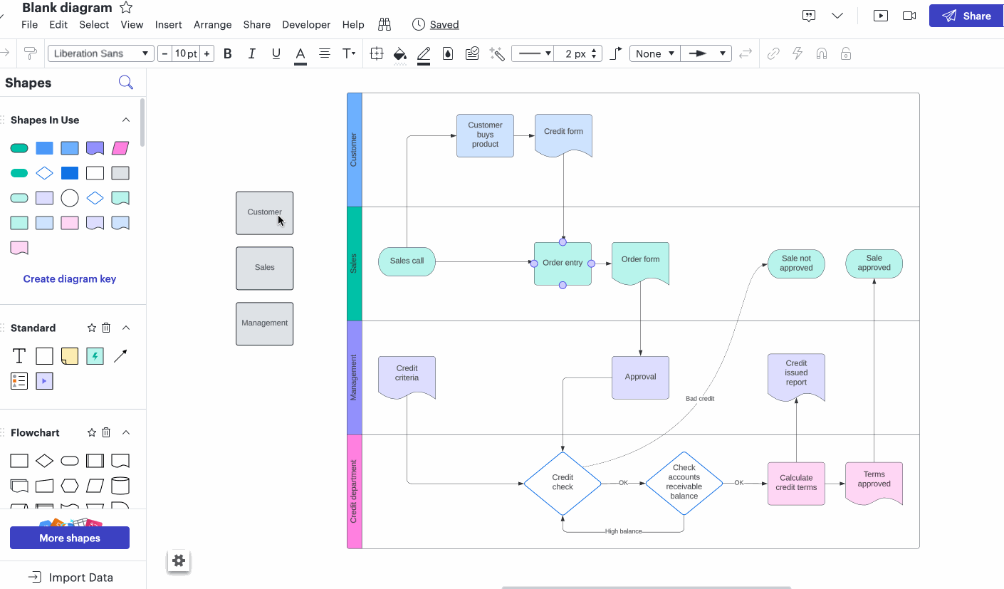
Context: In the attached screenshot, you'll notice buttons labeled with co-owning department names. These buttons contain an action that toggles specific rules on / off upon clicking. When a rule is activated, parts of a process not owned by the designated department are grayed out.
The problem: There's currently no visual indication on the button itself to signify whether the rule is active or inactive. Ideally, I would like the button's color to change to green when the associated rule is toggled on and gray when it's off. Otherwise, users might confuse which rule they toggled on and need to toggle off again to see the full process and its colour coding.
Could anyone provide insight on how to achieve this? Your assistance would be greatly appreciated.
Thank you.
Hope this visualized the problem a bit. Ideally the “Getting Started” button would not change colour. This would tremendously add to the interactivity I could offer the users and make it more user friendly.