Answer

Hierarchy disappears in org chart group view

  • May 29, 2025
  • 1 reply
  • 67 views

Forum|alt.badge.img

I'm working on an organizational chart in Lucidchart, importing data from a spreadsheet. I'm trying to use the 'Group View' feature to group employees by their respective departments (e.g., Marketing, Sales, HR).

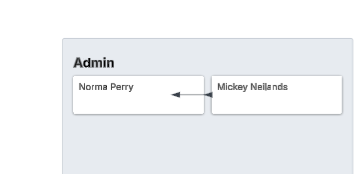
The grouping itself works, but when I apply the 'Group by Department' setting, the internal hierarchy (reporting lines) within each department disappears. Instead of showing who reports to whom within, say, the 'Marketing Department,' all members of that department are displayed in a flat list.

I've ensured my spreadsheet data accurately defines reporting lines and department information for all employees. I've also looked through the 'Group View' and 'Layout' settings for an option to 'preserve hierarchy within groups' or similar, but haven't found one that resolves this.

My goal is to have the organizational chart grouped by department, but still clearly show the reporting structure within each department.

Has anyone else encountered this? Is there a specific setting I'm missing, or perhaps a best practice for achieving this? Any tips or workarounds would be greatly appreciated!

Thanks in advance for your help.

Best answer by Cass A102

@kato 


It seems this might be as designed right now.  Here is a feature request you could up-vote.  


To play with this, I created a Lucidchart from sample data provided by Lucid and tested this two ways.  

Test Org Chart.  When importing the data, you can choose to create seperate org charts for each department. 

0_0?a=36126&x=797&y=-1885&w=584&h=509&store=1&accept=image%2F*&auth=LCA%20863ebbff1ad29d2eb42a16a0ab2417bf027d8dbc3eabd7a85b6a1a99ffaf64de-ts%3D1749569748

In the Test Org Chart linked above, I simply imported it twice.  Once for the entire Org, and once for a seperate chart for each department.  


After doing so I also created the Group View to test if I could manually draw lines, I could, but I don’t recommend it


Comments

Cass A102
Forum|alt.badge.img+6
  • Answer
  • June 10, 2025

@kato 


It seems this might be as designed right now.  Here is a feature request you could up-vote.  


To play with this, I created a Lucidchart from sample data provided by Lucid and tested this two ways.  

Test Org Chart.  When importing the data, you can choose to create seperate org charts for each department. 

0_0?a=36126&x=797&y=-1885&w=584&h=509&store=1&accept=image%2F*&auth=LCA%20863ebbff1ad29d2eb42a16a0ab2417bf027d8dbc3eabd7a85b6a1a99ffaf64de-ts%3D1749569748

In the Test Org Chart linked above, I simply imported it twice.  Once for the entire Org, and once for a seperate chart for each department.  


After doing so I also created the Group View to test if I could manually draw lines, I could, but I don’t recommend it