Solved

Create a custom org chart similar to "Org Chart with Analytics" example

  • November 12, 2025
  • 3 replies
  • 24 views

Forum|alt.badge.img+1

I’m trying to learn from this template about how to create an org chart with my own custom analytics. I’m having a hard time figuring out how to create my own custom table like the one shown here.   


Is there an explainer page that shows how to create this dynamic table, and the calculations that go into it?

Best answer by Ambar D

Hi ​@JessicaSant, thanks for posting in the Lucid Community! I’m happy to help!

To protect your privacy, I’ve removed the link to your document from your post. Instead, would you mind telling me the name of the template that you’re referring to? Can you provide a screenshot of the table you’re referencing? 

I also first recommend that you read through the following articles to get a better understanding of these features. Feel free to let me know if you have any questions on the functionality.

If you’re trying to create a data-backed org chart:

If you’d like to learn about data linking in Lucid more broadly:

If you’d like to learn more about dynamic tables:

Comments

Ambar D
Forum|alt.badge.img+10
  • Lucid community team
  • Answer
  • November 12, 2025

Hi ​@JessicaSant, thanks for posting in the Lucid Community! I’m happy to help!

To protect your privacy, I’ve removed the link to your document from your post. Instead, would you mind telling me the name of the template that you’re referring to? Can you provide a screenshot of the table you’re referencing? 

I also first recommend that you read through the following articles to get a better understanding of these features. Feel free to let me know if you have any questions on the functionality.

If you’re trying to create a data-backed org chart:

If you’d like to learn about data linking in Lucid more broadly:

If you’d like to learn more about dynamic tables:


Forum|alt.badge.img+1
  • Author
  • November 17, 2025

Thanks ​@Ambar D 

Specifically, I’m trying to understand how the “org chart with analytics” template works

https://lucid.co/templates/org-chart-with-analytics-example


I’m able to create an org chart based on excel data and use conditional formatting.  What I haven’t been able to figure out is how the table on the top of this template was created so I can create similar ones for my own org data.


Ambar D
Forum|alt.badge.img+10
  • Lucid community team
  • November 17, 2025

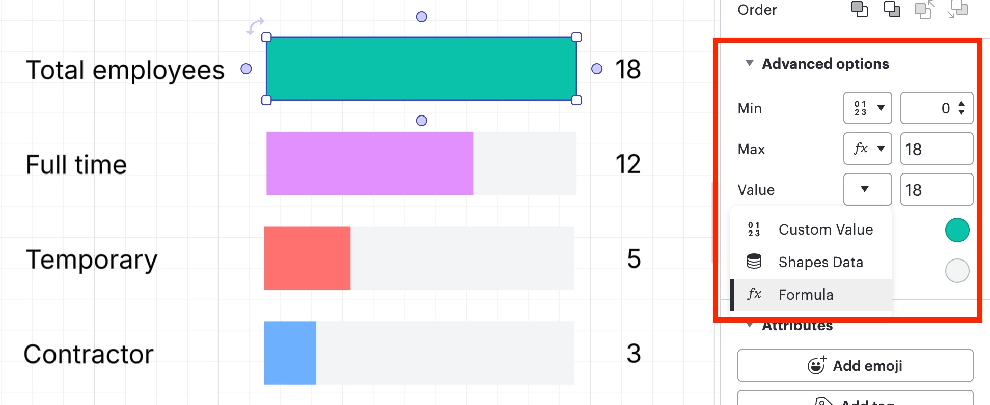
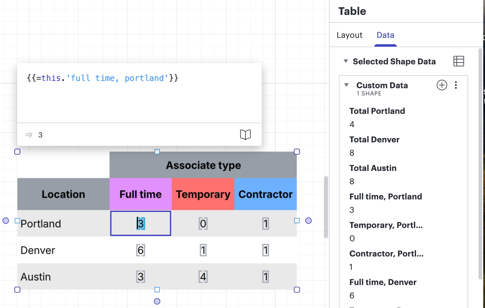
Hi ​@JessicaSant, thanks for sharing that link! Taking a look at that template, the items at the top are dynamic shapes and a table. 

To edit dynamic shapes, you can use either custom values, shape data, or formulas. By clicking on they dynamic shape, you can open the contextual panel and adjust which method you’d like to use. In the the template you referenced, it looks like the dynamic shapes use a mix of formulas and custom values as shown below.  

You can also use formulas and custom data to add information to tables. The example in the template looks like formulas are in use, as shown below.

I recommend taking some time to read through the following articles to get a better understanding of these options:

Please let me know if you have any additional questions here, happy to help!