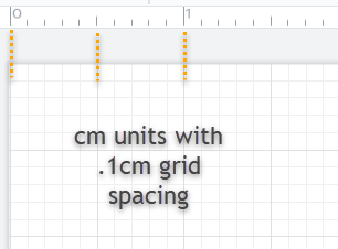
Is there a way to control the spacing of rulers and major grid lines so they are useful with any chosen grid spacing? For example in the image shown below the grid is set to .1" and I'd like the major grid lines to increment so they land on inch markers of the ruler. In this case the major grid markings should be equal to 5 minor grid steps. Is there a control option for the rulers and major grid spacing?


Hi Jim 


Thanks for posting in the community! You are correct - the ruler is always set to traditional 1/16th" spacing. (Should you find a metric ruler with centimeters/divisions of ten to be a more useful guide you can change your units for this purpose.) Thus the size of your grid will determine whether or not it aligns with the ruler and it can be adjusted in your Page Settings which are accessible under the File menu. In your example above your grid is set to .1" which as you've demonstrated does not correspond to the 1/6th" ruler markings.  In the example below I have my grid set to .125" inches which causes the grid lines and ruler markers to be aligned. 
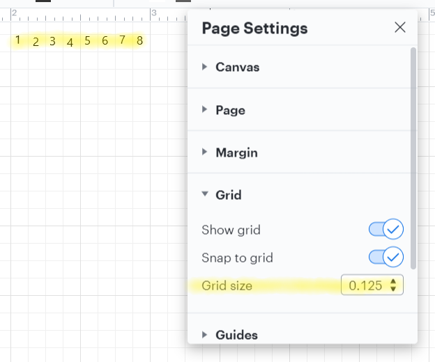


However if I change my grid size to something that doesn't share that denominator with 1/16th" such as .2" (dividing the grid into fifths) they will not align. 
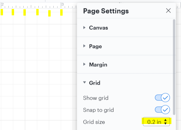


So long as your grid is set to something that shares that denominator with 1/16th" (such as .25" .5" etc.) you should be able to achieve this alignment. For more information on changing your settings please refer to this Page and Document Settings article from the Lucidchart Help Center and post any additional questions below! 
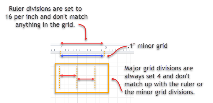

Micah - thanks for the excellent and timely answer.
The information was useful for a work around but reveals a design problem with the software (IMHO). I have two points to make.


1) Desired operation: Lucidchart offers speed advantages over other products but I was looking for explicit grid control options like those shown below from Illustrator and Photoshop.


2) The work around: Getting the rulers major grid lines and minor grid lines correctly lined up seems possible only with the following settings. This is not the case with other products and is an unnecessary restriction. The fixed "traditional 1/16" ruler spacing" operates more like a bug than a feature. Harmonizing ruler and grid controls with the same options would be great feature.


Hi Jim thanks for getting back to me. I'm glad that this tip will serve as a workaround but I certainly recognize that additional control and customization as you've shown above would be beneficial. Would you mind adding your thoughts to the product feedback section? Ideas submitted here are passed directly onto our development team for consideration when prioritizing future improvements to the product. Your use case details are highly valuable to us and we'd be grateful for your feedback! Thank you for your request and apologies for the inconvenience. Please feel free to continue this thread with any other questions!


Jim S 

I was having the same issue here. When I set the margin to 0 the grid and ruler lined up perfectly. Two years too late but hopefully will help other users out there.


Hi John thanks for commenting in our community! I'm glad to hear that this work around worked for you as well. Would you mind adding your voice to our product feedback section? We can continue to encourage developers to take a deeper look at this feature. 


Reply