
Whether you’re in a basement brainstorming your best startup ideas or finishing up your fifth round of funding Lucidchart’s data linking functionality empowers you to create data driven product roadmaps.
Product roadmaps are a great way to communicate your organization’s priorities to different teams and even investors. However creating a product roadmap typically requires substantial organization as you need to think through the strategic steps required to accomplish these goals. On top of that there are usually various stakeholders and teams that work cross-functionally to make gradual improvements to the product over time. This makes the creation of a product roadmap difficult because teams might have conflicting priorities and timelines to consider. With Lucidchart you can visualize the many variables that go into the creation of a comprehensive product roadmap.
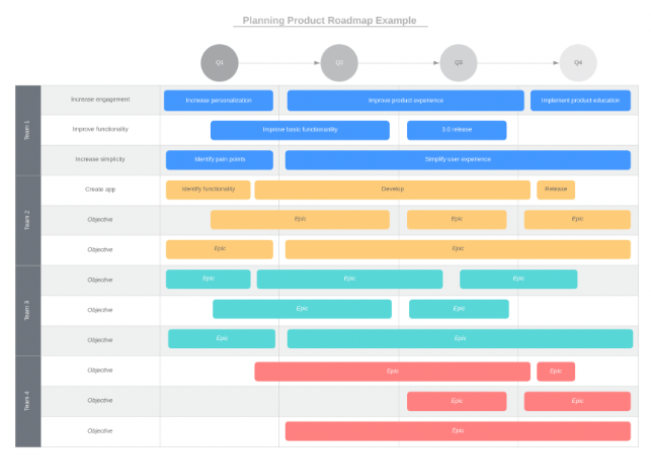
Rather than writing vague statements about your organization’s vision you can import data directly into Lucidchart to show exactly what projects each team is working on when.
For example the product roadmap example template shown above demonstrates how you can link your data sets to Lucidchart display data on shapes and arrange the shapes on your canvas into a timeline. To build this product roadmap example we took a simple spreadsheet that organized product objectives by team and Epics (aka: a big chunk of work that has one common objective). Then we imported the data set into Lucidchart and linked data to individual shapes on the canvas.
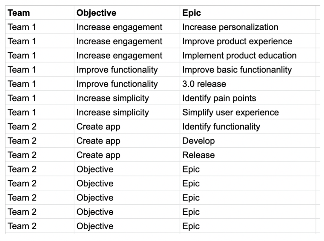
Spreadsheets like the one shown above are useful to reference but they fail to paint a full picture about the product vision or timeline.
When you combine spreadsheet data with Lucidchart’s flexible diagramming tools the possibilities multiply.
For example you can add conditional formatting rules to make the document easier to navigate. This template added four easy conditional formatting rules that color-coordinate the roadmap by team. Not only does this make the document more visually appealing but also it makes sure that your collaborators aren’t overwhelmed with information.

The possibilities don’t end there! For more complex projects:
- You might want to consider adding actions and hotspots to create buttons that link out to other document pages or external resources.
- If you want your product roadmap to double as a progress dashboard you can use layers and add dynamic shapes to track how far along teams are on their objectives.
- Additionally if you pull data from live data sources such as Google Sheets then you can rely on Lucidchart as your source of truth because Lucidchart automatically updates your data every 30 seconds.
- Once you’ve finished building the product roadmap you can easily shift to presentation mode and showcase your work to employees investors or anyone who might be interested.


