



Building software architecture diagrams using the Salesforce Shapes
Salesforce has partnered with Lucid to help you create professional looking software architecture diagrams. Use the Salesforce shapes and the Salesforce icon gallery to communicate your vision for your software solutions.
We provide a set of reference diagrams in our Salesforce Architecture Center, each linked to a Lucid template for easy reuse. But you can also start from a blank diagram and build a Salesforce style diagram with ease. This post shows you how to do it.
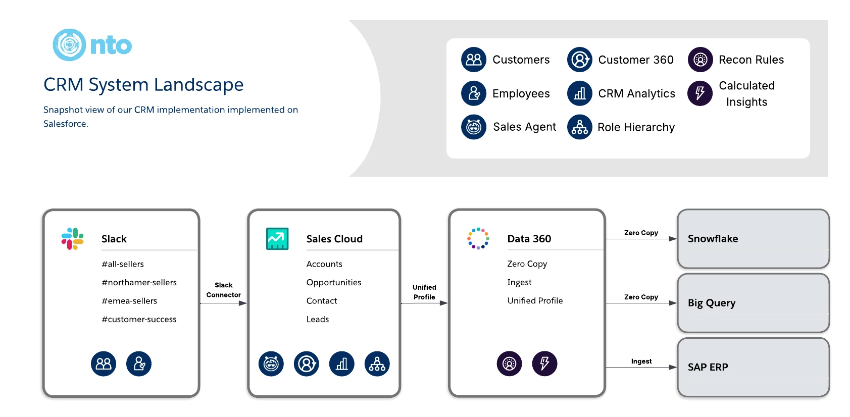
Here is the example diagram we will be building. This type of diagram is called a System Landscape diagram. It captures the major technical components of a software solution. In this case, it diagrams the Sales CRM implementation for a fictional company NTO.
To create this diagram yourself, you will first add the Salesforce shapes to your Lucidchart editor:
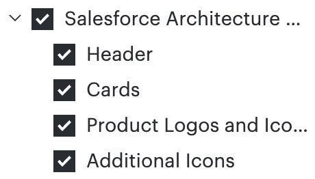
Once you have the Salesforce shapes in your editor, you can start building. The primary components of Salesforce diagrams are these shapes:
- Header shape - the shape at the top of the diagram with a title and a legend
- Salesforce Card shapes - the box shape with a title, icons, and attributes that represent a major component in the system
- Icons - the gallery of Salesforce specific icons for specific product and features available in the Salesforce ecosystem
The image below shows how the different components come together to make a Salesforce style diagram:
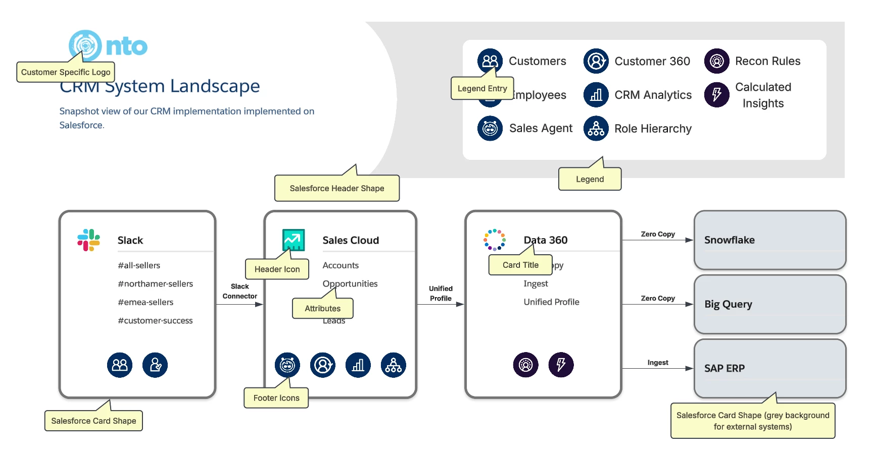
To add the header and legend, drag the Salesforce Header shape onto the canvas. Add a title, and add your company’s logo by dragging the logo image onto the canvas. The legend entries are manually created in the white box on the right. Use the Salesforce icon gallery to reference Salesforce ecosystem products and features and add text boxes for descriptions. Then group each icon and text box together for easy organizing.
The major components in these diagrams use the Salesforce Card shape. It has a custom set of properties that allow you to configure the card layout to fit your needs. The advantage to using the Card shape over a standard box shape is that the properties of the cards allow you to quickly build professional looking components with customizable elements.
The cards have one or more columns of attributes, with each column having one or more rows. The attributes list the details for each component. The attributes, and other properties, are configured in the card layout editor.
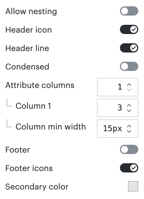
In the above configuration, this card is configured to have:
- A header icon placeholder, in which you drop a shape from the Salesforce Icon gallery
- A single column of attributes, with 3 rows of attributes in that column
- A footer bar of icon placeholders, in which you drop Salesforce icons
By using the Salesforce shapes, you can build professional looking software diagrams quickly and easily. Happy diagramming!
 Your privacy choices


