Idea

Change the Lucidchart top menu bar to display all file and menu options again

Related products:Lucidchart
  • September 26, 2025
  • 22 replies
  • 279 views

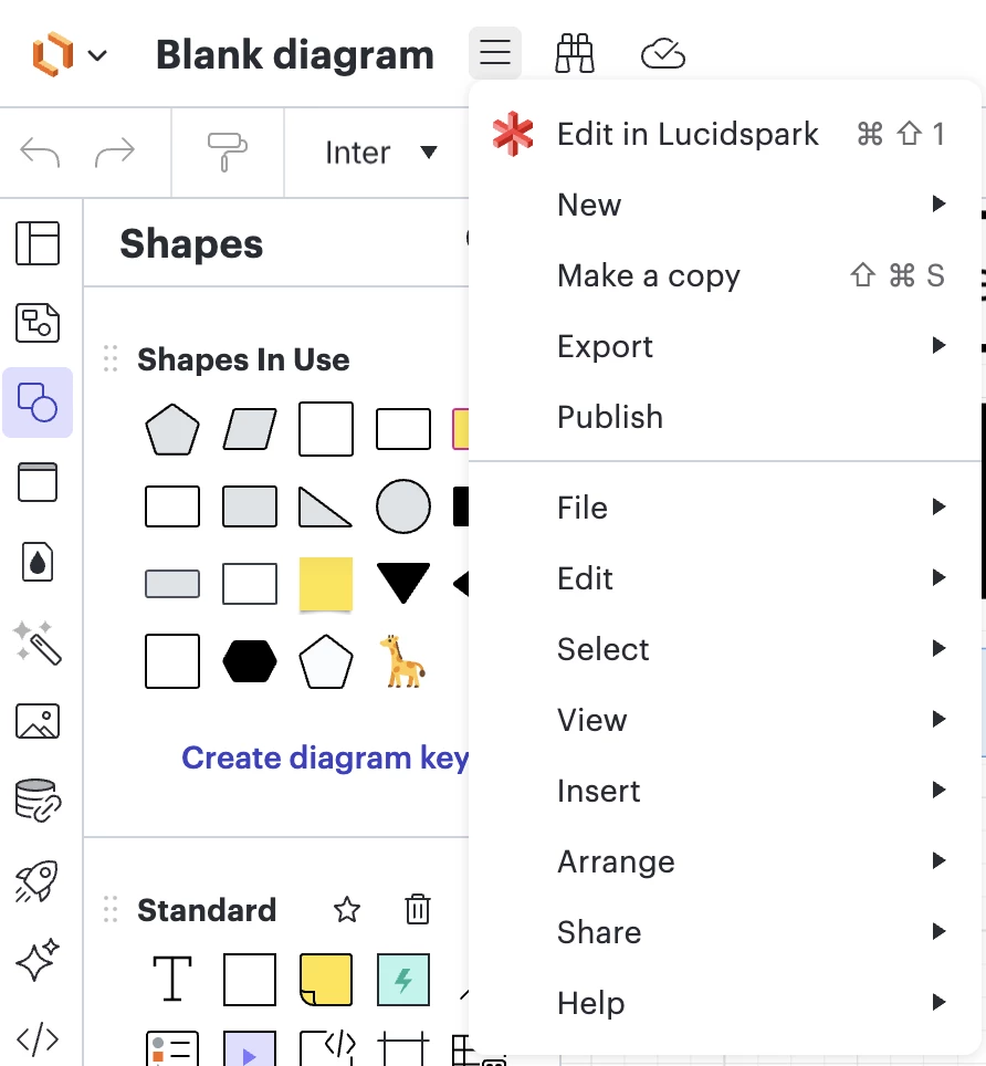
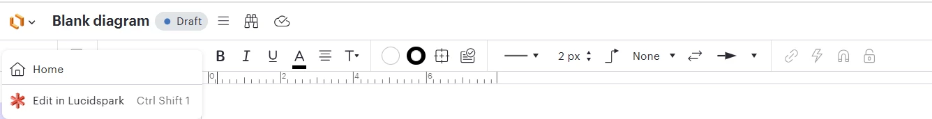
I’m using Chrome to access Lucidchart. However, for some reasons, I cannot see the top menu bar, i.e. the File|Edit|Select|View|…  I believed it was there before. Any idea how can I get it bac? Thanks!


Comments

Forum|alt.badge.img+5
  • Lucid support team
  • 70 replies
  • September 26, 2025

Hi ​@tsim ,

Thanks for reaching out.

The top menu bar has not been removed. It has been relocated into the three line menu next to the document name at the top of the editor. This update mirrors the interface in Lucidspark and is now the standard across Lucid products.

All the same options you are used to, including File, Edit, Select, View, Insert, Arrange, Share, and Help, are still available there. I have attached a picture for reference below.

Please let me know if you have any trouble finding a specific function.


Forum|alt.badge.img+1
  • Author
  • 1 reply
  • September 26, 2025

I see, thank you so much Ikalu, really appreciate that!


Forum|alt.badge.img
  • 3 replies
  • October 7, 2025

I just submitted a ticket about this one as well. Is there any way to provide an option to make it permanently visible like it was before?


Thanks.

Jason


Forum|alt.badge.img
  • 1 reply
  • October 8, 2025

How does burying the top menu bar improve our user experience? 


Forum|alt.badge.img+5
  • Lucid support team
  • 70 replies
  • October 10, 2025

Hi ​@jasonzarn and ​@Glen

I completely understand where you’re coming from, and I appreciate the feedback. The relocation of the top menu bar to the three-line menu was part of a broader effort to create a unified experience across all Lucid products.

That said, I’ve passed your comments along to our product team so they’re aware of the impact this change has had on your workflow. While there isn’t currently a way to make the top menu bar permanently visible, user feedback like this helps us evaluate potential interface adjustments in the future.

Please let me know if you have any more questions.


Forum|alt.badge.img
  • 1 reply
  • October 14, 2025

How does burying the top menu bar improve our user experience? 

Agreed.  The occasionally erratic UI dynamics, e.g., which shapes are grabbed when moving them, lead to frequent shape dislocation that was easily resolved by the “Undo” menu item--an item now hidden behind extra clicks.  Concern for ergonomics or customer centric experience would have made hiding/not hiding at least user-definable.  


Michel L
Forum|alt.badge.img+11
  • 56 replies
  • October 21, 2025

That new design is very BAD. The user must be able to choose. 

Now for my old user, the menu bar is here and for the new users the menu bar is not there. Very, very confusing to explain that to users and to explain them there is no more consistency among user 😞


Michel L
Forum|alt.badge.img+11
  • 56 replies
  • October 21, 2025

Moreover, if you have extension the user need to dig on the menu to find them. Very BAD


Forum|alt.badge.img+5
  • Lucid support team
  • 70 replies
  • October 23, 2025

Hi, 

Thanks for your post!

Unfortunately, this isn't currently supported in Lucid, but we're very interested in your feedback and committed to continually improving our products. If you're willing to share, we'd love to hear more details about your use case or what you'd like to see in this experience within this thread. I've also converted this post to an idea so that it's visible to others within the Product Feedback section of the community - from here, they can upvote it and add details of their own.


Forum|alt.badge.img+1

Commenting on Hamburger Menu (new/LucidSpark) vs. Full menu (Old Behavior)

I opened a support ticket on this a month ago and was told I was part of an A/B test being done.  I’ve tried since and have been told it can’t be undone.

Functionally there are times when I do NOT want to right click to access the menu (EX: I don’t want to risk messing up the alignment of several objects).  The extra menu click to traverse the hamburger menu to get to the original is a complete waste of effort (IMHO).  I don’t care if the new menu looks more streamlined.  This feature is a defect from my perspective.

Interesting to note that some in my environment still see the old menu format.  


Michel L
Forum|alt.badge.img+11
  • 56 replies
  • October 24, 2025

@Larry Kemmerling for all my old users for now the menu is still there. Hopefully they will keep it.

Regards.


Forum|alt.badge.img+1

Thanks Michel - but Lucid support (Becca G) informed me on October 17th that the hamburger menu “… is a Lucidchart UI update across all accounts now.”  I think the change is happening for all which is why I am commenting here in the community section - providing feedback on the change.  I do find it interesting that some in my environment still have the old menu structure.

I don’t like the change.  It does not improve my Lucid experience.  I am not just being cranky - this detracts from my efficiency with the product.

I do not like that I was entered into A/B testing without consent that I could not opt out of.  One day to the next the behavior changed with no warning.

I am not satisfied that, despite opening up a support ticket immediately and later escalating through our Lucid rep, the only response I have received is essentially, “We’re making this change to the UI.  The same functionality remains.”


Forum|alt.badge.img+1
  • 3 replies
  • November 12, 2025

I appreciate the extra screen real estate for diagraming, but having to search for the hamburger menu and the function I need does not improve my experience.  It is even worse because it is a coin toss as to which way my document will open.  Currently some show the previous menu style and some show the new menu style.

An option to allow us to choose which UI style we prefer would be beneficial.


Forum|alt.badge.img
  • 1 reply
  • November 14, 2025

Our entire team had a conversation on this today and nobody is a fan of the new hamburger menu! It takes several more clicks and much more movement to get to what we need now. There are some keyboard shortcuts I can use but overall it is not a good change.


Ambar D
Forum|alt.badge.img+10
  • Lucid community team
  • 1223 replies
  • November 14, 2025

Hi ​@Larry Kemmerling, ​@Dave T., and ​@jburcham

Thank you all for leaving your detailed thoughts and feedback on the new menu within this thread. Your feedback is incredibly important to us, and I appreciate each of you for taking the time to let us know what you think.

@Larry Kemmerling is correct - at this time, the updates to the Lucidchart menu is a UI update that has been released to all accounts.

I do want to share a bit more information so that you are all aware. As you have noticed, this change moves the file menu to a vertical style to match the menu in Lucidspark. For a further look into these UI updates, I recommend checking out the post below:


I’m sorry for any frustration here and confusion on the new experience. I am sharing each of your comments directly with our product team. As always, your feedback is still valuable and we’d love to hear from you, so feel free to keep letting us know what you think in this thread. 

For more information about how we manage feedback in this community, please take a look at this post:


Forum|alt.badge.img+1

I appreciate the transparency and that you are trying to improve your product.

My $.02 - make it an option for users to choose.  Different teams use your product in different ways and with different approaches.  The hamburger menu with vertical menu pull just isn’t a good fit for what I do with the uber large monitors I have at my disposal.  Others may prefer the burger menu.


Ambar D
Forum|alt.badge.img+10
  • Lucid community team
  • 1223 replies
  • November 14, 2025

I certainly see how that would be helpful, and I understand how it may help with your work. Thanks again for sharing and leaving this feedback. 

Your comments here have been shared with product! 


Forum|alt.badge.img
  • 1 reply
  • November 15, 2025

I typically prefer using LucidChart, but the new vertical three-line menu placement has been really frustrating.  The icon looks too similar to the alignment tool, and depending on the chart’s layout, it sometimes appears directly above it.  I have accidentally clicked “Alignment” instead of the menu multiple times and then had to track down “Undo” to fix the changes.

Would you please consider giving users the option to switch back to the horizontal menu format?  It was much faster and significantly more user-friendly.


Forum|alt.badge.img+1
  • 3 replies
  • November 17, 2025

I understand the desire for consistency, but users of Lucidspark and Lucidchart work in two different ways.  Lucidspark works great for free flowing thoughts, brain storming, project planning.  Lucidchart is great for those people creating detailed diagrams but need quick access to all the tools in the menu bar.


Forum|alt.badge.img
  • 1 reply
  • November 17, 2025

Forcing more clicks is a terrible design choice and a non-customer centric focus. It must be user definable.


Ambar D
Forum|alt.badge.img+10
  • Lucid community team
  • 1223 replies
  • November 17, 2025

Thank you ​@erisea, ​@Dave T., and ​@pcw for adding to this thread with your feedback. I apologize for the frustration here, but we appreciate you taking the time to let us know what you think.


Forum|alt.badge.img
  • 1 reply
  • November 20, 2025

I use the “Select all shapes with the same...” frequently. In the past, I had to hover over Select, Then the Shapes With The Same option, then select the criteria. Now I also have to click to open the hamburger menu too, every time - plus there is a delay after clicking the hamburger button. That alone is frustrating, ignoring the other interactions that require an additional click for no reason. Genuinely making me rethink paying for this app.