Lucid advice

Ready to up-level your org chart? Take a look at Group View 👀

  • 14 January 2022
  • 8 replies
  • 491 views

Having a thorough understanding of your organization’s structure is a critical tool for an organization of any size. With org charts in Lucidchart you can quickly see who reports to whom and get clarity during the hiring process by easily identifying gaps within your organization. 

But many modern organizations aren’t always captured with the typical top-down hierarchical model. In particular hierarchical org charts can fall short when you need to visualize the cross-functional ways team members work. 

For example at Lucid our product developers work in SCRUM teams. Each SCRUM team consists of a product manager two or three software developers one or two quality assurance specialists and a UX designer. This means individual members from four different departments are regularly collaborating on a project but this collaboration isn’t easily represented by the traditional top-down org chart. That’s why we created Group View which allows you to separate your org chart data by any unique values in your data source. 

To understand how this is useful consider the following example. The org chart template shown below provides most of the information one would need to understand the organization’s structure:

f6LfY3lg6_apzuD33KamWA.png

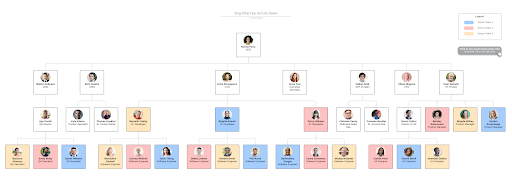
You can quickly identify the CEO and executive team and you can follow the lines to see all direct reports in each department. You can also see how conditional formatting was used to color-code employees according to their SCRUM team which is useful but doesn’t help much if you want to plan organize and adjust SCRUM teams.

Group View solves this problem through an intuitive framework that enables you to visualize your org chart data in a new way without ever changing the original data source. In this case if you separated employees according to SCRUM team then you’d create a Group View that looks like this:

Ch6lkNQcuMly_pkEB8NwNQ.png

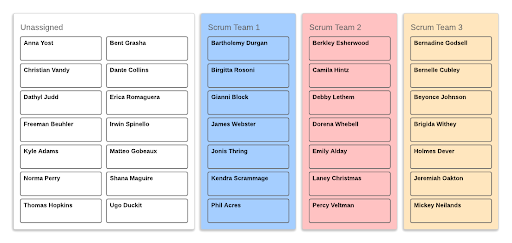
Now you can see clearly which team members belong to each SCRUM team and quickly drag-and-drop unassigned employees to a team. The beauty of Group View’s flexibility is that it empowers you to do anything from organizing project teams to breaking down employees by seniority location or any other factor that’s important to you.

No matter how or why you use org charts Lucidchart aims to make it as easy as possible to create a professional data-driven visualization of your organization that anyone can use.

Start working with the SCRUM team org chart template in this example or browse additional org chart templates. We also welcome you to follow up in the comments with questions or examples of how you use Group View to visualize your organization.

Comments

Badge +2

Hi! Is this the best way to break out large charts into smaller ones for the sake of printing clear charts in a readable format?

Userlevel 5
Badge +14

Hi @nina.halon, thanks for posting in the community!

Groups view may be helpful for this, and additionally, you many find it helpful to add each sub-department to individual layers or page tabs. You can print both page tabs and layers on their own pages.

Our layers and hotspots resource might give you more insight into exactly how to accomplish this as well as this community post, which gives step by step directions on creating a chart with multiple layers! 

Let us know if you have additional questions.

Userlevel 2
Badge

[...]That’s why we created Group View which allows you to separate your org chart data by any unique values in your data source. 

The link for Group View is taking me to an unknown page


Userlevel 5
Badge +14

Hi @Cass A102, thanks for catching this for us! I just updated the link so you should be able to click on it and get to the right spot now 😊 please feel free to tag me any time (@Addie) if you see any other issues with links!

Userlevel 2
Badge

Thanks @Addie, I just checked and it’s not yet updated, but perhaps it takes time to propagate changes? I’ll check back again later.  Ultimately, I uploaded a spreadsheet into an org chart and now I’m trying to use containers to group the different teams; I’m struggling to make this work. I may have to add a special team name into the employee data, it seems

Userlevel 5
Badge +14

Hi @Cass A102, thanks for the response - here’s the link in case it takes a bit to update, but let me know if the original link continues to load the “oops” page if you experience that in the future. I recommend using groups view to display different teams, and this help center link I attached above gives step by step directions on how to implement this. If you try this steps and still experience issues, please let me know where you’re getting stuck and I’m happy to help!

Badge

I’m curious if there’s any guidance for this use case. 


I’ve got an org chart spreadsheet: Person, Manager, Team, Role.

I bring that in as an org chart.

Then I create a Group View - Person grouped by Team and a conditional formatting to show a different color by Role.

What I’m seeing is that within each Group (Team) the People are sorted by Name. I’d like to sort them by something else (e.g. either implicit sorting from the order they’re in in the spreadsheet or explicitly sorting by some value).


My desired end state is that each Group has each of the People ordered the same so that it looks consistent. 

e.g. Product Owner, Engineering Manager, Design Lead, Analyst

Right now each Group is ordered alphabetically by the Person’s name and it looks weird. 

THANKS!


Userlevel 2
Badge +3

@Matt Nicole — we don’t have that kind of sorting customization today, but it’s a great feature request! Thanks for your feedback and taking the time to detail the benefit this would offer.

Reply