Solved

Virtual Dock Management board for warehouse

  • 24 May 2024
  • 5 replies
  • 94 views

Userlevel 1
Badge +3

I’m currently working on a dock management board for use in our warehouse. Any help is greatly appreciated. Here is an outline of everything:

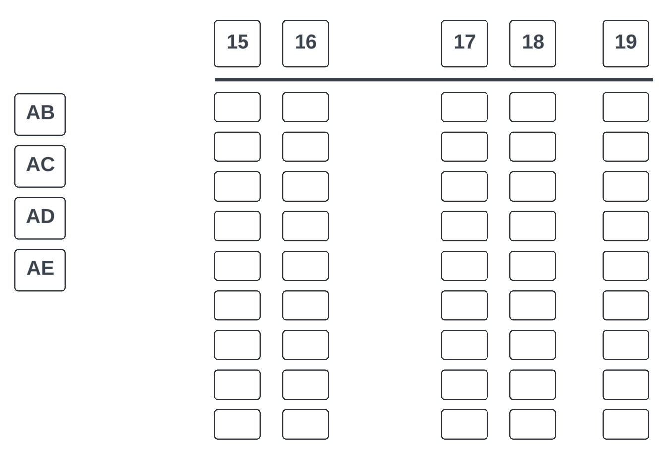
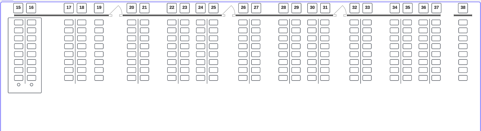
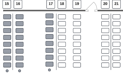
The snip below is an overhead view/blueprint of our shipping dock.

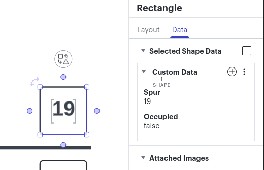
  • The numbers signify dock doors, or “Spurs”, where trailers are dropped.
  • The spaces (i.e. door 19 into 20) are emergency exit doors - a natural breakage in our dock layout.
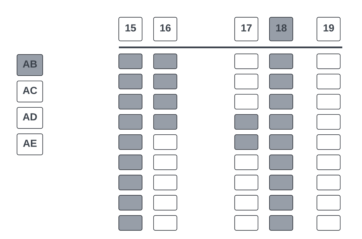
  • The rectangles below the Spurs (dock doors) are pallet positions separated by a center line.
  • There are 8 pallet positions per spur.
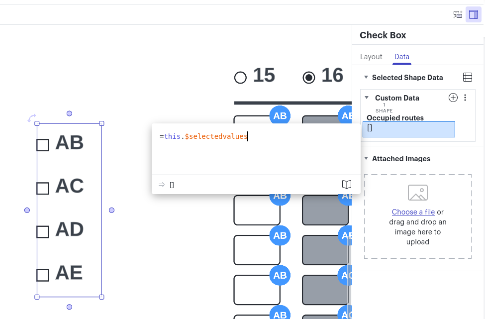
    • Example: Door 15 and 16 would be pallet positions 15 and 16 A through H (15 - A, 15 - B, 15 - C, etc.) 
    • 15 is the Spur and A through H is the pallet position.


Our overall picking process involves “releasing” a shipping route and it’s orders virtually. Then, shipping labels are printed and distributed to pickers so they can physically pick the items and build/place them onto pallets.

  • Before releasing picks and printing labels, we assign each pallet to spurs on our dock for organization purposes
  • Once a picker is finished, they drop their pallet off at the spur their label tells them. 
Shipping Dock Layout

The issue:
We don't have a quick or virtual way to view spurs that are currently being used or have pallets in front of them. We cascade down the dock and eventually reuse spurs in the lower numbered doors

My Idea:
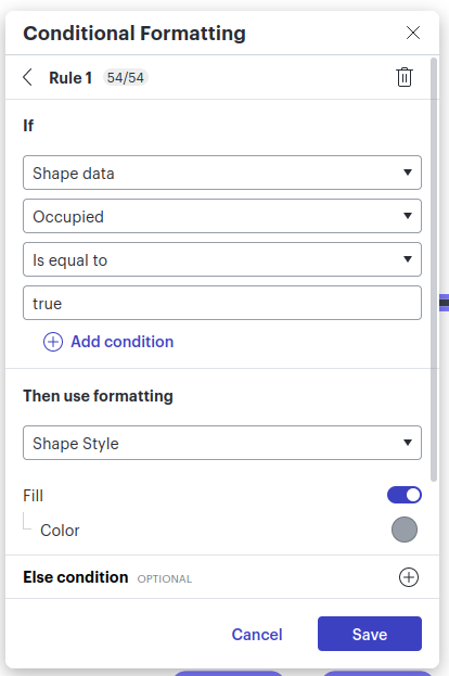
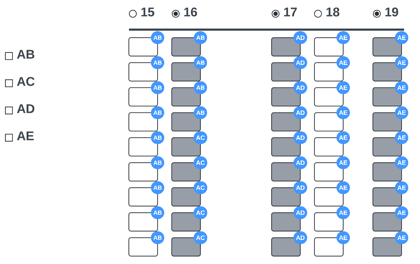
I want to create a board that our team can use to easily click and highlight spurs similar to my snip below

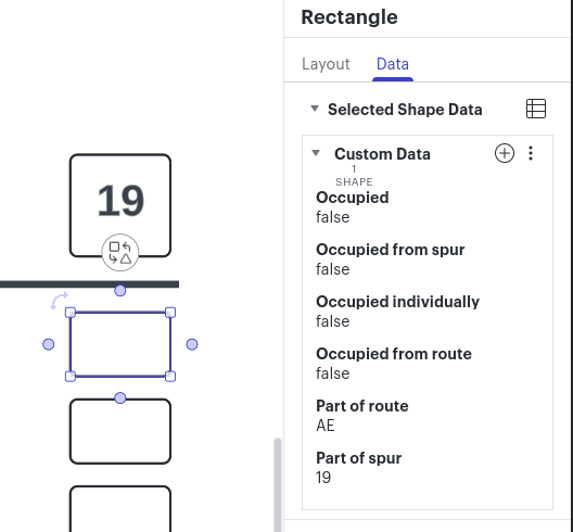
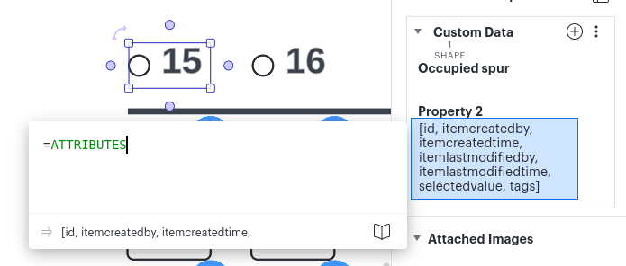
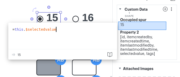
  • The circle below the spurs 15 - 17 could be clicked and it highlights that entire row automatically, marking that the spur is occupied by freight. That way we don't try to “double dip” when assigning pallets to spurs.
     
Rough Draft of Idea

Bonus Points:​​​​​​​

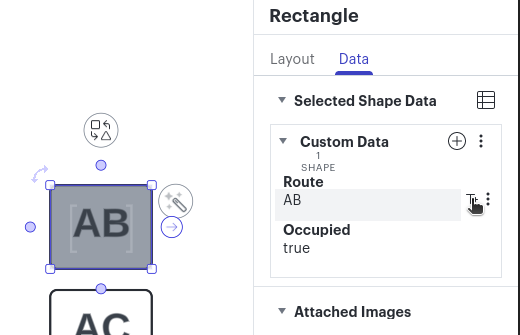
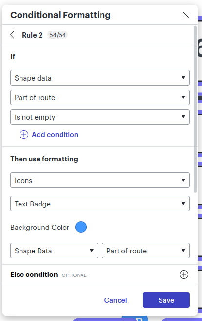
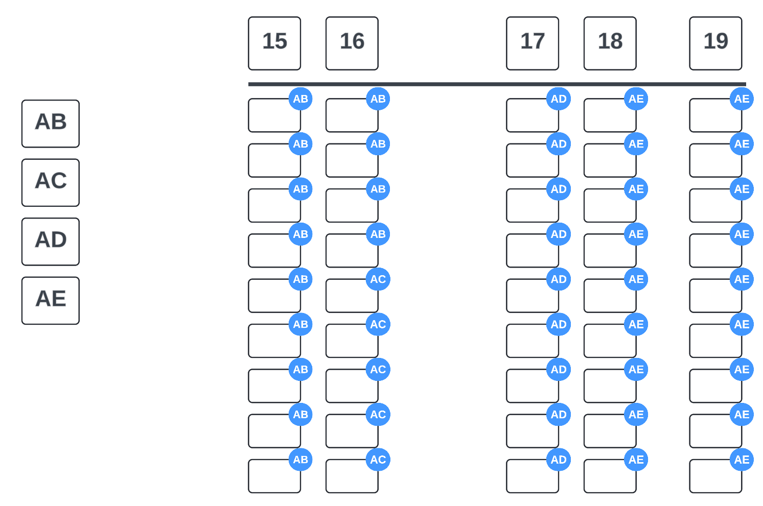
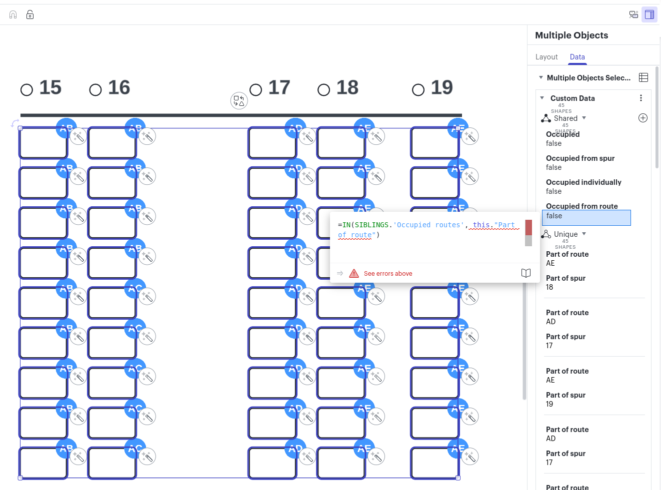
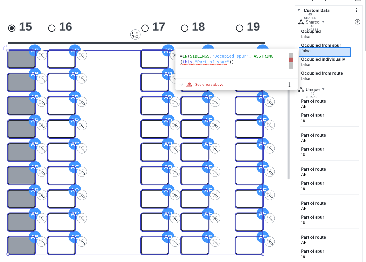
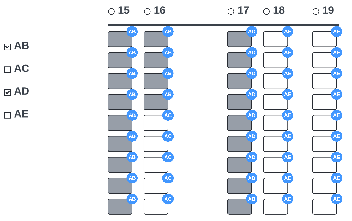
  • Each of the routes we drop into the spurs have different route codes
    • Example: Route AB, AC, AD, AE, etc

If there was a way to highlight the spurs but also have a dropdown list of which route it is (AB, AC, etc) that would help us visualize the dock at a deeper level. 


  • Not every route takes up the full 8 pallet positions in the spur. 
    • Example: Route AB @ Door 20 might only require 12 pallet positions, meaning we would highlight the full 8 pallet positions in 20, and an extra 4 positions in 21. 

Being able to highlight a specific amount of pallet positions and have a route identifier attached with it ( AB, AC, etc) would help a lot.


I’m thinking some type of formula could be made to achieve this with conditional formatting 


Thank you


icon

Best answer by Lance 25 May 2024, 03:36

View original

Comments

Userlevel 2
Badge +1

Hey, cool use case. There’s a couple options I’d suggest exploring:

  • One would be to assign conditional formatting to each spur that could then be toggled using actions to flip the formatting off or on depending on when that bottom circle is clicked.
  • Another would be to assign custom data to each shape that notes whether the pallet is occupied, and then using conditional formatting based on the shape data to show when something is highlighted (you could extend this so that if any of the shapes in that spur have custom data that show they’re occupied, then the conditional formatting would show all shapes in that row as occupied - this would be a little harder and would require formulas)

Either way, I think a combination of conditional formatting plus custom data are the way to go here. Our Intelligent Diagramming badge would be perfect for learning more about these options. I’d start by watching this video


Now let’s go for that Bonus :) ...that’s actually pretty doable using some of the features noted above. I’d suggest adding another Custom Data element that represents the route code...you could hit the +T next to the custom data so that data shows up on the shape itself; it could also be used as the way to show to the solutions above that the spur is filled (ie: conditional formatting that if the route code is not empty, then show it as grey). Total positions as well as number of filled pallets could also be custom data...though you may want to consider another shape that represents the spur and it’s related data so you can calculate things based off that. You could get fancier with some formulas, but I think this would do as a start. 

Give that a go and let us know how it’s working for ya.

Userlevel 5
Badge +4

I took a stab at doing what you’re looking for on this document, https://lucid.app/lucidchart/7ef3734c-bcc5-46b6-9c08-f19fbae215af/edit?viewport_loc=131%2C188%2C1799%2C1047%2C0_0&invitationId=inv_941f8dcd-bc39-467b-b284-1e68b0603af1. Feel free to play around with it to explore the details. I also recommend the training referenced by cbailey.


I’ll walk through the different parts. The base looks like this.


Each spur header has the properties “Spur” and “Occupied” that don’t have formulas. I did use the option on the “Spur” property to add it as text to the shape so the text would always stay in sync.


Each route has the properties “Route” and “Occupied” that work exactly the same as the spur headers.


Then the individual pallets have the properties “Occupied”, “Occupied from spur”, “Occupied individually”, “Occupied from route”, “Part of route”, and “Part of spur”.

I’ll explain each property.

“Occupied individually”, “Part of route”, and “Part of spur” don’t have formulas. Those are just text fields modified by the user.

“Occupied from spur” and “Occupied from route” have formulas that work the same way.
=FILTER(SIBLINGS, x => x."Spur" = this.'Part of spur')."Occupied"
Replace “Spur” and “Part of spur” with “Route” and “Part of route” for “Occupied from route”. Sibling refers to all objects in the same group that aren’t the current object. I don’t have any groups, so it checks the page. So this is filtering to the object on the page that has the property “Spur” that matches the pallet’s property “Part of spur”, and it grabs the “Occupied” property off that object.
Note: this will return an array if there are multiple objects with the property “Spur” that match. That will make the formula I have in “Occupied” fail because it expects to have a string, not an object.

“Occupied” has the formula
=OR(this."Occupied individually" = "true"this."Occupied from spur" = "true"this."Occupied from route" = "true")
So it just checks if any of the other “Occupied...” fields are true.


Finally, I have a conditional formatting rule that will change the background color to grey if the shape data “Occupied” is equal to “true”.


Since I used the same property “Occupied” on the pallets, spur headers, and routes, it changes any of them that have the property “Occupied” set to true to make it more clear what is happening.


To use it, all you have to do is change the “Occupied” property on any route or spur header or the “Occupied individually” property on a pallet. Here is an image of the result.

Here, I have set “Occupied” to true on route AB and spur 18, and set “Occupied individually” to true on two pallets in spur 17. All the occupied pallets in spurs 15 and 16 are marked as part of route AB.


When setting this up, you can select a as many objects as you want and apply the properties at the same time. So you can select every pallet, then add and define all the properties. Then you can select the group of pallets in a specific route and set the “Part of route” field on all of them at the same time.


I hope this helps! Let me know if you have questions. And thanks for the challenge. 😉

Userlevel 5
Badge +4

Bonus: You can use a conditional formatting rule to show the routes for each pallet too, and you can hide it anytime you don’t want to see it.


Userlevel 1
Badge +3

Lance, terrific work as always. I appreciate it!

Is there any way to simplify the way pallets are highlighted? Like just making the header into a button or something? 

Userlevel 5
Badge +4

Alright, I added functionality that makes it possible to simplify this. The Check Box and Radio Button shapes in the UI Input library now have the attributes “selectedvalues” and “selectedvalue”, respectively.


We can replace the route boxes on the left with a Check Box shape and add the property “Occupied routes” set to =this.$selectedvalues. This will return an array of all checked values.

Then, we can update each of the pallets to set the “Occupied from route” property to =IN(SIBLINGS.'Occupied routes'this."Part of route").

It will find the sibling object (on the same page) that has the property “Occupied routes”. Since there is only one, it directly returns that value. And we check if the property on the pallet, “Part of route”, is in the returned array.


Similarly, we can replace the spur headers with Radio Buttons. (It doesn’t actually matter if we use Radio Buttons or Check Boxes, but remember that the attribute on the Radio Button is “selectedvalue” and on the Check Box is “selectedvalues”. You can check what attributes are on a shape by using the formula “=ATTRIBUTES”.)

On the radio buttons, I added the attribute “Occupied spur”, which is set to =this.$selectedvalue. It returns the value of the selected option (in this case, there is only one possible option because I have a separate radio button shape for each spur).

Then, we can update the “Occupied from spur” property on the pallets to =IN(SIBLINGS."Occupied spur"ASSTRING(this."Part of spur")). We have to use “ASSTRING” because our “Part of spur” property is interpreted as a number, but the “$selectedvalue” attribute is always interpreted as a string since it is the text typed into the shape.


Now we end up being able to easily select routes and spurs.


Reply