
Once a project is underway, communication with all stakeholders is key to making it successful. Use Lucidchart’s Data Linking tool and Communication Plan template to easily visualize deliverables and communication needs to keep your project on track. Take a look at the example below to see this in action!
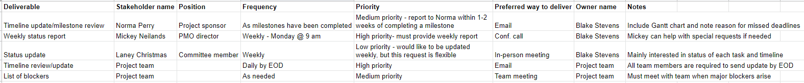
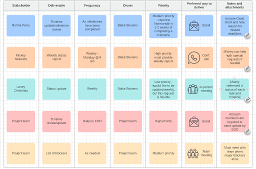
- First, I began with a data set that includes stakeholders deliverables communication frequency and preferences and other relevant information.
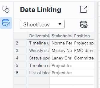
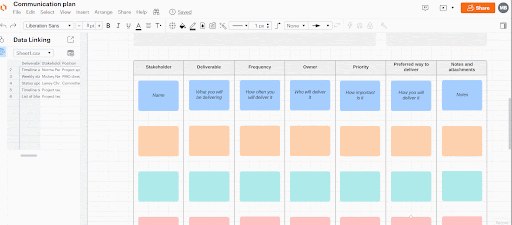
- Then, I imported my data into a Lucidchart document with the communication plan template.
- Next, I could view and manage it in the Data Linking panel on the left of the editor.
Note: if you have linked data from Google or Microsoft 365 (rather than uploading a file from your device), you can determine how that data interacts with Lucid. The steps and capabilities for this differ between Google Sheets and Microsoft 365 Excel. Check out the corresponding sections below for more information.
- To display this data on my shapes in the template, I need to attach the data to these shapes. I did this by clicking and dragging the row of data to the shape with which I want to associate it. Once data was associated with a shape a small link icon appeared next to the data in the data panel.
- To display the data on my shapes, I opened the Shape Data panel on the right side of the editor then selected the shape I wanted to work with. When I hovered over the different data elements in the panel a +T icon appeared to the right. I simply clicked this icon to add the data to my shape in the corresponding column! Note that I can do this for both a particular field (e.g. “Stakeholder”) as well as the value of that field (e.g. “Mickey Neilands.”)
My finished diagram is an easy to navigate representation of my project’s communication plan which will ensure that all team members are aligned on expectations and nothing falls through the cracks.
Check out our Help Center for more information on getting started with templates. As always, feel free to post any questions below!