Okay so my connecting lines are not all the same. Also the boxes are not evenly spaced as well. I'm not sure on how to fix it. It won't let me adjust manually. I would also like the orange boxes to all be in the same line but it won't move. It's mostly on the right side of my chart. 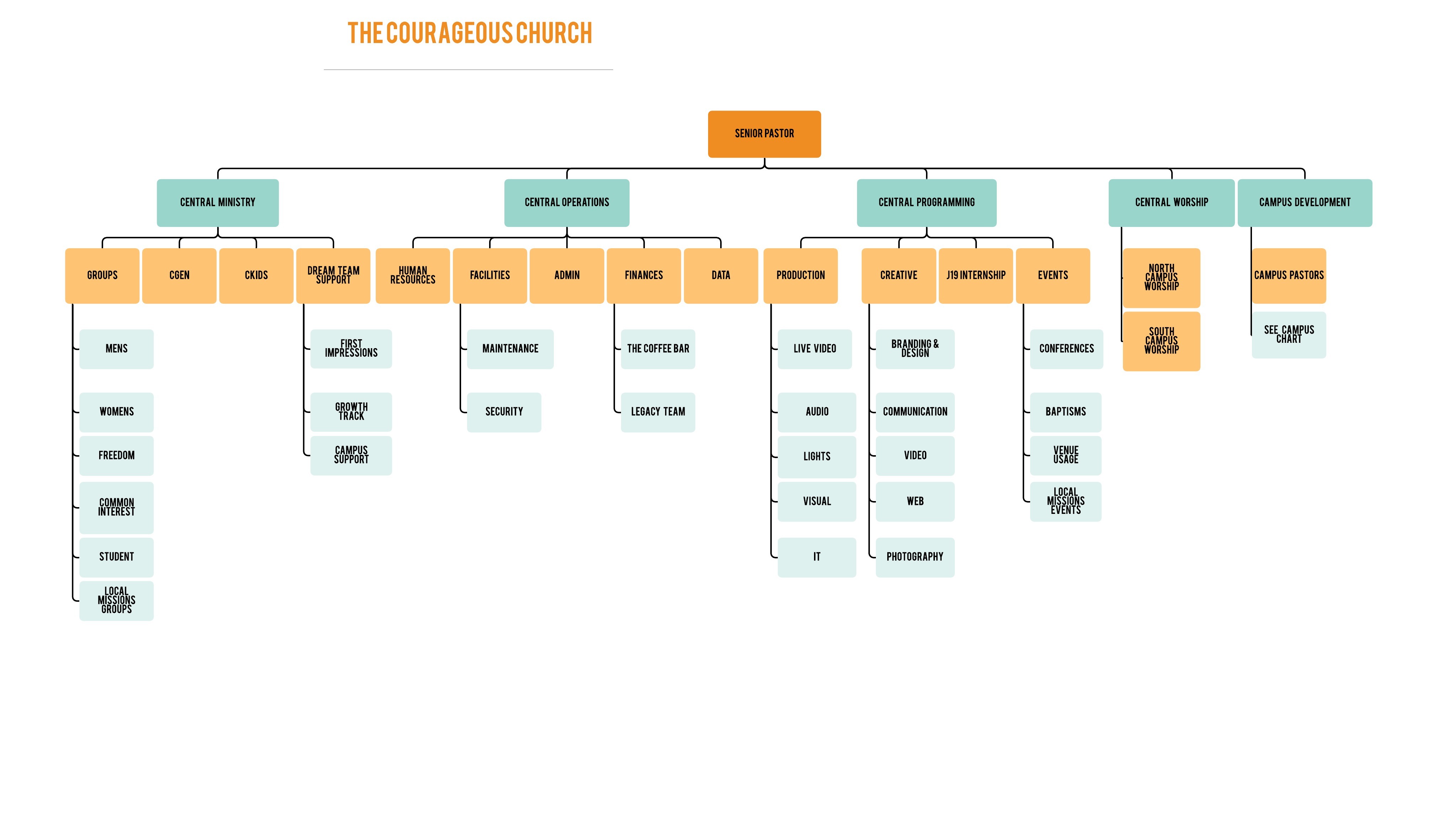
Uneven Spacing

Create an account in the community
A Lucid or airfocus account is required to interact with the Community, and your participation is subject to the Supplemental Lucid Community Terms. You may not participate in the Community if you are under 18. You will be redirected to the Lucid or airfocus app to log in.
Log in to the community
A Lucid or airfocus account is required to interact with the Community, and your participation is subject to the Supplemental Lucid Community Terms. You may not participate in the Community if you are under 18. You will be redirected to the Lucid or airfocus app to log in.
Log in with Lucid Log in with airfocus
or
Enter your E-mail address. We'll send you an e-mail with instructions to reset your password.