Hello Community,
Can someone tell me how can I turn on the taskbar ribbon, it has somehow magically shifted to when i select an object. I liked the view that I had all options above on the task bar.
please help,
Thanks
Hello Community,
Can someone tell me how can I turn on the taskbar ribbon, it has somehow magically shifted to when i select an object. I liked the view that I had all options above on the task bar.
please help,
Thanks
Good afternoon
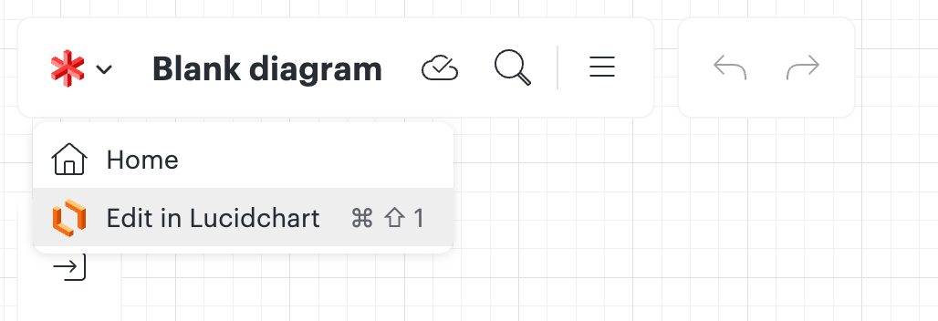
It sounds like you might be editing your document in Lucidspark instead of Lucidchart. Can you confirm if that is the case? In the upper left hand corner of your document, are you seeing the Lucidspark icon, and do you have the option to switch to editing in Lucidchart? See my screenshot below for reference. Let me know if switching back to Lucidchart fixes the issue, and if not, please provide a screenshot of what you are seeing.
Hi Shantel, I am creating my documents in Lucidchart its just, earlier I use to see the whole editing ribbon stacked on the upperpart. so for example how in excel we have the top ribbon. but now im not sure why it only appears when i select an object (shape, box or any text). its just not user friendly because while you applying the same editing criteria to a group of objects its just so confusing. I Have been using lucidchart since over 3.5 years now.

Good morning
Thank you for explaining that for me, and for taking the time to share your perspective about why it is not user friendly. I will pass along your feedback to the team that owns this feature.
Hello
Could you tell me more about why you dislike the experience? It should still have all the same controls you had before. Can you tell me more about what is confusing when editing groups?
Hi Zach, thank you for replying back to me. I understand that you are integrating the functionality “when an object is Selected” “then appear the format toolbar”, however, as a UX designer think from the perspective of “I am making a complex wireframe which will be used to build a power bi file while c-suite individuals are on a call or in a meeting. Sometimes when there are options in front of you the users brain starts to build next steps and actions and exactly know where to go for what edit. I really like lucid chart over your competitors, I would really appreciate if it can have perhaps an option to make it appear all the time or switch according to your way of only appearing when something selected. Microsoft Power BI also heard users to implement the same in terms of the (Selection, Format, Data, Visual pane). now on power bi we can have it displayed or have an on-object interaction. I am sorry if everyone at your end is having a good laugh by my small concern, but it goes a long way for users who are actively using the software. Thanks, Samrat malik
Hi
Hi, just to add to this. As I guess feedback is the best way to get action.
Can you please reverse this? Or at least provide the option to go either/or?
It hides the optionality behind layers of clicking, and it just creates so much friction, for what? Saving a slight bit of space on our screens which are often in excess of 24-26inch’?
This isn’t user ‘friendly’, it’s user ‘pretty’.
I genuinely think I would switch to an alternative if this is the route that lands
Hi. I’m not sure if this has anything to do with my experience, I’m a new user. But the top format toolbar was floating on top of the diagram canvas a couple of days ago, and now I cannot seem to figure out how that got enabled. Now it’s off and I want it back on. This is all in lucidchart
Hi
Thank you, Leianne. The image shows how the toolbar is docked on top now. But when I first started using LucidCharts a couple of weeks ago, it became undocked and floated over the canvas like the bottom box in the image I sent. I can’t figure out how that happened.

Hi
Thank you for providing that screenshot. My name is Annie and I am product manager here at Lucid. The experience you are describing was one that we were testing with users. It sounds like you want that original experience back (where it was floating, instead of being docked on top). If you are open to it, I’d love to discuss more with you what you liked about the experience and how it compares to what you are seeing now. Let me know if you are interested. Thanks!
Hi EWK, I also work with Zach and Annie. We are still testing that experience. We collected a lot of data with the experience on, but we turned it off for a subset of users while we continue testing and exploration. There isn’t a way to turn it back on right now.
Thank you, Annie and Lance!
As a senior software architect, I give that feature two thumbs up (allowing the bar to float). It takes up less space and allows more room for the canvas, so I find it to be a great UI experience.
Hmmm… I feel like this is going to be a change that some will love and others will hate --- how about a toggle switch to let the user be in control of the interface - something like floating vs ribbon?
A Lucid account is required to interact with the community. You will be redirected to the Lucid app to create an account.
A Lucid account is required to interact with the community. You will be redirected to the Lucid app to log in.
Enter your E-mail address. We'll send you an e-mail with instructions to reset your password.