Hi Lucid community!

I’m working on a responsive design project and using Lucidchart to map out wireframes and user flows for various screen sizes. While it’s helpful for visualizing the structure, I’m finding it a bit challenging to manage and align assets that need to be scaled or adjusted for different devices.

I’d love to hear if anyone has tips for optimizing Lucidchart for responsive design, particularly when it comes to managing different asset versions, handling scaling, and organizing design components for mobile, tablet, and desktop views. Websites like sincere mechanic seem to do this well, and I’d appreciate any suggestions on improving workflows in Lucidchart for responsive design projects!

Hi ​@GeorgeHenry667, welcome to the Lucid Community! Thank you for your post. 😁 

Would you mind sharing more information for your specific use case, or an example of what you're hoping to create? That would help us as the Community to best support you!

To start out, it may be helpful to check out our blog, UX designers: Build robust user journeys and low-fi mockups. The blog specifically mentions that to add depth and interactivity to your mockups, you can build out your design across multiple Layers and use Shape Actions to link between pages to toggle layer visibility.

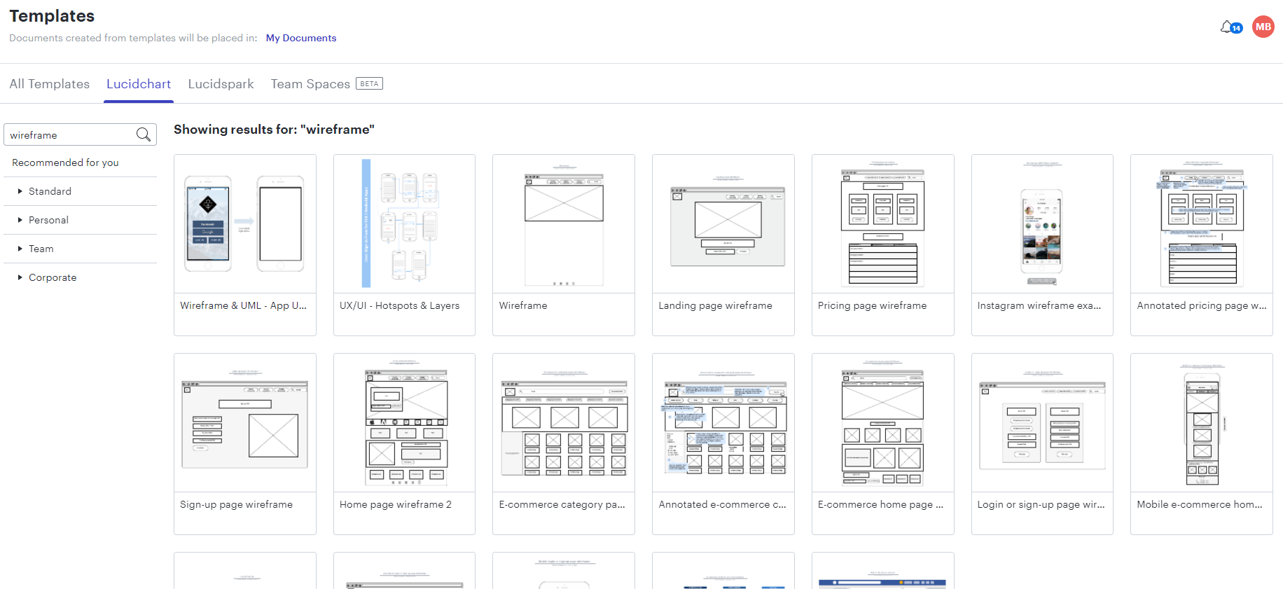
Additionally, if you've not already, I'd recommend searching the Lucid template gallery for "wireframe." You can also copy and paste certain elements of different UIs modeled there to create a wireframe of your own!

Ge0FKLz4h9hvWFjuSuIr-w.png


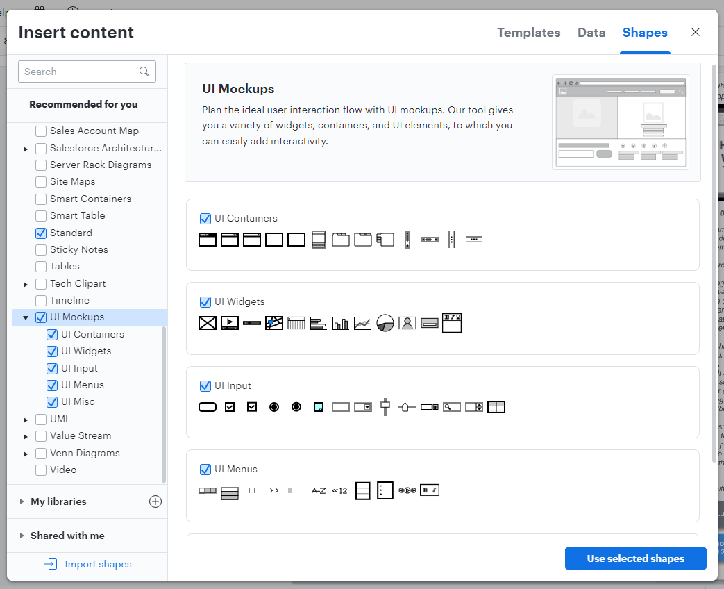
You can also explore a look at the UI Mockups shape libraries which contain all of the UI elements our template contain and which you can use to supplement existing wireframes or build one of your own.

WyBwkSMzt2-SMZ6XIwdFsw.png


Reply