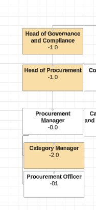
Why are my numeric data labels in Lucid Org chart showing as negative numbers when they are positive in data source?
Any why oh why can I not make the legend key (eg the colour circle) bigger at the same time as the font? If you make the font bigger the key disappears to miniscule….
Best answer by Flavia D
Hi @Sarah.Downes,
Thanks for providing this additional context!
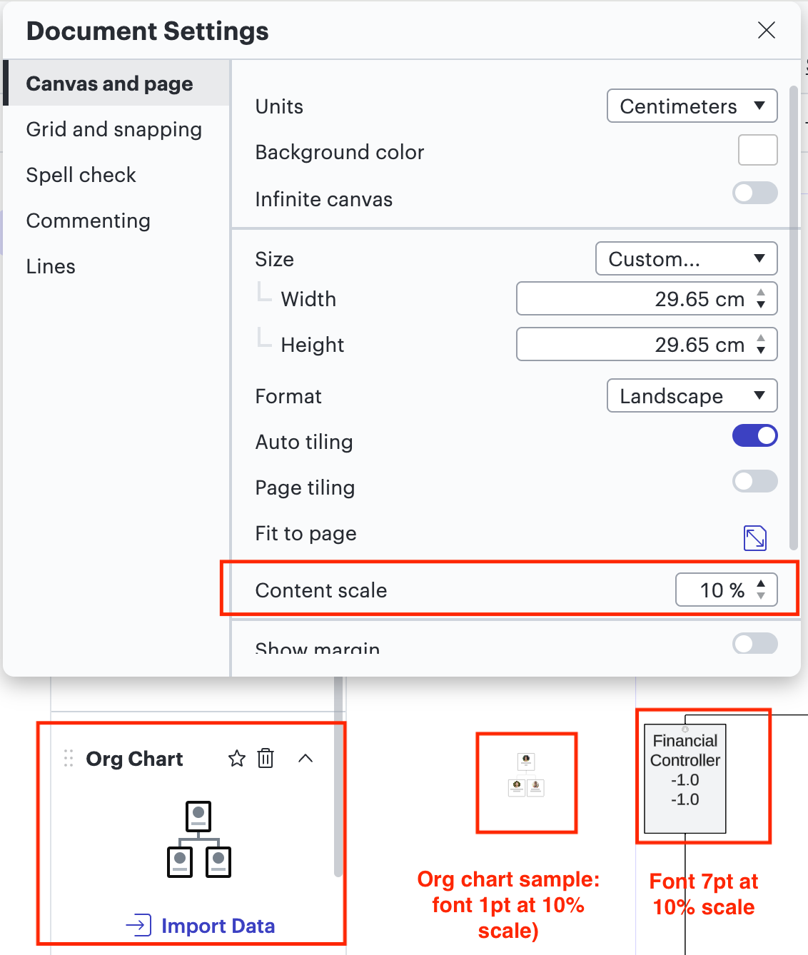
Regarding the scale/proportions of your org chart, including the font
It appears that your Org chart has been enlarged and is disproportionate to what it is set by default. If you take a look at your Content scale (File > Document Settings > Canvas and Page > Content scale), you will notice that it’s at 10% while the default is 100%. This will get even clearer if you drag an org chart shape sample from the Shape menu, as shown below:
To fix this, I’d recommend taking the following steps:
Press Cmd/Ctrl + A to select all content on your org chart.
Adjust the font size to 1pt (compatible with the org chart sample at 10% scale) from the font size menu. this will make all the text on your diagram to have the same size. You will notice that the font will become quite small compared to the org chart shapes.
Drag an org chart shape sample onto the canvas.
Press Cmd/Ctrl + A again to select all content on the canvas.
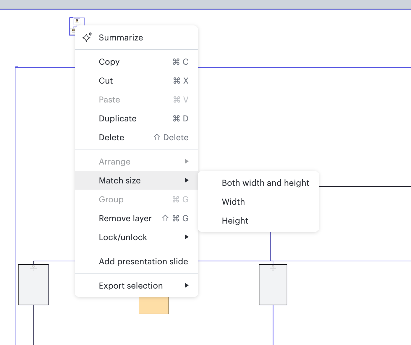
Right-click the org chart shape sample and select Match size > Both width and height from the dropdown menu.
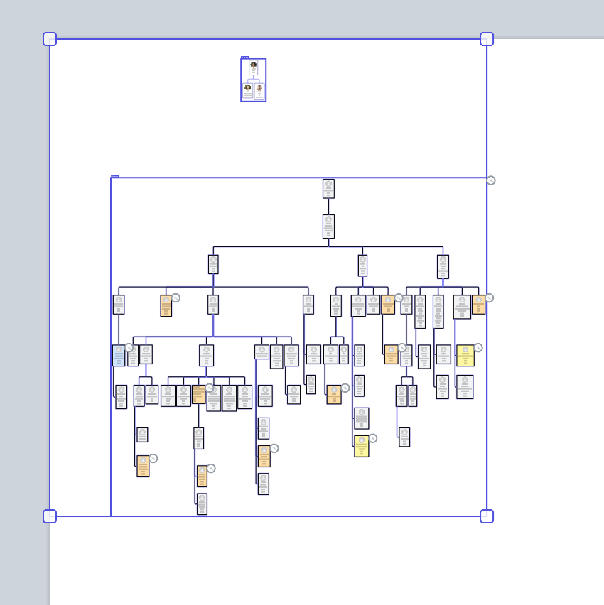
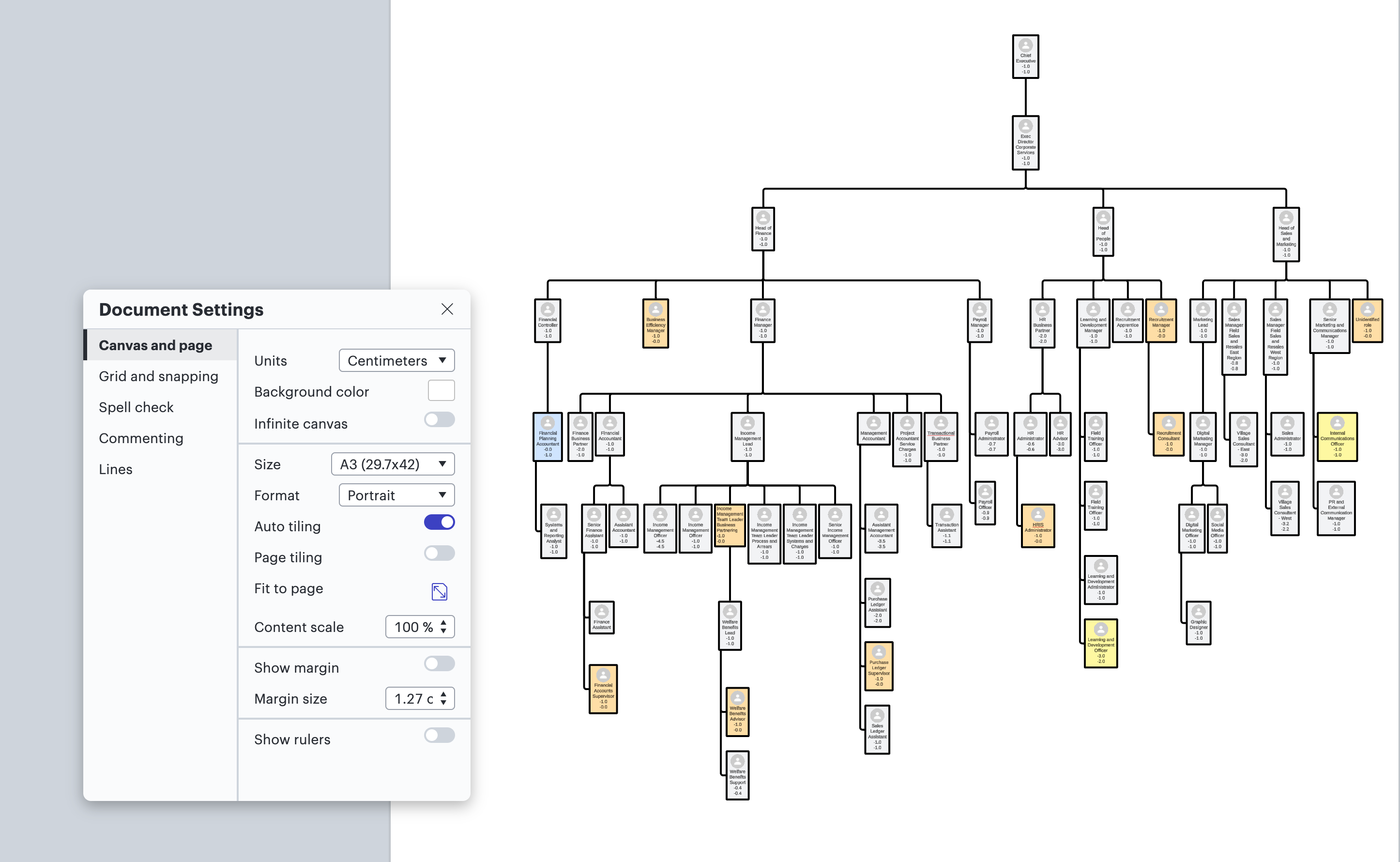
You will notice that your org chart will become quite small compared to the canvas. To make it larger, adjust the Content Scale to 100% (File > Document Settings > Canvas and Page > Content scale). For more information, please review our Adjust document and board settings article.
AFTER MATCHING SIZE AND BEFORE ADJUSTING CONTENT SCALE AFTER ADJUSTING CONTENT SCALE TO 100%
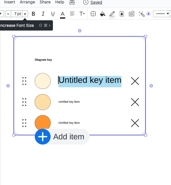
Regarding the diagram key
Yes, you’ll need to manually select a color that matches the colors from your conditional formatting rule. As for making the circle bigger, the only alternative in this case would be to select the text and make it smaller so the circle become bigger as compared to the text.
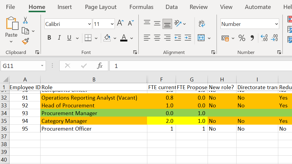
Regarding the numeric data labels showing as negative
I believe this is happening because the numbers in your Excel file are formatted as numbers and not as text. Could you try format the numbers in that file as text and replace the dataset in your org chart to see if that resolves the issue? You can more more information about how to format numbers as text in an excel file here.
Regarding the numeric data labels showing as negative: Could you post a picture of the issue so I can see what you’re seeing? Could you also specify the type of data label you’re referring to (e.g., data imported from your dataset or custom data)?
Regarding the legend key: Are you referring to the diagram key? If so, the best way to resize the color circles along with the text is by resizing the whole diagram key group. To do that, please select the diagram key box and drag its corners. To learn more our digram key functionality, please check out the Add a diagram key in Lucidchart Help Center article!
Regarding the diagram key - if you select the whole item and drag the corner out, it makes the text bigger but not the key on my example (already had formatting) but TBH I’ve deleted it now because it was causing so much trouble!
Regarding the numeric data labels showing as negative
Can you please share a document support PIN for this org chart? This will allow me to take a closer look at what’s happening. The support pin is for internal use only and doesn’t allow public access to your org chart, so you can share directly in this thread!
Regarding the legend key
So sorry for the confusion– it seems like I misunderstood your questions about diagram keys. If you want to make only the font bigger, the best alternative would be to select the text and resize the font directly from the font size menu.
No, I wanted to make the circle with colour bigger but if I made the font bigger the circle reduced in size - and vice versa, like a seesaw. I lost my mind ….
Also on the CS tab - my page has now reset and I can’t work out how to get it on 1 page? On the CS sheet, the number (FTE) is tiny - I can’t seem to make all the font the same across the whole diagram.
With the diagram key - do you always have to colour it yourself? I would have thought the conditional formatting would do it automatically like a legend in ppt?
Regarding the scale/proportions of your org chart, including the font
It appears that your Org chart has been enlarged and is disproportionate to what it is set by default. If you take a look at your Content scale (File > Document Settings > Canvas and Page > Content scale), you will notice that it’s at 10% while the default is 100%. This will get even clearer if you drag an org chart shape sample from the Shape menu, as shown below:
To fix this, I’d recommend taking the following steps:
Press Cmd/Ctrl + A to select all content on your org chart.
Adjust the font size to 1pt (compatible with the org chart sample at 10% scale) from the font size menu. this will make all the text on your diagram to have the same size. You will notice that the font will become quite small compared to the org chart shapes.
Drag an org chart shape sample onto the canvas.
Press Cmd/Ctrl + A again to select all content on the canvas.
Right-click the org chart shape sample and select Match size > Both width and height from the dropdown menu.
You will notice that your org chart will become quite small compared to the canvas. To make it larger, adjust the Content Scale to 100% (File > Document Settings > Canvas and Page > Content scale). For more information, please review our Adjust document and board settings article.
AFTER MATCHING SIZE AND BEFORE ADJUSTING CONTENT SCALE AFTER ADJUSTING CONTENT SCALE TO 100%
Regarding the diagram key
Yes, you’ll need to manually select a color that matches the colors from your conditional formatting rule. As for making the circle bigger, the only alternative in this case would be to select the text and make it smaller so the circle become bigger as compared to the text.
Regarding the numeric data labels showing as negative
I believe this is happening because the numbers in your Excel file are formatted as numbers and not as text. Could you try format the numbers in that file as text and replace the dataset in your org chart to see if that resolves the issue? You can more more information about how to format numbers as text in an excel file here.
Thanks for giving that a try. In this case, I think we will need to take a look at your dataset to understand why this is happening. Since the file can’t be shared in a public forum, I created a Support ticket from your post so we can continue to investigate. Please refer to that email for further correspondence.
A Lucid or airfocus account is required to interact with the Community, and your participation is subject to the
Supplemental Lucid Community Terms.
You may not participate in the Community if you are under 18. You will be redirected to the Lucid or airfocus app to log in.
A Lucid or airfocus account is required to interact with the Community, and your participation is subject to the
Supplemental Lucid Community Terms.
You may not participate in the Community if you are under 18. You will be redirected to the Lucid or airfocus app to log in.