I have recently noticed a change in all my Lucid diagrams, which makes them much less readable than before...
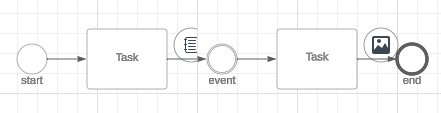
I mostly use the BPMN shapes. In the BPMN "language" the circes have a specific meaning. They correspond to an "event" that happens during the process.
Today, all the pictures and notes that I have attached to a shape are presented in a circle (it was not the case before) and can therefore be taken as an "event" in the process while they're not events at all.
Here is an example of a note and a picture attached to a shape :
Is it possible to have a rollback in order to keep the notes and images presented as they were before, which was much better and made my diagrams much more understandable ?
Thanks in advance for your help.