Hi Everyone!
I am very new to Lucid and am looking for some help! The church I work for is in the slow process of developing a leadership pipeline across all areas of ministry. I am currently looking for software solutions that can help us lay this out as well as potentially offer us some insights to how we’re doing. I currently have the structure laid out here.
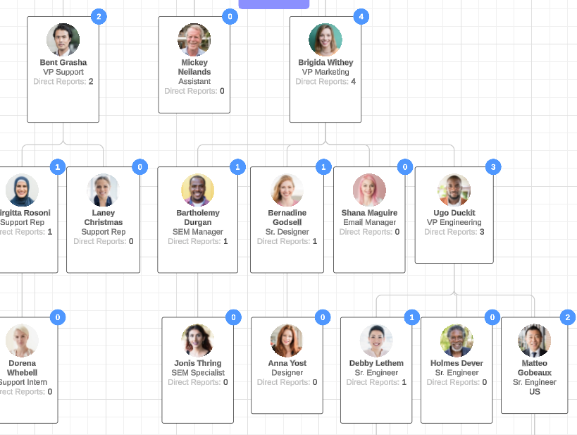
While simply seeing this is helpful, there are some additional functions that could be super helpful. I imagine they are available but I am just unsure of how to do it! Currently, this entire chart is made using “Smart Containers.”
In an ideally world, we would be able to do things like:
- plug in specific lists of people in each team and be able to flag where we have duplicates, ESPECIALLY as the pipeline goes up (meaning… where do we have leaders leading in multiple areas?)
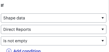
- Track our progress in filling this out. This is set up as a desired outcome, not a currently reality. Is there a way to flag positions that aren’t filled?
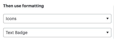
- Show number of direct reports to show where we need more/additional leadership. I know this is available using more basic shapes, but I like the visualization of our teams currently using the “Smart Containers.” I think in a perfect world there would be another layer that links to the positions… perhaps this is where the full lists of people live. Then the full lists populate total numbers on the top layer.
- Have a flag/icon present for when a staff member vs. volunteer is currently operating in that role
That’s where I’m at currently. Mainly needing some help figuring out if this is possible! I’m sure there is some additional functionality I could come up with too, but these are the big ones.
Thanks in advance for any help!!