Hello!
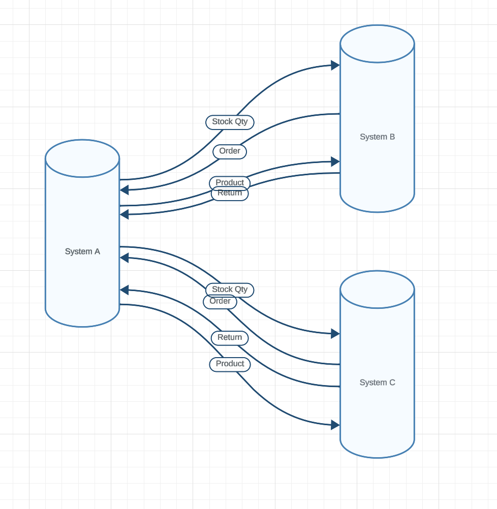
I am new to Lucid App and I’m trying to illustrate the connection on how data flows between three systems; A, B and C.
As you can see in the attached image, the anchor points are very spread out.
If I use the default center point it will get cluttered.
Is there a way I can organize the connecting lines so they spread out evenly on source and target?
System A should have 8 evenly distributed lines coming out from it
ystem B should have 4 evenly distributed lines coming out from it
System C should have 4 evenly distributed lines coming out from it
Any help on how to achieve this is appreciated, without having to do it manually (if there was a grid snap to the object, that could work).


