
We're all about creating documents that stand out captivate and communicate effectively. But have you ever thought about how your document's appearance affects those with disabilities? Introducing a simple yet impactful solution: color selection and using high contrast.
Choosing the right colors and contrast isn't just about aesthetics; making the right styling selections can be a game change for accessibility. Here's why:
-
Enhancing Readability
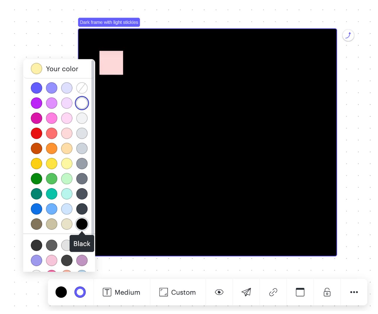
For individuals with visual impairments sensitivity to bright light dyslexia cognitive disabilities or aging eyes choosing the optimal colors can significantly improve the reading experience. The high contrast between text and background reduces eye strain and can also help users distinguish between different things on the canvas.
-
Minimizing Glare and Discomfort
People with certain visual conditions like photophobia or migraines can find light colors uncomfortable or even painful to look at. Using darker colors mitigates these issues by providing a gentler less glaring visual environment.
-
Supporting Various Needs
Accessibility is not one-size-fits-all. Using darker colors and high contrast complements other accessibility features like larger fonts and alternative text for images providing a holistic solution for diverse needs.
When creating your Lucid documents consider the colors and contrast you’re choosing. To learn more about these features and to explore step by step directions visit this Help Center article. It's as easy as a few clicks but its impact on inclusivity is immeasurable.
🌟 Share Your Experience in the comments below!
Have you tried using color and contrast for accessibility for your documents? We'd love to hear about your experiences and any ideas you have for improving accessibility further in this feedback thread. Drop a comment below and let's spark a conversation!