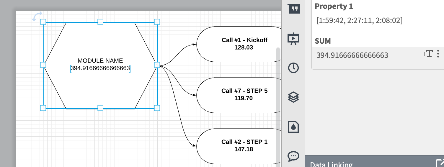
I would like to display a sum of the durations of an set of objects that are grouped together.

The objects have linked data.

I create a custom field "Property 1" which is =SUM(children."Call Durations")

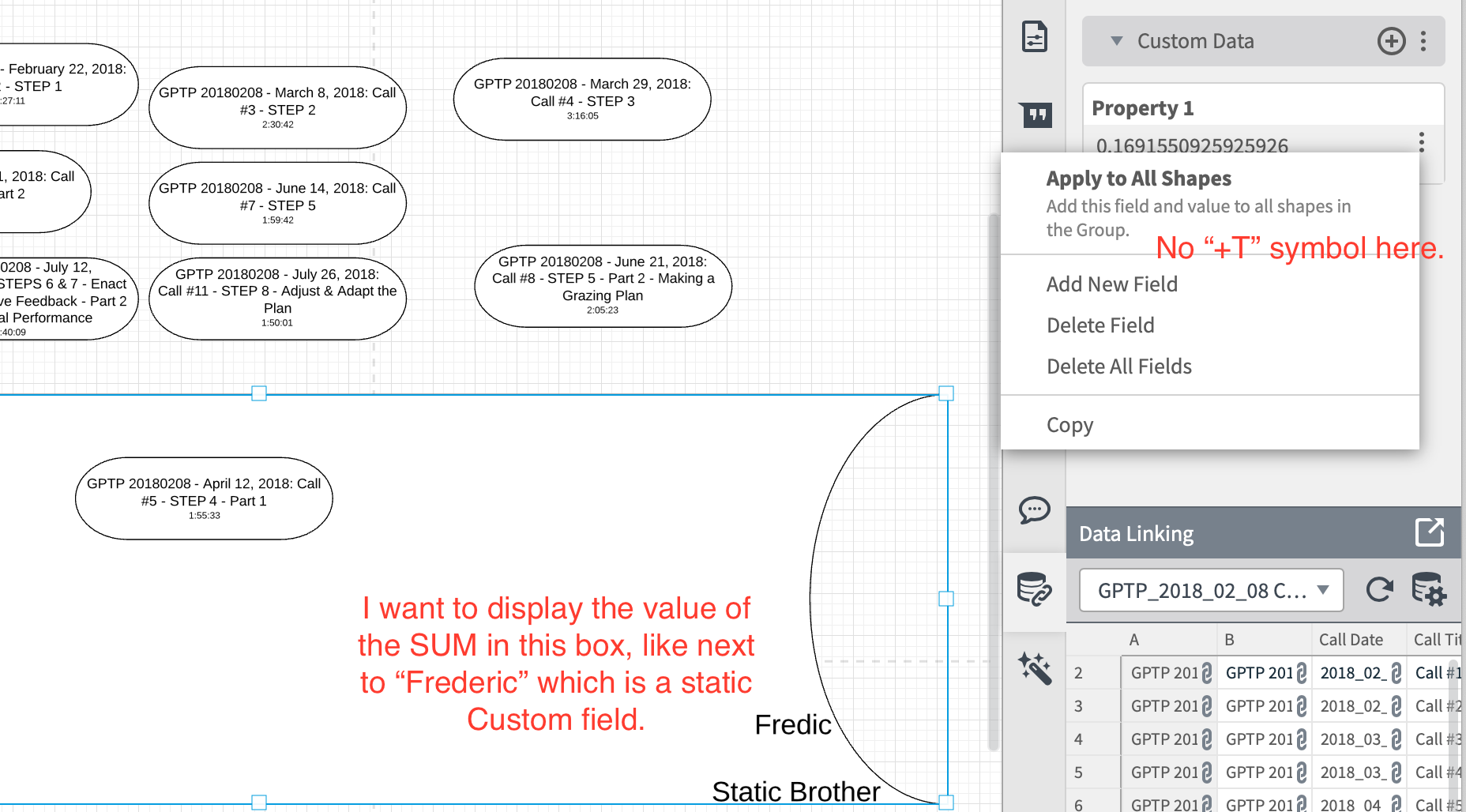
It does return a value.  But I do not know how to get that value onto the page!  For Static Custom Values or linked data there is usually a "=T" symbol which will put the field on the object.  But in the case of a Group... there is no +T.... so how do you actually get the value of this computation to display on the page?

The article "How to Use Formulas" example shows how to make the calculation but not how to put it on the page.

My hope is to be able to sort items into groups and have the calculation show the total duration.  That way as we are making decisions  about what to group together we can see what the total duration is.
V7FIaFFx4ux0XqbiIYizUQ.png


I didn't figure out how to get calculations from children in a group to display on the page or on an object containing the group.


However I did figure out how to use the calculation to get items that are connected by lines:


=SUM(connecteddeep."Duration Decimal")


the +T icon appears for this and it can be added into the shape that has all the others connected.


Note that the calculation here is being done on a number not on a date or duration representation in the Google Sheet.    


When displaying a single duration from Google sheet it displays as hh🇲🇲ss


However when I summed the durations field from the google sheet the sum displayed in Lucidchart as a number (like 0.612344567)


So I did the conversion in  Google Sheets into minutes in order to make the sum display as minutes in Lucidchart.


Have a very similar problem would love to hear the solution


Hey Ricky -- I'm not sure if you were asking me for more information or asking support.  Frankly it has been a year since I worked on this and I have cleared the space in my brain for other things!


I think I gave up using lucidchart calculations.  They seemed like a very underdeveloped tool at the time.   


Recently I had to do something similar to what I was experimenting with in the original post here .. I had a list of videos to choose from to make a 24 minute compilation.  I used google sheets with a checkmark column.


A calculation column then took the duration from a video if there was a checkmark.  


Then at the bottom I just totaled this calculated column -- each row contributed zero if it was unchecked and contributed the length if it was checked.  I also worked in decimal minutes not HH:MM because I hate the way spreadsheets always seem to want to work with datestamps instead of durations


So except for the graphical niceties this allowed me to pick from a pool various combinations to see how they added up.


The big advantage to doing it in lucidchart would be the extra level of conceptual contextual meaning that shapes colors and proximity can provide.. all of which is hard to do in a spreadsheet.  


So. No real help for you but some tangential thoughts.


Keith


Hi Keith and Ricky


Thanks for posting sorry we hadn't commented on this thread earlier. Unfortunately I don't have much to add beyond what Keith has already mentioned above. I think connecting shapes via lines is the best work around at the moment. I will pass this information along to our development teams. If you have any further suggestions please let us know via our feature request form. 


Hi! I’m Micah from Lucid’s community team. 👋 Jumping in here to share about Lucid’s Data Trusted User Group. This group is made up of knowledgeable users who regularly analyze and visualize data in their work. As part of this group, you’ll have the opportunity to connect directly with Lucid’s product team, gain early access to beta features, and share insights about your needs, shaping the future of Lucid’s data solutions 🎉 You can learn more and request to join here. Thanks!


Reply