Notes are a good example of this because a small discrete icon is present to show the viewer that another dimension or additional information at least is attached to some given shape. However the problem there is the format of the notes box (the shape cannot be changed nor font size etc) which is a little inconsistent aesthetically with the rest of the Lucid-chart experience in my opinion and indeed if this is the only option as regards said functionality.
With that said is there a way to create shapes or text that can by default be shadowed out (for example) and thus appear as "background" shapes or texts that transform to "foreground" when the cursor is directed to or over them; selected etc.? Such would be an amazing feature in my opinion.
Layers should seem to do such but I can't see how that feature works since the added items in any given layer are either visible or invisible when to the main layer without any means to an unknown viewer that they are there in the first place (meaning that the Layers experience is much less interactive and intuitive since to view them if they are hidden requires that the viewer understand the dock and so forth and actually make them manually visible just to see them if I understand such correctly?).
Thank you
How to create shape/text that is hidden or shadowed out until cursor is run over it?
Best answer by Carson G
Hi Justin
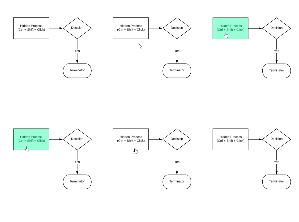
Thanks for posting! I hope I'm responding effectively to your questions. What I would recommend is to place a hotspot on a shape and to set the functionality of that hotspot to toggle layers. This would allow you to maintain an additional process that would only appear when clicked (see gif).
 Please let me know if you have additional questions about this!
Create an account in the community
A Lucid or airfocus account is required to interact with the Community, and your participation is subject to the Supplemental Lucid Community Terms. You may not participate in the Community if you are under 18. You will be redirected to the Lucid or airfocus app to log in.
Log in to the community
A Lucid or airfocus account is required to interact with the Community, and your participation is subject to the Supplemental Lucid Community Terms. You may not participate in the Community if you are under 18. You will be redirected to the Lucid or airfocus app to log in.
Log in with Lucid Log in with airfocus
Enter your E-mail address. We'll send you an e-mail with instructions to reset your password.