Hi @matthew f101 thanks for continuing this thread and sharing the solution! Just adding a screenshot example of the "Conditional Formatting" that may be applied to your document incase any other users are running into the same issue.
To unapply or delete the rule click the wand icon in the formatting bar at the top of the canvas. Locate the rule that is applied to your document and click the three dot menu > select unapply or delete to remove it.
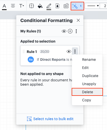
This feature is a great way to highlight information in your diagrams. If you're interested in this feature I recommend taking a look at this Help Center article for more information.
I hope this helps! Feel free to let us know if you have any questions about this feature or create a new post if there's another topic you'd like to discuss! 🙌

 See screenshot.