How do I manually format the Lucidchart Org Structure?
Hi,
I would like to format my structure chart so my lowest level of staff are presented in columns so that I can fit it all on to one page. I can either do this automatically or I would like to manually format the chart to present how I want it to.
Thanks
Page 1 / 1
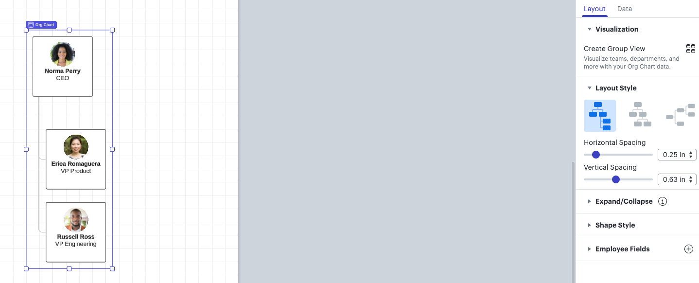
Hey @Nathan Bradley -- thank you for posting! If you navigate to the right contextual, you can adjust your layout and make your bottom staff into a straight column.
Hope this helps!
I followed this thread as it’s something I’ve mentioned in a feature request. If you have someone with 50 reports then you need more options than a horizontal line or a vertical line. It would be good to have the option to lay them out in a grid (say 5 columns by 10 rows) or to have the option for reports to be in one overall box. This is how I manually handle this in InDesign or the like.
The other thing I’ve like is to have all reports listed in a single box, which is how I sometimes represent a team of people under someone (too many boxes make it harder to read).
Hey @Andrew B105 -- thanks for posting! If you have an employee with 50+ reports, I would recommend creating a separate Org Chart for this employee and connect it to the bigger Org chart with a manual line or separate this part of your Org Chart by pages and departments.
Hope this helps!
Hi! Wanted to jump in on this thread for the sake of anyone else who comes across this post to say that we’re very interested in your feedback! This ability to manually resize or determine the structure of your org chart isn’t currently supported in Lucid, but we’re very interested in your feedback and committed to continually improving our products. If you’re willing to share, we’d love to hear more details about your use case or what you’d like to see in this experience. I am linking @Andrew B105’s excellent request that he mentions below:
Finally, for more information on how Lucid manages feedback via this community, take a look at this post:
Reply
Create an account in the community
A Lucid account is required to interact with the community. You will be redirected to the Lucid app to create an account.