
Hello are you able to manually state what 'tier' members of staff should be. We have instances where different tiers/levels report into the same staff.


For example let’s say employee 2 has a higher title/position than employee 3. But both of them directly report to employee 1. How can I display this? I don’t want employees 2 and 3 to be on the same tier.

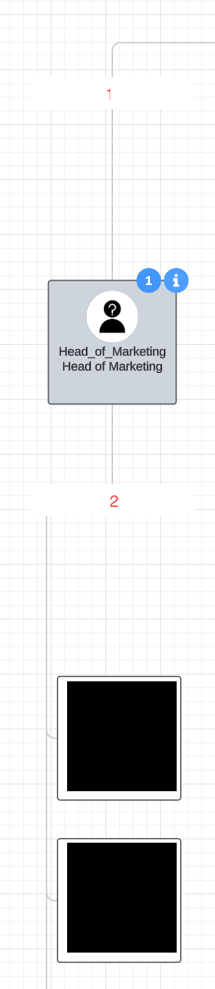
Hi there thanks for posting in the community! Unfortunately Lucidchart does not have a feature to have two employees at different tiers/ levels reporting to the same supervisor. However a workaround for this would be to create an employee in the area that should be 'skipped' and on the right hand menu deselect all information and choose the 'text only' style. This will leave an (almost) blank space which will look for the most part correct in terms of the reporting structure and move the employees to the correct tiers. Here's an example below - Hope that helps!


For more information on org charts take a look at this Org Charts Help Center article.


____________________________________________________________________________________________________________


¿Habla español? ¡Haga una pregunta aquí!


Fala português? Faça uma pergunta aqui!


@Micah just checking if anything changed so that we would not need this workaround anymore?


Thanks a lot!


Hi @luciduser_1234, thanks for your question! This is unfortunately not supported in Lucidchart at this time, and the workaround described above remains the best option. This is great feedback, though. Would you be willing to upvote and/or add additional details about your use case to this thread? This will help us centralize the conversation surrounding this request. 🙂 Thank you!


Thanks, @Micah! This workaround works okay, but I still have two problems with this workaround:

  1. As you can see on the screenshot, Lucidchart aligns the line on the left when choosing vertical layout and when there are several direct reports. This makes the workaround a bit more present as the line in the box labelled as “2” is centered on the top and left-aligned at the bottom. Is there any workaround for aligning the two lines in the same way without creating two intermediary boxes (that would again change the vertical order / layer).
  2. The conditional formatting with the number of direct reports in the blue circle is incorrect when using this workaround. Is there any way to still correctly show it (which often includes taking the number of direct reports two levels down) while using the workaround? I guess I would need to use Conditional formatting “Text badge” with “Shape data” and link a custom variable (which is calculated in Google Sheets)?

Looking forward to your help! Many thanks in advance!


Hi @luciduser_1234, thanks for your response. 

  1. Unfortunately, it’s not possible to reposition the lines within the vertical layout. I might suggest styling the centered line leading to the hidden box to also be transparent or white, then adding a line of your own to continue the left-aligned extension back up to the top employee. I do understand, though, that that’s quite manual and more flexibility here would be ideal!
  2. You’re correct - the standard way of doing this uses the CHILDREN or DOWNSTREAMDEEP formulas based on the data you’ve imported into Lucidchart. You can find our full formulas documentation here, and I’ll also share this post as an example of using this within the org chart. Perhaps it’s possible to apply something like this to your head employee, then simply subtract 1 to remove the count for the blank employee. 


Thanks for the explanation! Makes sense :)

Re A: It seems like I unfortunately can only edit all connecting lines of an org chart at once, i.e. either all lines are transparent or have a certain color. Consequently, it would be a lot of effort, if I would make the line transparent only for aligning it with the one box because I would then need to manually recreate all connecting lines. Is this correct or do I miss something here?


@luciduser_1234 You should be able to single-click a particular line segment within your org chart and apply a style to only that portion. I’ve demonstrated that below:


Can you confirm if you’re able to similarly select the line in question?


Hey @Micah, fair point - when I tried to delete the line, it deleted the whole org chart but selecting a single line and making it transparent works! 


Glad to hear it!


I am chiming in here to say that as a new user it is extremely disappointing that there is not an easy way to represent people at different levels reporting to the same manager but not appearing in different tiers.In the case of our org, it almost makes this program not worth it. I have been searching for a software/app to create an org chart more easily and was hopeful Lucid would be it. 


Hi @casalemi, thank you for continuing this post and sharing valuable feedback about this feature. 

If possible, could you please upvote the following idea post and share any additional details about your use case or what you’d like to see in this experience there? This will help to refine feedback and properly capture the popularity of the request. Thank you!


Finally, for more information on how Lucid manages feedback via this community, take a look at this post:


We appreciate your willingness to provide your requests and feedback in the Lucid Community!


Reply