Hi Stuart, thanks for posting in the community! You can achieve this using our formulas and data validation.
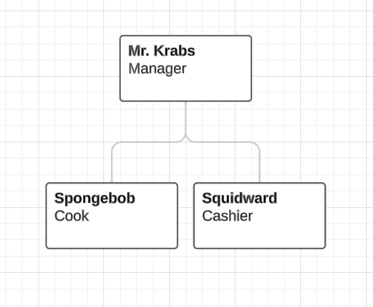
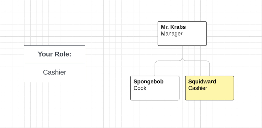
Let's illustrate this with the following org chart:

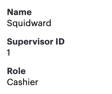
First, we'll need to ensure each employee has a "Role" field in the Org Chart Data menu.

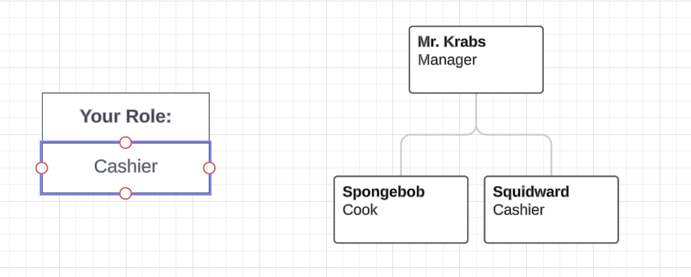
Next, we'll create a box for users viewing the org chart to input their current role:

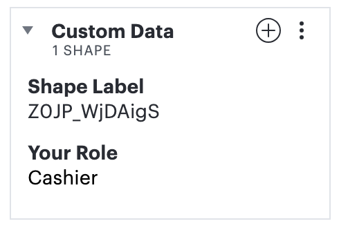
We'll need to create two Custom Data fields for this input box:

The "Shape Label" field will contain the formula: =label(THIS)
The "Your Role" field will contain the formula: =THIS
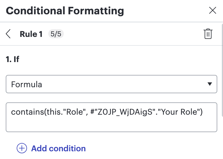
Next, copy the populated shape label and navigate to the Conditional Formatting menu. Create a rule and use the 'Formula' dropdown.
Input the following formula: contains(this."Role", #"[YOUR COPIED SHAPE LABEL]"."Your Role")

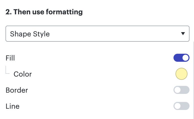
Then, customize the conditional formatting options!

Your finished product should look like this:

Feel free to follow up in this thread with any questions, or an example of your own diagram!
