Hi,
I’m not posting this as an idea as I have no faith in the ‘vote by committee’ hole where good ideas tend to disappear into. I no longer make feature suggestions as I believe it’s a waste of my time.
My quibble for this post: why is Lucidspark’s flow design so poor?
- For example, double-click creates a sticky note. But if you double-click, then paste, it doesn't paste into the sticky note. It pastes a new text box. To paste into the sticky note, I need to double click, then double-click on the sticky note again.
- Another example - there is no keyboard shortcut, such as Ctrl+enter, to force a proper break in content into a new box. It takes painfully long to paste lots of individual content into LucidSpark and radically reduces my usage of the platform as I spend more time adding content than sorting it.
- Another, why is it that sometimes if I have a text box selected and paste, it replaces the text box, and at other times, it creates a new text box?
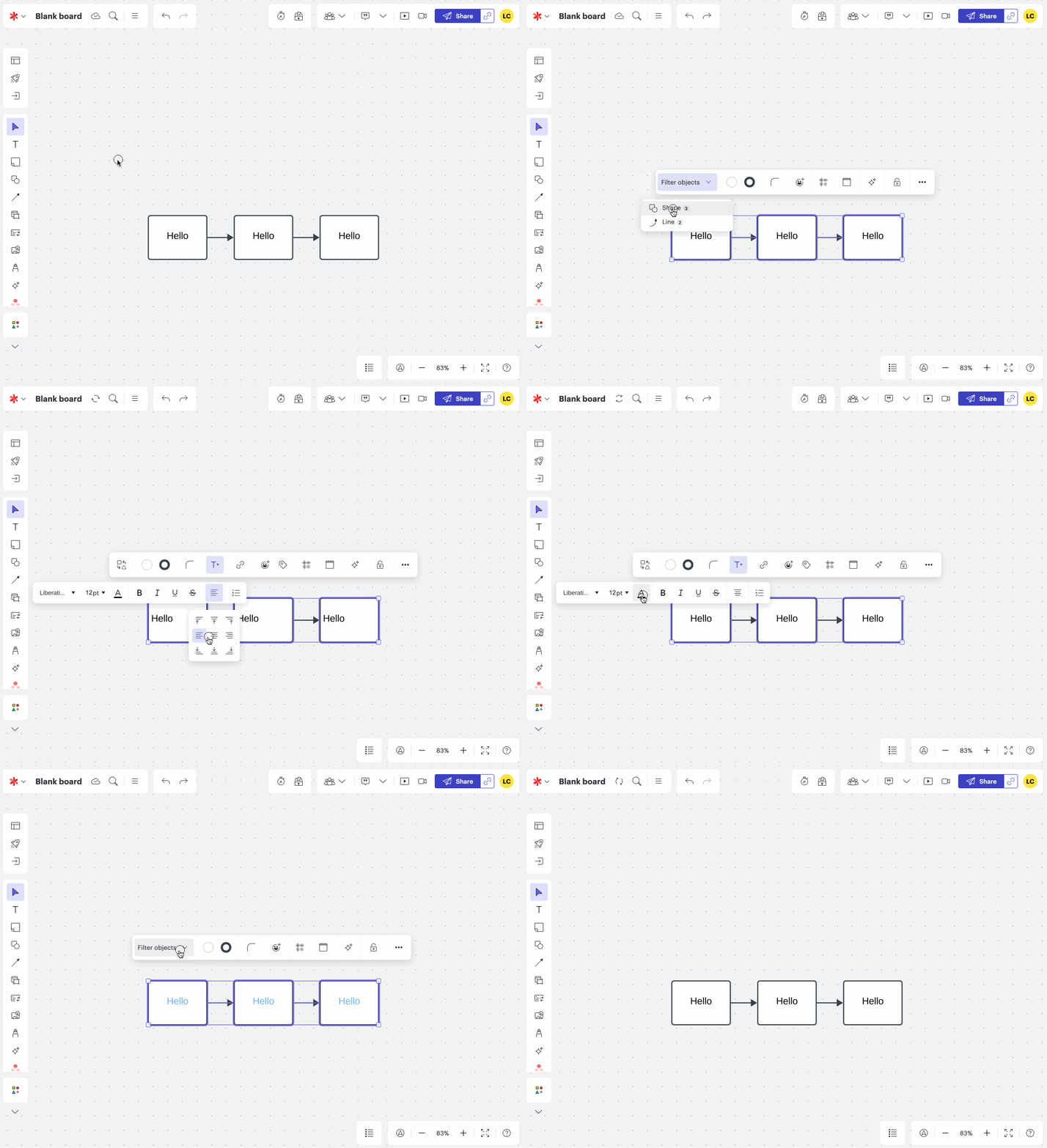
- And lastly, why does a shift-ctrl-V (format less) paste cause text to always align to centre? And why is it that if I select multiple boxes, including their linking arrows, I lose the ability to change alignment for all the text boxes? Considering that it’s very likely I’d select arrows align with multiple text boxes, this seems strange. To make this work, I have to individually select each box, wasting a lot of time.
I really like LucidSpark and use it several times a day for different projects. But the low issues are painful and it doesn’t feel like the people designing this app actually use it often.
thanks,
James


