Want to create a pie chart in Lucidchart but aren’t sure how? While there isn’t a way to automate this process you can use dynamic shapes to build a pie chart for your data.
Dynamic Shapes:
The first step to creating a pie chart in Lucidchart is to access the Dynamic Shapes library. For more information on how to do this check out our Dynamic Shapes Help Center article.
Setting up your Pie Chart:
Once you have accessed the Dynamic Shapes library you are ready to start building your Pie Chart. Use the following steps to start setting up your chart.
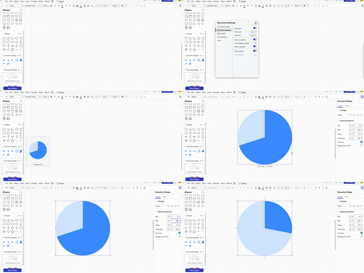
1. Adjust the Grid and Snapping settings to snap to objects and guides. This will make it easier to build your Pie Chart later on. You can find the Grid and Snapping settings in the Document Settings under the File menu.
2. Choose the type of pie chart you want. You can opt for either a progress pie chart or a progress doughnut chart. You can also select the half-sized options for both chart types. Once you've decided drag and drop your choice onto the canvas.
3. If you need to resize your chart to a larger size press and hold the Shift key and then drag out one of the corner edges that appear when you hover over the Dynamic Shape. Using the Shift and drag technique will allow you to increase the chart's size while maintaining a perfect circle (which will be helpful later when building your pie chart).
4. Set your maximum and minimum values. You can set these values by clicking on the dynamic shape and editing them in the side menu that pops up. The maximum and minimum values indicate the range that your sections cover.
- For example if you interviewed 250 people and want to show how many gave a specific response in a pie chart your maximum number will be 250 and your minimum will be 0 (since you can't interview a negative number of people)
Note: To ensure the pie chart is complete the total value of all sections should equal the maximum value number.

Creating Pie Chart Sections
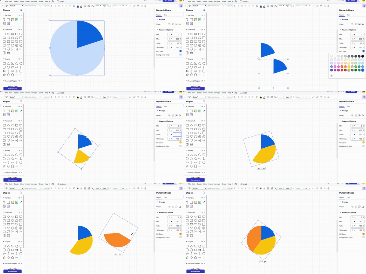
1. Adjust the value of the dynamic shape to match the percentage or value you want for each section. In the example above with the 250 people if 50 of those individuals provided a specific response you wish to record then the value of that section would be 50.
2. Set the background color.
Note: You can choose any color you prefer for the background. For aesthetic purposes in my example I've set it to transparent.
3. Duplicate the dynamic shape you created in the previous steps and readjust it to correspond with the value you desire for the next section.
4.Change the color of the next section to differentiate it from the other sections of the pie chart.
5. Rotate and position the current section beside the previously created section. This process will eventually form the circle or half-circle that constitutes your Pie Chart.
6. Repeat steps 3-5 for each section you intend to include in your Pie Chart.

If you have aligned your sections perfectly and your maximum value matches the sum total of all the section values in your pie chart you will achieve a perfectly circular pie chart.
Editing the Pie Chart
Since the dynamic shapes are essentially layered on top of each other making edits to colors or sizes of sections after constructing your org chart can be a bit complex. If you wish to revise a section follow these steps:
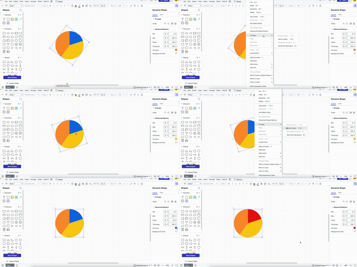
1. Select the top layer and right-click it.
2. From the pop-up side menu choose 'Arrange’.
3. Then select 'Send to Back.' This action will move the top layer to the back revealing the one beneath it.
Note: The selected layer will be indicated by the fill color displayed in the dynamic shape side panel.
4. Repeat this process until you can access and modify the desired section.


