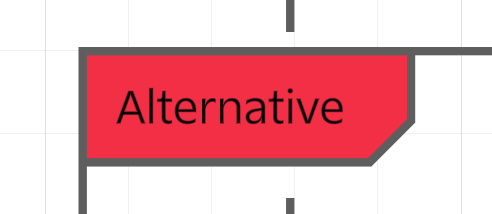
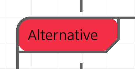
When you apply corner routing to a UML Markup diagram, it also applies rounding to the background of the option and alternative blocks titles. It doesn’t look right.
Without rounding:

With rounding:

I would not expect the red background behind alternative to round as well leaving white space inside of the label container.


