
I am creating a drawing and hitting a few bumps.


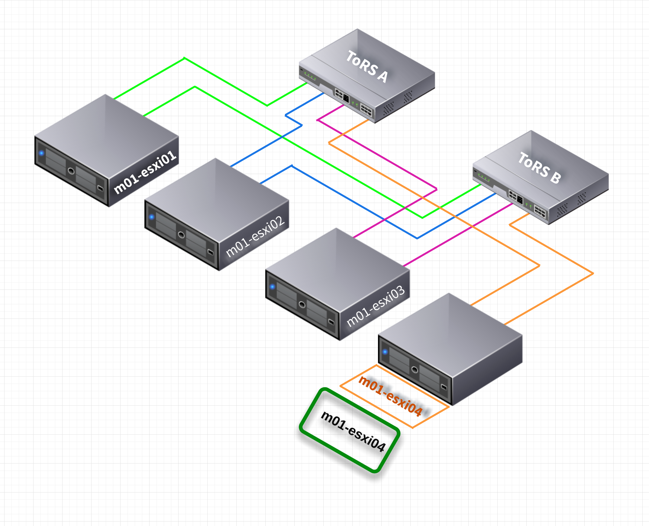
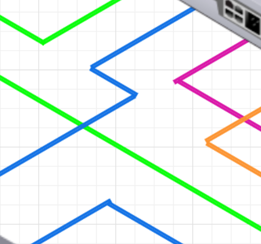
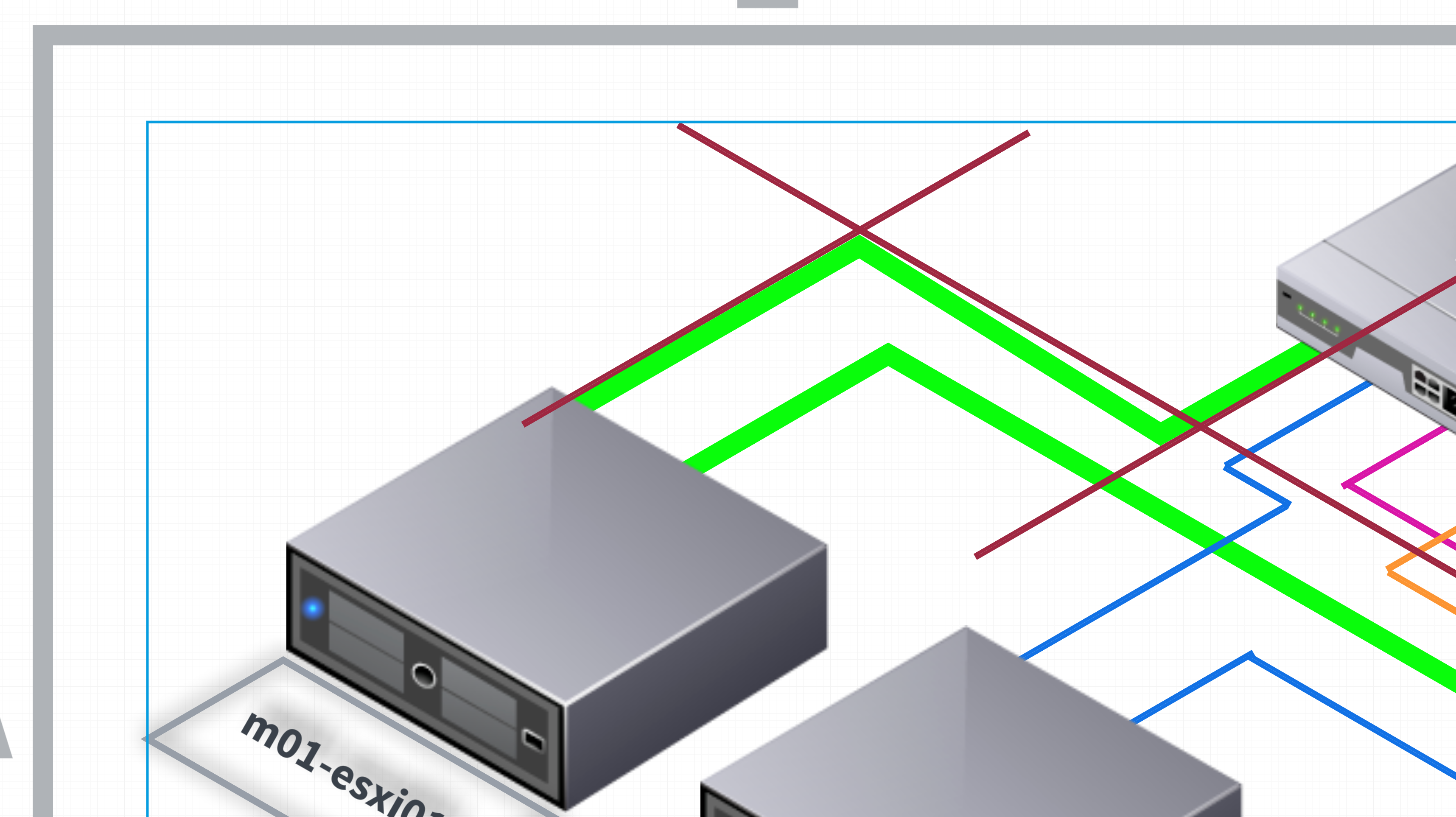
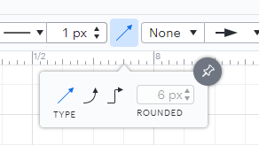
1.  How can I connect lines? In what I have attached the lines connecting to equipment are not fully connected / sharp. Also the orange box in the front of the server. How can I connect them?


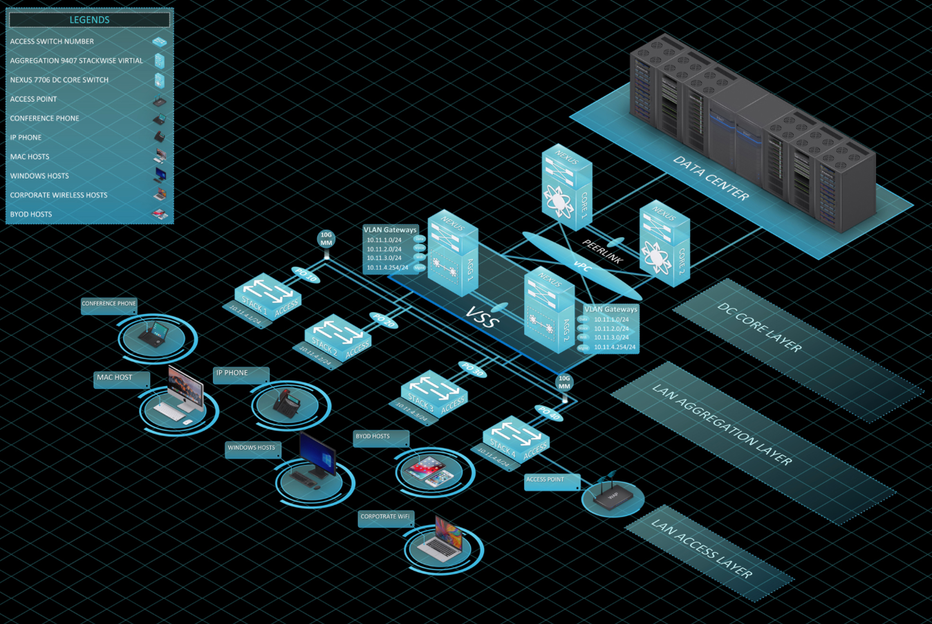
2. Is there a way download or edit text so that it can look flat on the orange box isometric text? I can rotate the text but unable to make it flat. The last image is similar to drawings I have produced in the past.


3. The green box is rotate 30 degrees but does not work for what I am looking to created.


If there are any packages I will require to download and upload to the system could you please provide them.


Thank you.  


Hi thanks for posting in the Lucid Community! There are no additional packages to upload to your account; I'm happy to provide recommendations on how to achieve this using Lucidchart's features as-is:


1. Regarding the lines are you referring to the line junctions as shown in this screenshot?


If so I recommend one of the following two options for a seamless connection:


a. First utilize a single line to create these connections and use the joints within each line to change the angles as needed. I've demonstrated this in the GIF below.


b. Second if you prefer constructing these connections using individual lines for each segment I recommend disabling Snap to Grid which forces precise alignment to the canvas's grid and prevents perfect overlap of the line endpoints. By disabling this you can arrange the lines according to your liking for a seamless connection. 


2. Unfortunately getting the text to lie flat as shown in your example is not currently supported in Lucidchart as the aspect ratio of text isn't editable. However I certainly understand how this would be useful and I've logged this feedback for review by our development team. It utilizes requests like these when prioritizing improvements to Lucidchart. If you'd like to share additional details about your use case or what you'd like to see in this experience we'd love to learn more via this thread or our feature request form. Thanks again for your feedback and apologies for any inconvenience!


3. If you've used a rectangle or square shape here for that green box it's not possible to adjust those shapes' right-angle corners to achieve a look like the orange box which has obtuse and acute angles. For this I recommend our Flex Polygon shape within the basic Shapes library which will allow you to adjust the corners as needed. 


I hope this helps! Please let me know if you have additional questions. 


Thank you for that. For some reason I was unable to adjust the line but when I hit "L" I was able to adjust. But I am having difficulty with the line staying where I am putting it. When placing the line anchor where I would like it it is auto adjusting not where I would like. I have the snap disabled. Where it is adjusting to is taking the visual away. I have 30 guide lines but it seems to not want to allow precision placement. 


The square worked niceness. 


To clarify you will need to select the straight line type from the Line Options menu to achieve angles like this as shown in the screenshot below. Apologies for not clarifying this in my previous response!


Regarding adjusting the lines - are you utilizing actual Guides within Lucidchart? If so I also recommend disabling the Snap to Grid option within the View menu:


Let me know if this doesn't resolve the issue!


Yes I have those options configured and still having a problems putting the line where I like. Is there away for my to add a video or send to you to show what is going on? It is not allowing me to add it to this comment. 


Ok thanks for confirming that. if you are able to capture the behavior as a GIF you can upload that to this thread so I can take a look. Alternatively if you have a video file you can share that via secure support ticket with our team and we'd be glad to continue helping!


Reply