Hi Mike thanks for posting! With the data in your spreadsheet being colors there is not a way to do this with conditional formatting.
This may however be something you can accomplish manually using Actions and Layers. I tried to make a simplified version of what you described:
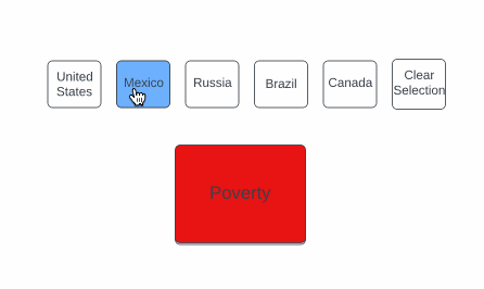
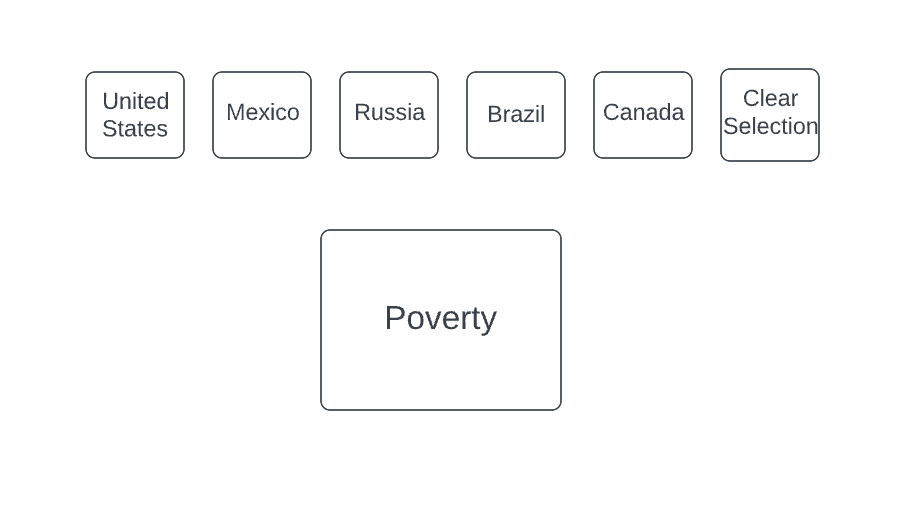
To do this on the initial canvas I added process shapes for each of the countries I wanted to represent as well as a process shape for the Poverty parameter.
Then I created a new layer for each country. On the layer I added a new country shape filled in with blue as well as a new “Poverty” shape with the corresponding color for that country.
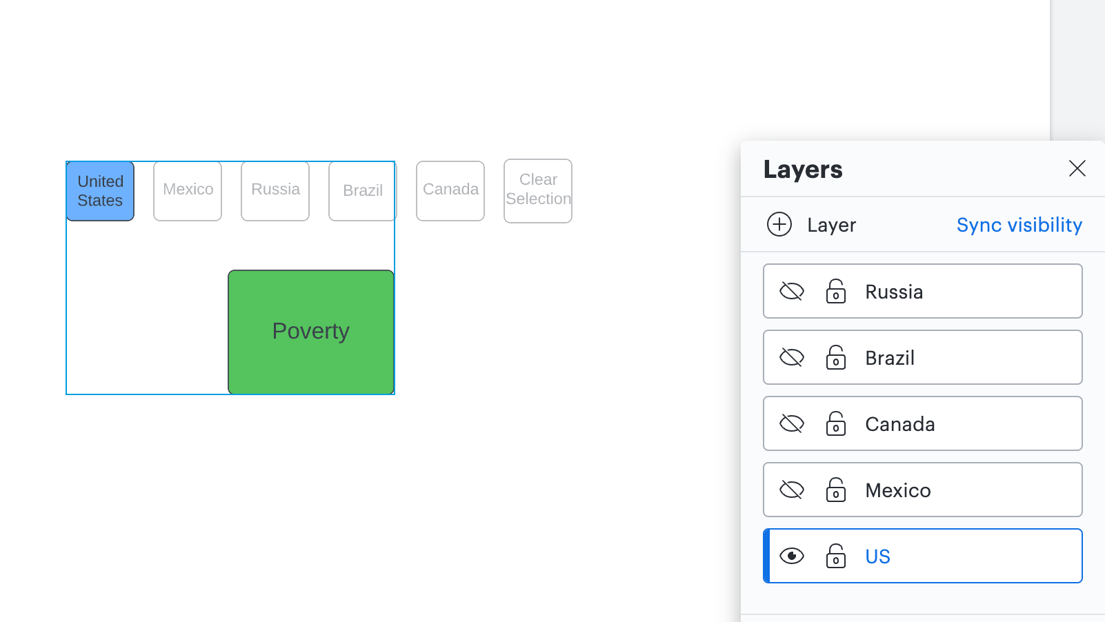
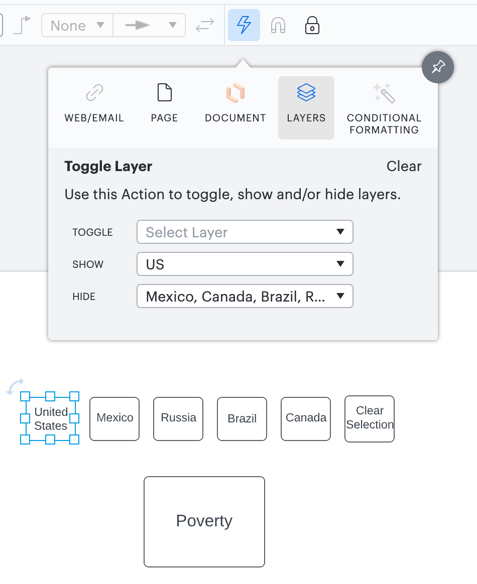
Once all of my layers were created I hid all of them. Then I added Actions to each of the white country boxes on the original layer by clicking the Actions icon (lightning bold in the top toolbar) selecting Layers and adjusting the “Show” and “Hide” options for each shape so that only the corresponding layer would show when each shape was clicked and the rest were hidden.
After setting up the actions for each country shape you can trigger them by using the hotkey reference you will see when you hover over a shape with an action assigned to it. If you are on a Mac this hotkey is Shift + Command + Click (on the shape). If you are on a PC the hotkey is Shift + Ctrl + Click (on the shape).
Because it sounds like you are wanting to show this to a wider audience I would recommend publishing which you can do by following the steps in this Publish your Lucidchart document article. One cool thing is that on the published version your audience won’t have to use the hotkeys mentioned above and will instead be able to click on the shapes normally.
If this example isn’t exactly what you were envisioning would you mind sending me a couple of screenshots from your document and data set so I can do some adjustments to better suit your needs?
Hi Morgan thanks for this detailed response! This is potentially a solution for me. I have somewhat more countries and variables to deal with than that but may ultimately be the way I need to go. I will post back if I have any clarifying questions (or by any chance arrive at alternative solutions!).
Cheers Mike
Just a quick update because I managed to solve this using conditional formatting after all. The dataset actually includes the words "red" "green" etc. so I was able to set up formatting based on finding these words in the shape data within the property "[country name]". For each rule I had a string of ELSE IF conditions for each colour. I then set up country shapes (as you did) and attached hotspots to them to toggle the conditional formatting. So that you could see which country was being shown I added further conditional formatting to show an icon when that country's data was being shown (as you can't show data for more than one country simultaneously).
That sounds amazing! I'm really glad you were able to get it with conditional formatting. Thank you so much for sharing your update!!
Hi! I’m Micah from Lucid’s community team. 👋 I thought you, and any others who might come across this topic in the future, might be interested in Lucid’s Data Trusted User Group. This group is made up of knowledgeable users who regularly analyze and visualize data in their work. As part of this group, you’ll have the opportunity to connect directly with Lucid’s product team, gain early access to beta features, and share insights about your needs, shaping the future of Lucid’s data solutions 🎉 You can learn more and request to join here. Thanks!