Hey am I crazy or did the color palettes in LucidChart change recently? They were more muted but the current scheme seems a lot more saturated. Any way to change it back?
Page 1 / 1
Hi Sean
Thanks for posting in the Lucidchart Community and for your feedback!
You are correct: our color palette has been updated to be more consistent with Lucid brand colors. Unfortunately at this time it is not possible to revert to the previous experience. However we highly value users' input when prioritizing improvements to the product. Would you be willing to connect with our Development Team so they can learn more about your feedback on our color picker?
Ummm... so this is a huge feature regression I don't know if you guys realise how impactful this is and how much of the value of your product you're taking away with this.
From what I can see you can no longer make the fill colours of shapes have transparency. This is a huge issue because it basically means you can no longer create diagrams with overlapping shapes.
Previously you could have two shapes one with a background fill of colour A at 50% transparency and the other with a colour of B at 50% transparency. When you overlayed the two shapes you got a colour output for the overlapping area which was a different colour than both so you could easily see the part that was overlapping.
With the new functionality all the backgrounds are a solid fill so if two shapes overlap the one that is "highest" in the stack is the only one you see.
If you want to speak to me feel free to reach out via the email attached to my account - this needs to be fixed ASAP. The ability to have transparency in the shape background fill is pretty much the only hard reason I have stayed with Lucid instead of switching to Miro.
Oh wow... apparently I figured out how to add transparency back.
1. so you have to go to the fill colour picker:
2. Then you have to select the colour you want to use as your like "base colour" I guess: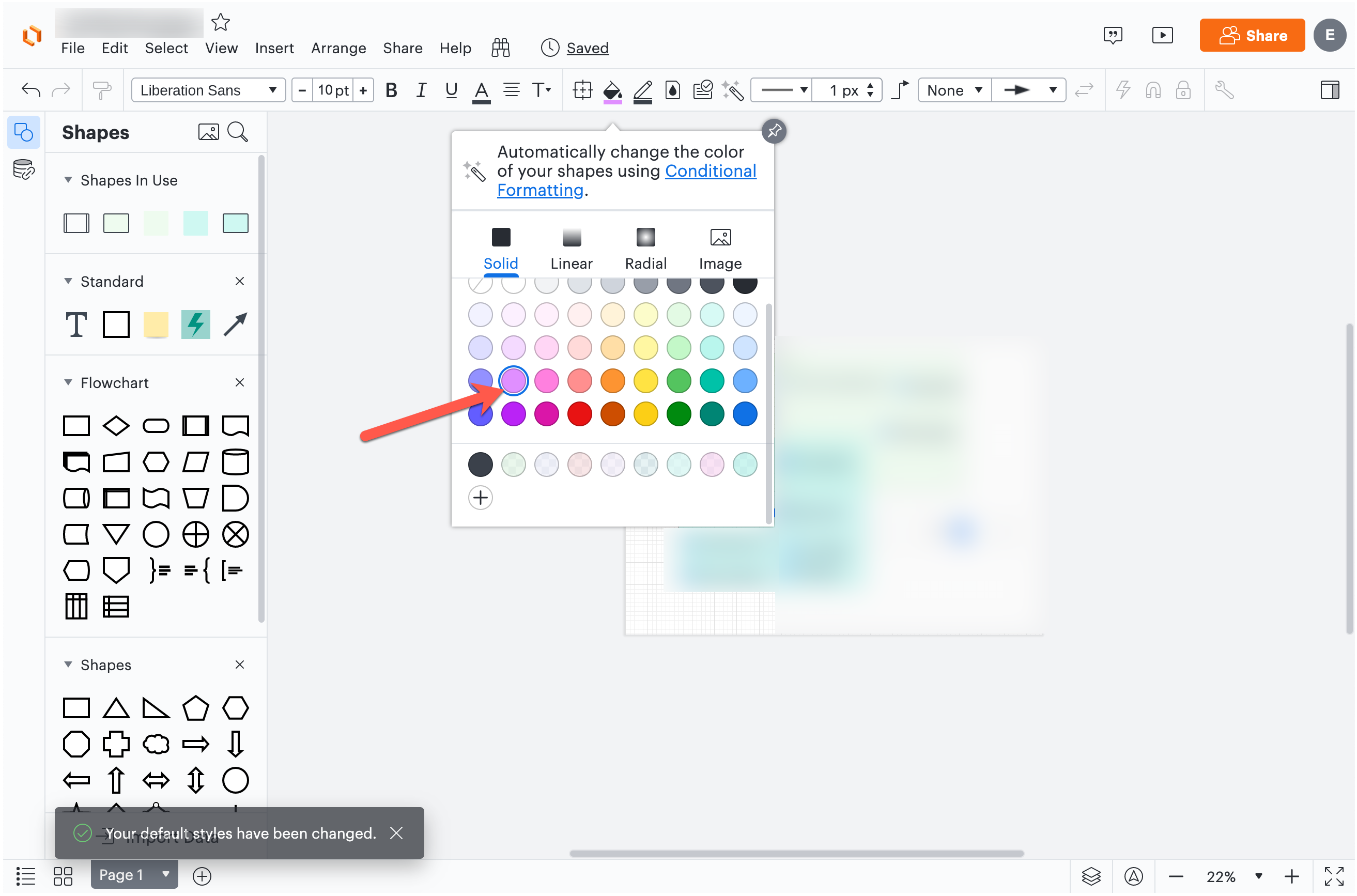
3. This then closes the colour picker popup: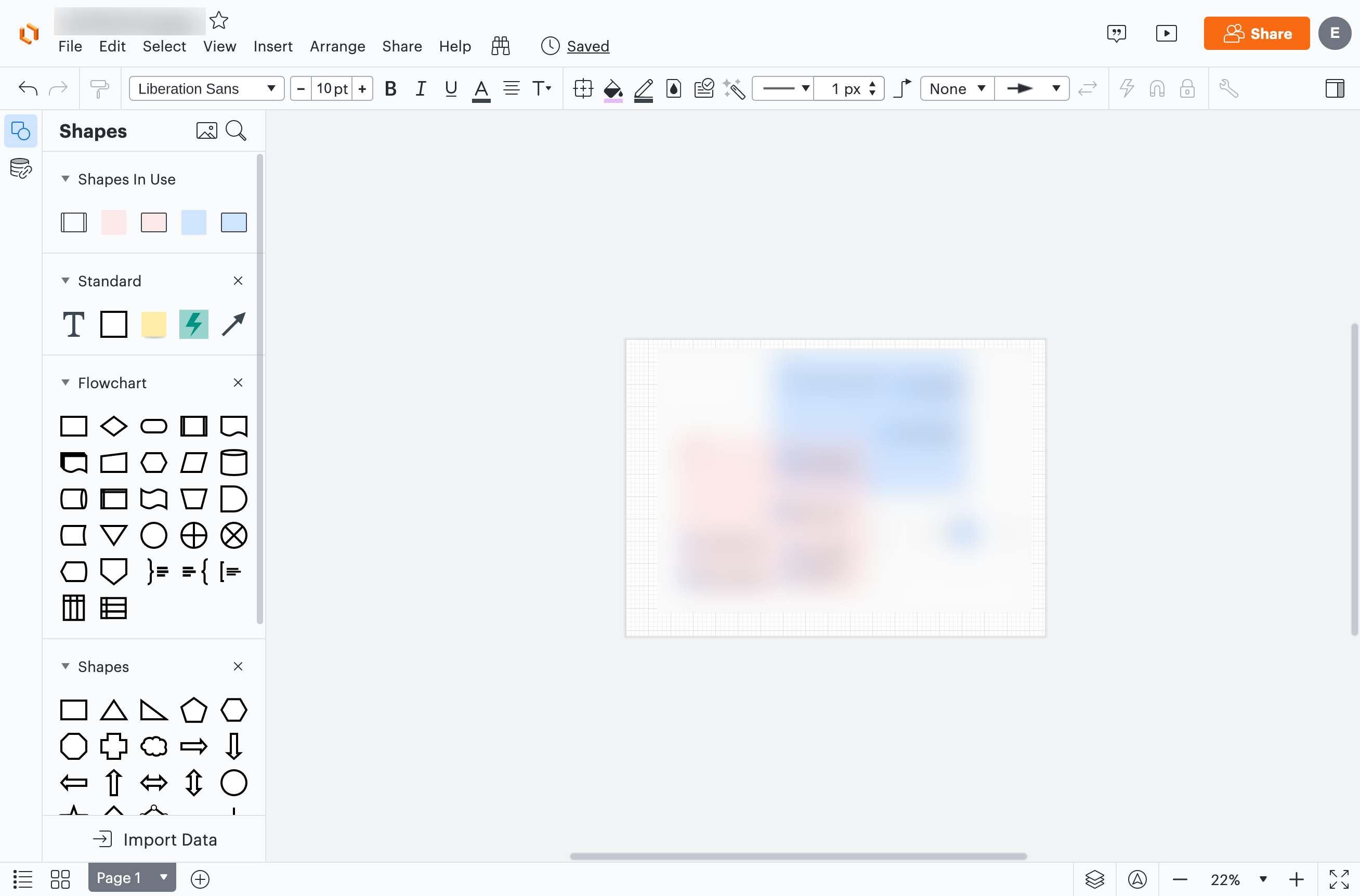
4. So I now need to open it... AGAIN: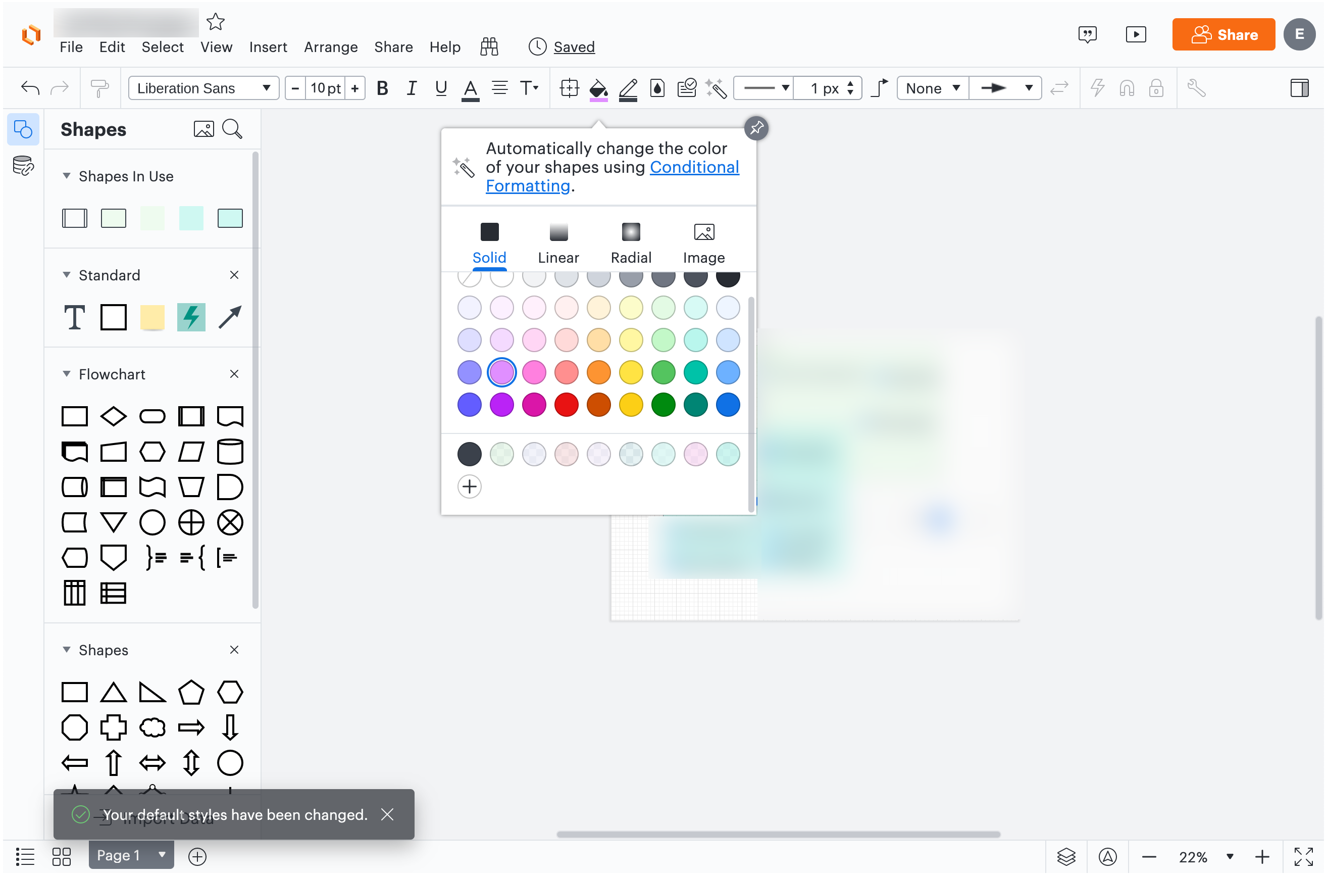
5. Then you have to click this tiny little "plus" button at the bottom of the picker to... I don't really know... "create a new colour"...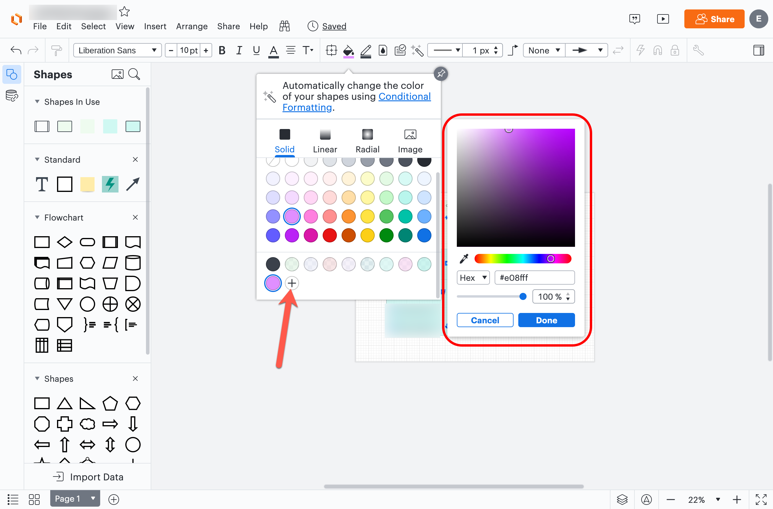
6. Then you have to adjust the transparency slider to what you want the new colour to be:
7. and THEN you have to click "Done" to save the new colour so you can use it...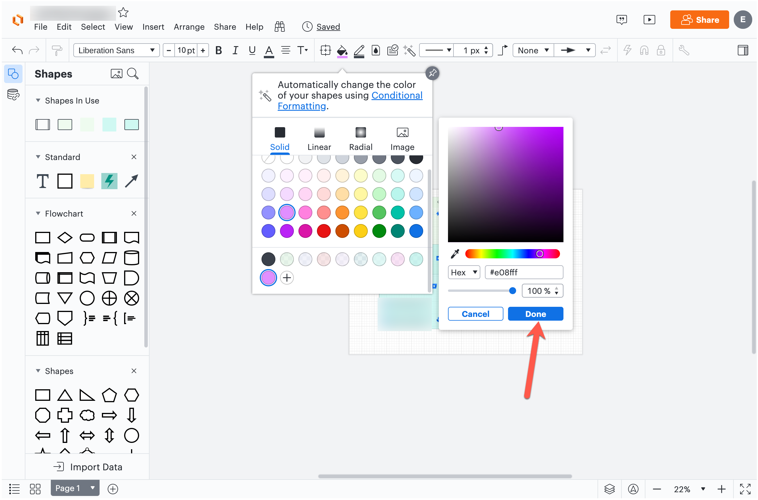
Don't get me wrong I know I'm making a big deal out of this I get it... but if there was an actual UX designer on the team that designed this flow they should be ashamed of this.
Also... in what reality is the ability to pick between "solid" "linear" or "radial" gradients of colour a higher priority UX feature than adding transparency? You hide transparency in a sub-menu and put all the gradient stuff upfront?
Oh and the cherry on top... between the colour picker popup and the new transparency customiser thingy they now cover around 1/3 of the screen real estate right in the middle... So half the time I can't see the shape I'm making transparent because it's stuck behind the damn popups: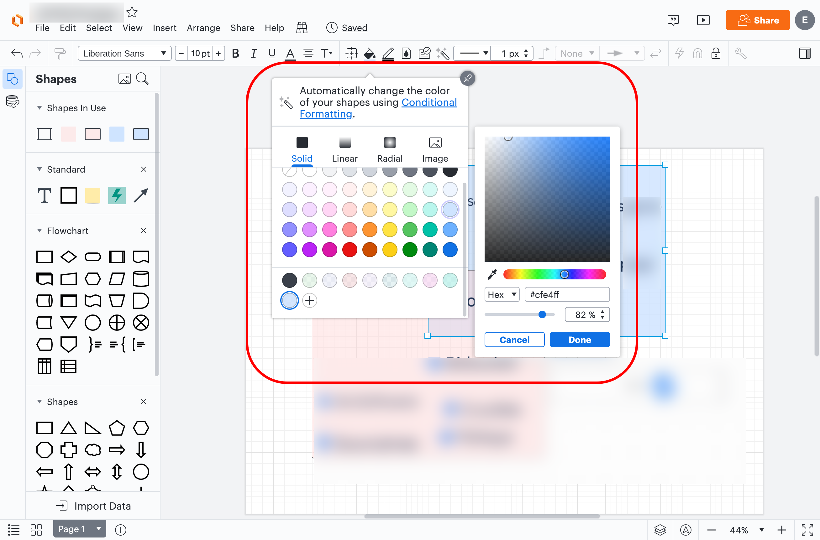
In my view the largest impact this has is for reworking or updating diagrams created before the color switch. If you'd like to maintain a consistent color scheme in an old diagram when trying to update it with new information requiring new colors your options are:
- choose colors manually to fit with the old color palette
- rework all colors to follow the new color palette & allow you to quickly choose colors from the new palette
I have a lot of visuals in LucidChart that I still maintain and this is the reason I was hoping to be able to swap the color palette to the old one.
Hi Sean
Thanks for taking the time to provide such detailed feedback on our new color picker and so sorry for the frustration this UI change caused you!
I have passed your remarks on to our product team and they will reach out to you shortly to delve into your feedback and better understand your use case.
The new palette doesn't include black (#000000). Forget about Lucid's color scheme what about people that need to create high contrast diagrams for accessibility? Or because their corporate colors include black? Absurd decision. Triumph of corporate hubris over customer needs.
I cannot find out how to make the colors stick either. I can add them but they disappear next time I want to use the palette. Worse still I cannot do that in a template.
Hi Spencer thanks for providing your thoughts on the new color picker. We truly appreciate your feedback on this! Our Product team decided to revert some of these changes and restore the version of the color picker which includes black and white. This should prevent the issue you described with custom colors not sticking but please don't hesitate to let us know if you continue to experience issues with this or if you have any further questions.
Reply
Create an account in the community
A Lucid account is required to interact with the community. You will be redirected to the Lucid app to create an account.
Log in to the community
A Lucid account is required to interact with the community. You will be redirected to the Lucid app to log in.
Login with SSO
Log in with Lucidor
Enter your E-mail address. We'll send you an e-mail with instructions to reset your password.