How do you insert a color code chart to show what the colors mean in the Org Chart?
Page 1 / 1
I am not certain if there is an easier way to do this but I would add a box at the bottom right corner (under my Chart). I'll then add smaller boxes fill it with the chart colors and add text labels to identify what the colors represent
Hi @hr d and @ria s thanks for posting in the community and starting this conversation! It sounds like the Diagram Keys feature may be useful for creating a colour code for your Org Chart and other diagrams. To do this you can drag the Diagram Key shape from the shape menu onto the cavas and edit the text as needed.
After this you can click the circles to select colours and click '+ add item' to add more rows to your key. 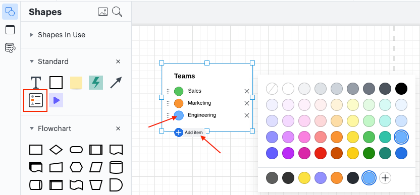
This can help you create a key for your Org Chart quickly and easily!
I hope this helps! Feel free to comment in this thread if you have any questions or create a new post if there's another topic you'd like to discuss!
I just had a look at the diagram key feature. This is a much easier method. Thank you
Reply
Create an account in the community
A Lucid account is required to interact with the community. You will be redirected to the Lucid app to create an account.
Log in to the community
A Lucid account is required to interact with the community. You will be redirected to the Lucid app to log in.
Login with SSO
Log in with Lucidor
Enter your E-mail address. We'll send you an e-mail with instructions to reset your password.