I have large spreadsheet where there are many many many rows of individual assets with their IP addresses and a column containing the results of a traceroute for each asset. I've copied an example of what the data looks like in this column for each row.
Is there a way that I can import this information into Lucidchart to have it create a diagram based on this information? I'm essentially asking if Lucidchart can create a network diagram based on traceroute results imported from Excel. Does anyone have an idea how I could do this? I have approximately 135K rows in a spreadsheet that I want to try to do this for but can't find something that does this for me.
I created a small test where I manually created a diagram for about 15 assets and then used the auto layout tool and it looks fantastic! Thing was I had to manually create each shape for every hop while also checking to make sure that I'm not creating a new shape for a hop that already exists. It's a bit of a nightmare to do at this scale and I'm hoping there's something better. Thanks!
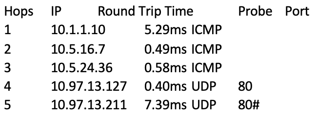
The data within the cell is tab delimited and the "#" denotes the end of data for the cell. If I need to normalize this and clean it up to remove the first line and what not I can do that too if it would help.