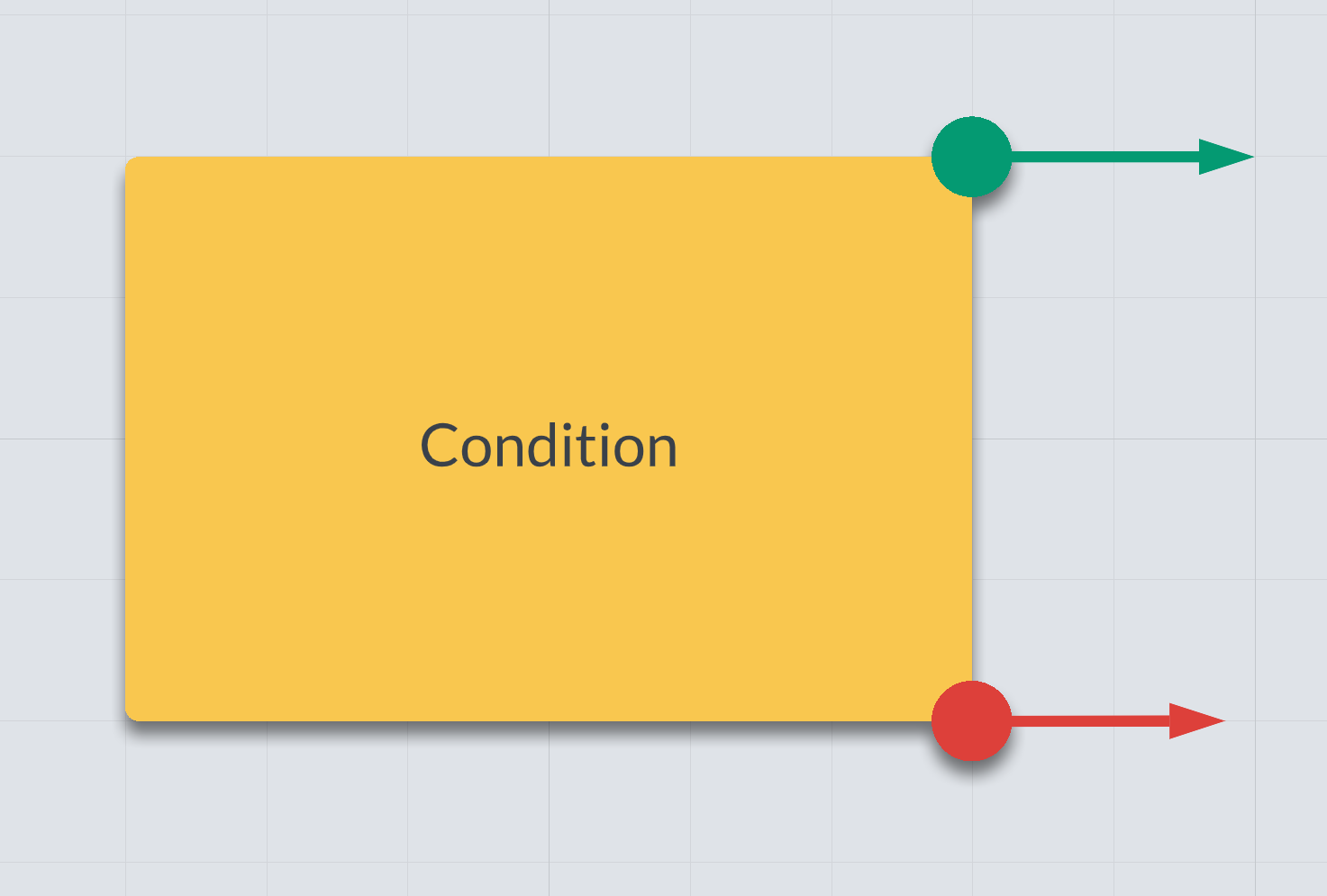
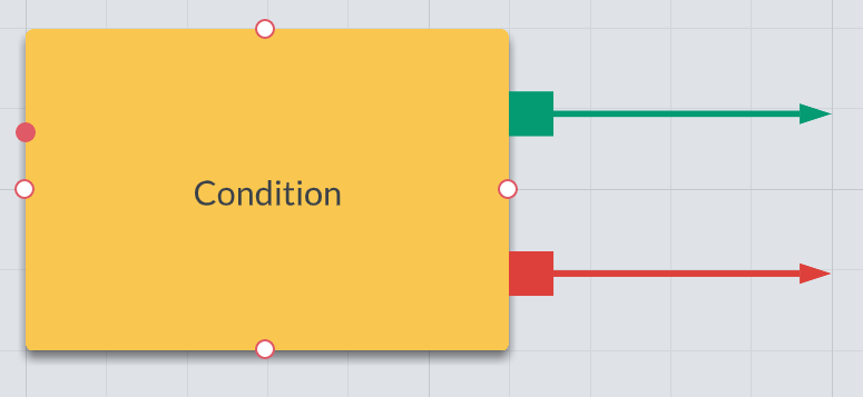
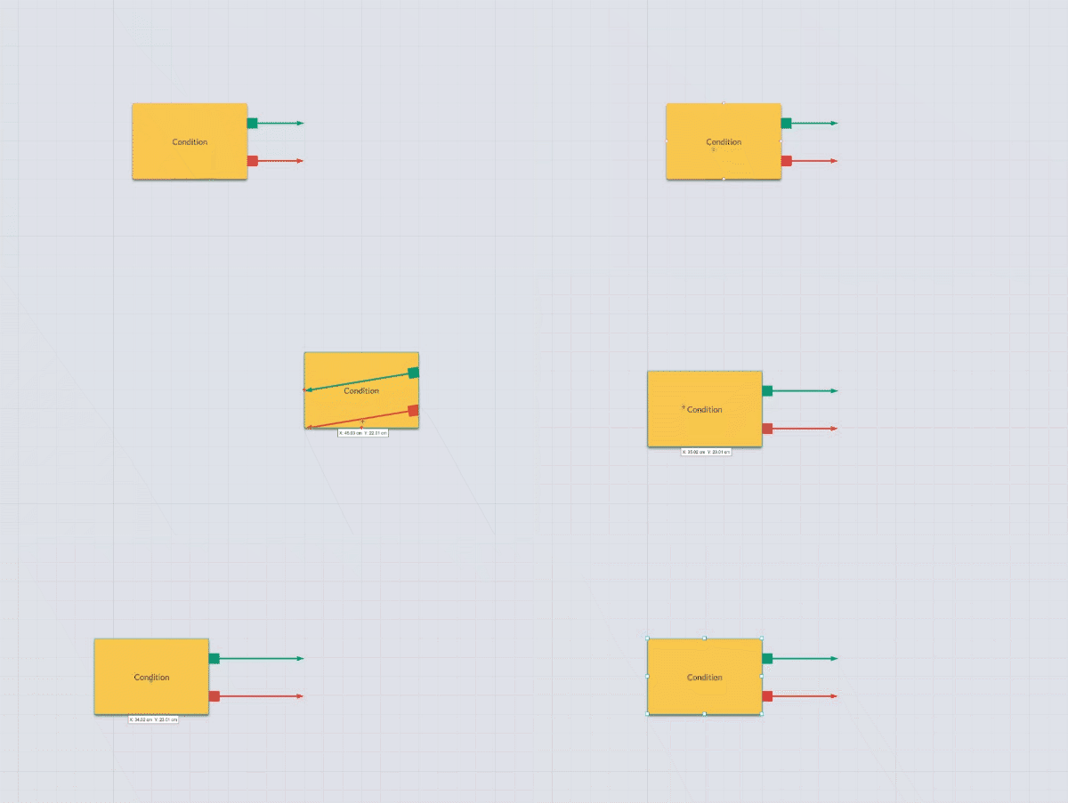
Hi there! I've created a number of custom shapes. One of them I'd like to be a condition node where we pass through a yes/no gate. I wanted to represent the yes/no connection points as green and red little nodes like this:


It works great... for the most part. The one annoying thing is that the green and red tabs aren't grouped with the yellow box so in order to select the whole object I have to drag a selection window around the entire thing. Quite annoying when I'm working with tons of these.


I know I can group these objects together but then it makes it a real pain to edit the text. I have to double-click the object to edit the group then double-click again to edit the text.


Anyone have ideas for a good solution here?


Cheers!

Hey Lucas


Thank you for posting in the Lucid Community! Aside from grouping which does take a few extra clicks you could try using conditional formatting. You can customize where the green and red tabs show up on the conditional shape and they would move with the shape without needing to be grouped. Here's a Lucid Help Desk article concerning conditional formatting that should help out along the way. 


Hope this helps--feel free to reach back out with any other questions or concerns. Cheers!


Hi Philip


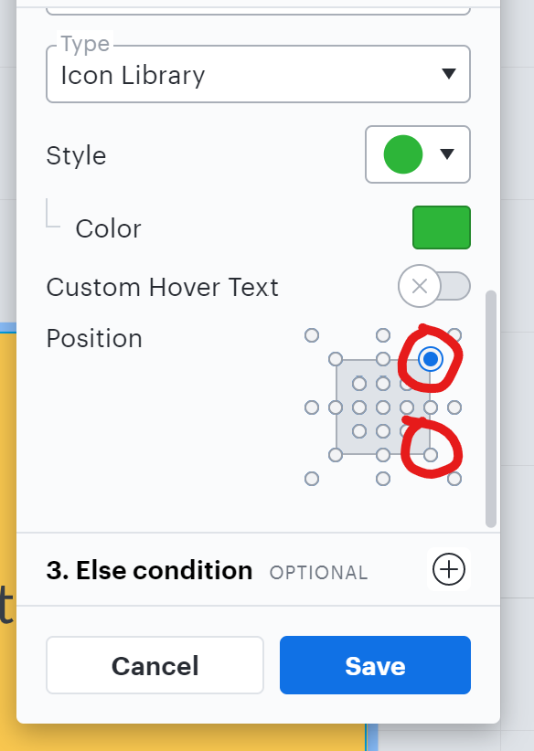
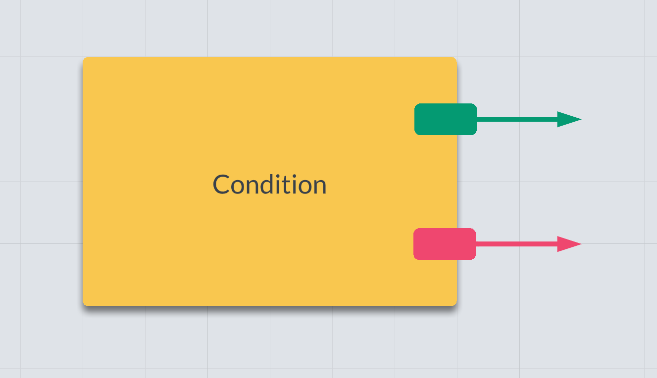
Thanks very much for the quick reply! I appreciate the idea about conditional formatting. I gave it a shot but I'm not sure that will work in this case either. Unless I'm missing something 1) I can't apply the red and green "tabs" because conditional formatting only allows applying a set of pre-selected icons that can't be edited 2) Even using the two closest icons I could find you still only have a limited number of options on where to place them (in this case in the corners of the square).


This is the result of my best shot--is that about as good as I could make it? Did I miss something on positioning or the types of icons that can be applied? Thanks again!


-Lucas


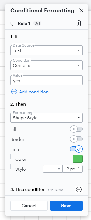
@lucas l Jumping in here! Instead of using the "icon" option for conditional formatting I'd recommend trying the "shape style" option! This will allow the conditional formatting tool to apply a specific style to your line rather than adding an icon shape. In my example below I've set my rule to identify lines containing the word "yes" then style them green then added a complementary rule for lines containing "no" to be red. 


This way simply by creating the lines (and choosing the larger dot line endpoint in the Endpoint menu in the toolbar at the top) I've created the following:


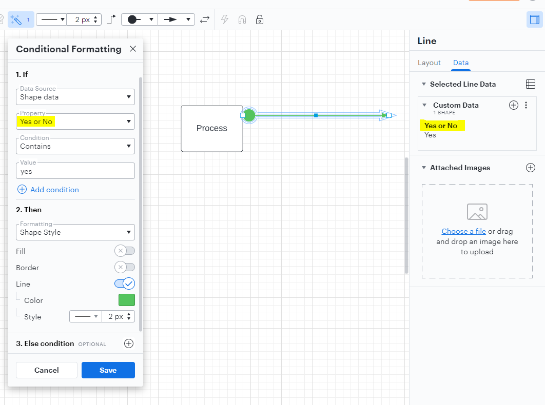
If you'd prefer to not have the "yes" and "no" text in your lines I'd suggest trying the "Shape Data" option for the "if" part of your conditional formatting rule. This would require to to create a custom data field for each line with some sort of identifiable property to distinguish whether it should be red or green - in my example below I've simply named this property "Yes or No" then assigned the value of that particular data field for my selected line as "Yes".


I hope this helps! Please continue this thread with any other questions we can help with. 


Hi Micah


I'm absolutely loving the community here! Y'all are so quick and responsive and helpful. Thank you!


This is another great suggestion. In thinking about it I wonder why indeed there needs to be conditional formatting at all? I created the following object just by adding a red and green line with squares as the starting points for each line:


This actually looks great for our purposes. I like it!


But then I'm back to my original problem which is that this custom object doesn't move around as a "group." In other words if I click and drag on the yellow box the endpoints of my lines will stay put.


So I need to drag a selection box around the whole object to get it to move as a unit which is exactly what I was trying to avoid in the first place.


Perhaps I've hit the limitation here? Thanks y'all so much for your insight!


-Lucas


Hi @lucas l thanks for giving those suggestions a shot. I'm really glad to hear that you like the option of using a red and green line with square endpoints! Unfortunately the best way to move your shape around the canvas will be to either draw a selection box over it or group the shapes together. 

However we're always looking for ways to improve Lucidchart and your feedback is the best way for us to do that. Would you mind adding your idea to our feature request form? Ideas submitted to this form are passed on to the product development team for their consideration.
 
Thanks so much for your help and patience with this! Please feel free to continue this thread if you have any questions or create another post if you have a different topic you'd like to discuss - we really appreciate it! 


Hi Leianne


Feature request submitted! Basically what I'd like is for users to have the same power that the LucidChart team has to create custom shapes. There are all kinds of amazing shapes in the shape library which include multiple shapes stuck together multiple text fields custom locations for arrow-attachment nodes--but the user isn't able to create shapes in the same way. I'd like to be able to create custom shapes as complex as the LucidChart developers can--that's my dream!


Is there any way to see what features the devs have accepted and are working on? Any way to track progress? I'm the narrative designer for a game studio and we're using LucidCharts for our next project and this feature would *really* help our pipeline.


My thanks!


Lucas


Hi @lucas l thanks for submitting a feature request and sharing your Lucid dream feature this is such a great idea! I can definitely see how the option to create complex custom shapes would be useful for a wide range of users. While this is not the same feature it is possible to import SVG files and Visio Stencils as custom shapes in Lucidchart which may help you add more shapes you'd like to use for your next project!

Regarding your question about feature requests we unfortunately do not currently have a way to view / follow the status of request submissions. However we will update community threads if the requested feature has been implemented and you should be able to see the update if you've made / commented on a relevant post!

If you're interested in checking out some of the most recent topics and feature requests made by users in the Community I recommend checking out our monthly Community News posts - here's the July edition! These news posts include a summary and highlight of recent important conversations and popular feature requests. Hopefully this can help you and other users discover more topics or features you've never seen before! In case you're interested you can see previous months' editions here as well. 

Thanks again for your request and feel free to let us know if you have any questions! :)


Reply