You’ve built a Lucidspark board, or Lucidchart document-- nice work! Now it’s time to share it, but you’re second guessing the visual elements. Do these colors work? Would people want to engage with this? The good news is, you don’t need to be a designer to make something that “WOWs” your audience. Before you hit that share button, here are four tips and tricks to apply to your Lucid document to make your audience admire and explore it:
Use the eye-dropper tool to add color from color palettes or images Whether you’re following your company’s branding guidelines, or want to play more with color, this trick will work for you. Add an image of a color palette from an online search to your canvas. Then, highlight the shape(s) you want to add a specific color to, and from the “fill color” option, click +. This will give you the eye-dropper tool. Take that eye-dropper and click on the color you want to add to the highlighted shape(s).
*Using color can get really tricky. We go deeper into best practices using color in our Designing in the Lucid Suitecourse.
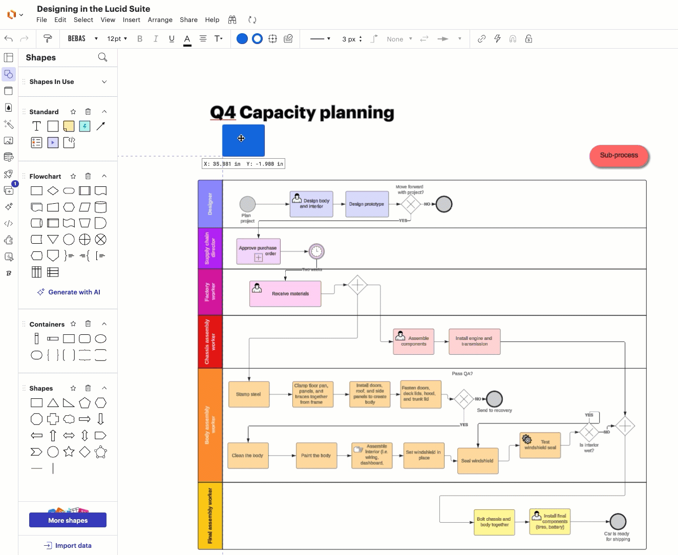
Layer shapes to titles to add pops of color Add colored shapes to your main titles to distinguish it from the rest of your text and to add pops of color. Add a shape to the canvas on top of the text title and adjust the length of it to fit the length of the title. Fill the shape in with the color you want (we recommend choosing a lighter shade but you can use the opacity feature to lighten a darker color) and then arrange the text so that it sits on top of the shape.
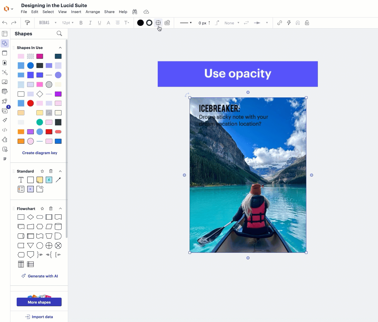
Use opacity to turn images into a background This trick adds interest to your document without detracting from the text you place over it. Add an image to your document and with that image highlighted, go to “shape options” in Lucidchart. Drag the shape opacity to the left. How far do you lower it? You’ll want to lower it to the degree you can see the text that you want to layer over it.
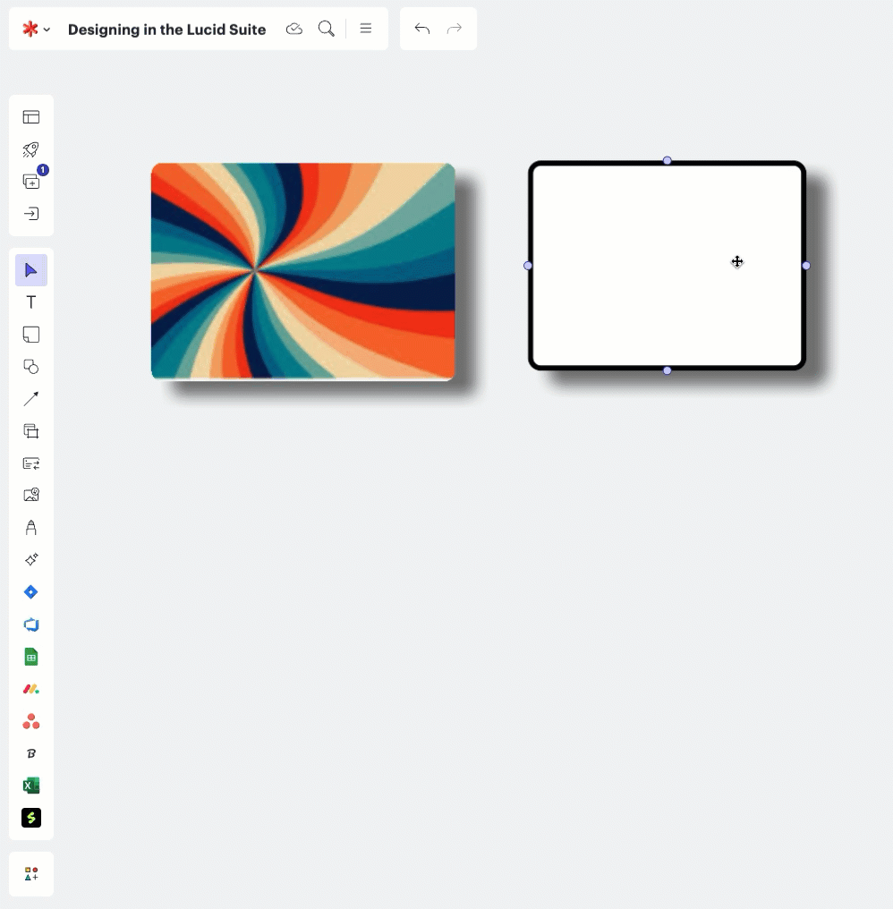
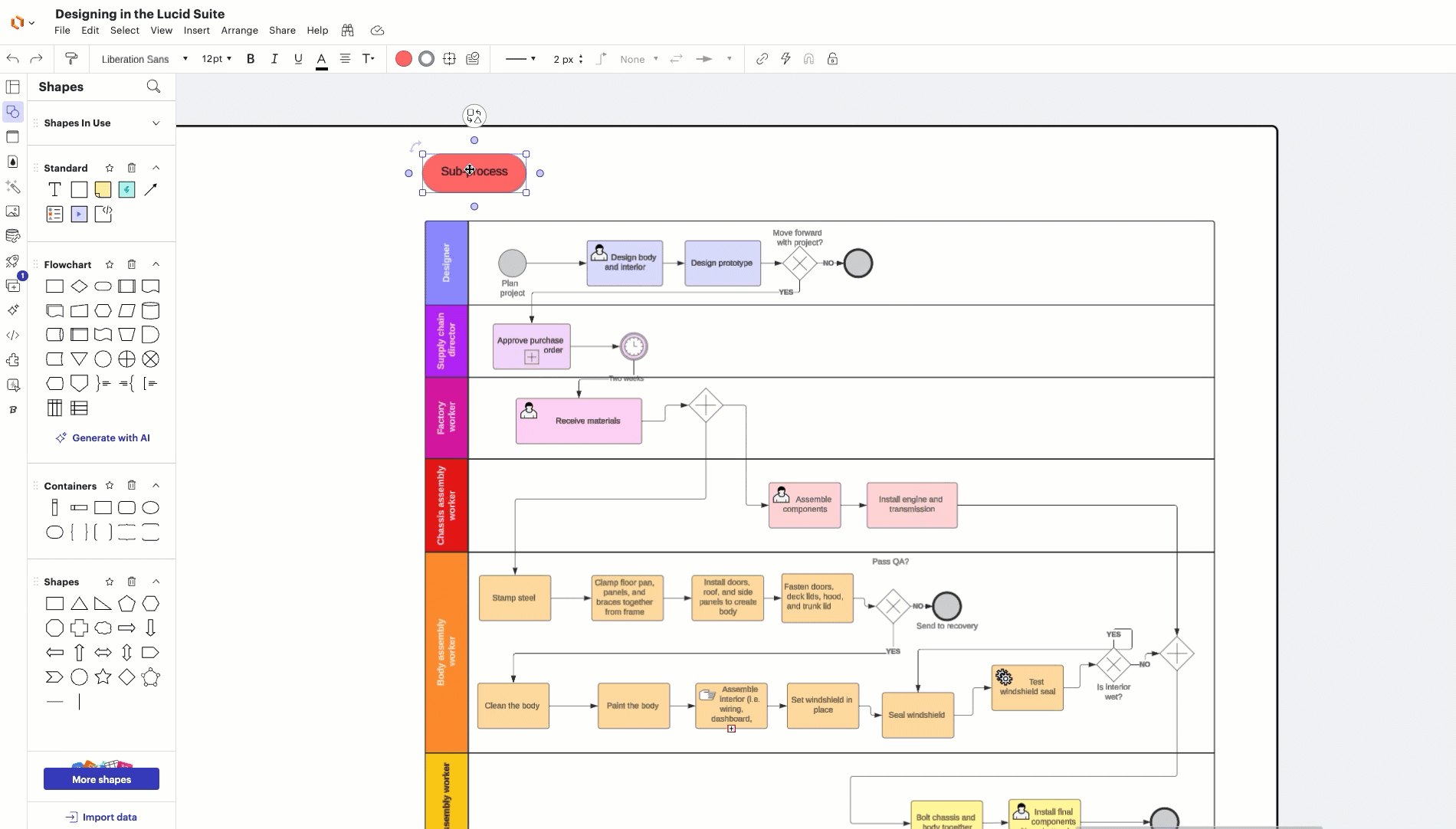
Add drop shadows to make buttons If you want to hint at your user to interact with the document, add a drop shadow to a shape that has an action attached to it to make it look like a button.Select a shape that has an action attached to it and from the “shape options” icon in Lucidchart, click “shadow” and then “on.”
If you want more tips and best practices for designing Lucid documents that are eye-catching and communicate your vision effectively, check out our Designing in the Lucid Suitecourse!
These tips are SO great, @Torrie F! I think my favorite is the simple color block behind the title. It makes more of a difference than you’d think - I’m always more excited to get to work in a board when it looks nice from the very beginning! 💥
I LOVE these @Torrie F ! I am a big fan of the drop shadow on a button. I always take it a step further and change the text to look like a hyperlink with some blue text and an underline to really drive the point home that its a button!
@Cal Martin Ohhh good call! I really like that added touch because that is what we tend to be familiar with when interacting with links online. Little touches like that will help collaborators know how to engage with the document more quickly. LOVE IT!
A Lucid or airfocus account is required to interact with the Community, and your participation is subject to the
Supplemental Lucid Community Terms.
You may not participate in the Community if you are under 18. You will be redirected to the Lucid or airfocus app to log in.
A Lucid or airfocus account is required to interact with the Community, and your participation is subject to the
Supplemental Lucid Community Terms.
You may not participate in the Community if you are under 18. You will be redirected to the Lucid or airfocus app to log in.