
Once you finish building your perfect Lucidchart document (you’ve visualized processes added custom shapes and even linked data) there are two final steps before you’re ready to showcase your document to others:
- Make your document beautiful.
- Present your document directly on Lucidchart with Presentation Mode.
Read on for a detailed guide on how to make your diagram aesthetically pleasing so that it is ready to be shared with the world.
Design matters. See for yourself: which of these flowcharts would you prefer to follow?
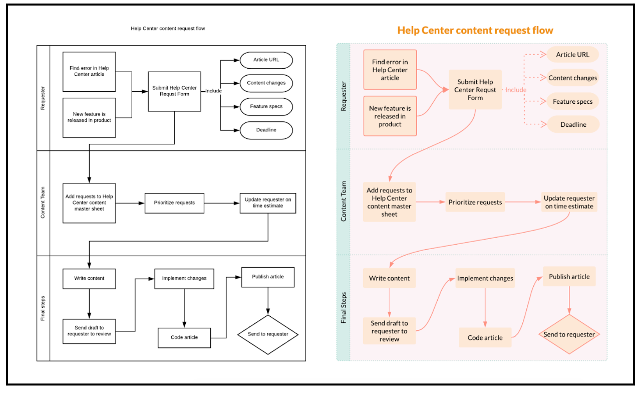
The one on the right immediately catches and keeps my attention – what about you?
Both diagrams contain the same information but the second diagram uses color and other styling features to make its content attractive and easy to follow. Win win!
We’ve collected a few sneaky tricks to help you transform your document from a black and white compilation of shapes to an intelligently designed aesthetically pleasing presentation. Check them out!
1.) Color color and more color. The most evident difference between these diagrams is the addition of color. Color can really make or break your document – a lack of color makes your document boring while too much color can overstimulate your audience. There are also endless ways to incorporate color on your document. Whether you’re using conditional formatting or replicating a Van Gogh painting our color palette tool makes finding the perfect colors fast and easy. As shown in the image below the color palette tool allows you to import images and detect the exact RGB color code for that shade.
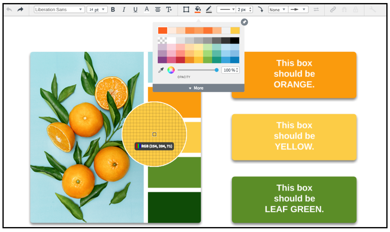
Simply find an image online with a color scheme you like drag-and-drop the image to your Lucidchart canvas select the shape or line you’d like to add color to and click the icon in your color picker to identify the RGB color code from the image. It’s best to choose just three or four colors per document to avoid color overload. If your document still looks too colorful for your taste try adjusting the color opacity to reduce color contrast.
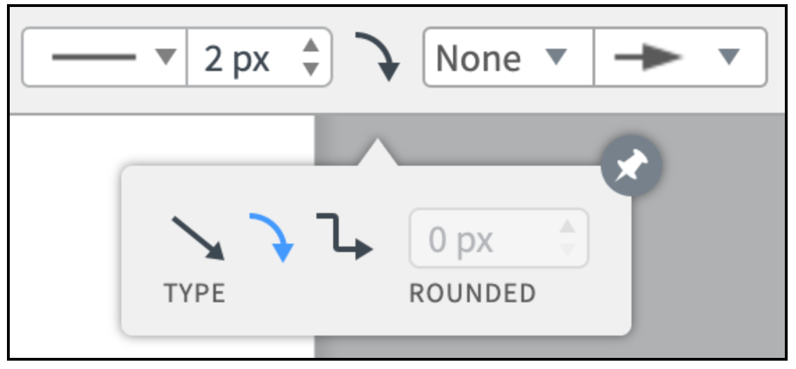
2.) Lines are your friends. Lots of lines are inevitable when creating a Lucidchart diagram and that’s especially true for complex process diagrams. Sometimes it might seem like the lines in your diagram add more chaos than clarity. However lines can help you if you let them. Simple changes to line styling make a significant difference. Take another look at the line styles in the “before-and-after” diagrams above. The default lines in the “before” diagram overlap and can be easily confused with the swim lane lines. However in the “after” diagram the curved line style and added color streamline the flow from one shape to the next. To make your lines curved or apply another stylistic change select the lines while holding down SHIFT on your keyboard. Then select your preferred line preferences (width type roundness style and end arrows) in the properties bar at the top of your canvas.
Learn more: For more information on line formatting check out our Work with lines in Lucidchart article.
3.) Fun with fonts. It can be easy to overlook the importance of fonts when aesthetics are not your priority. However fonts are a great way to give your presentation personality and help you tell your story. Are you presenting a pitch to a new prospect? Impress their marketing team by importing a custom font to keep your presentation 100% on-brand. You can also add styling to text to emphasize key phrases or takeaways and drive your audience’s attention in the direction you choose. Deliberate design keeps you in control.
4.) Break it down into parts Sometimes a document can become so large or complex that when it comes to adding styling you do not know where to begin.
Luckily Lucidchart offers ways to break down your haunting document into smaller more digestible parts.
- Layers. If your document seems too large to style consider adding layers. Lucidchart layers allow you to show or hide certain contents of your diagram so you only see the information you need when you really need it.
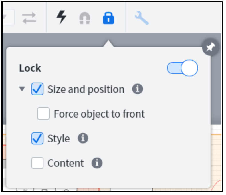
- Groups. Another way to break your document down into simpler structural components is by dividing the shapes on your document into “groups." Simply select the shapes you want in the group then use the Command-G keyboard shortcut or right-click > “Group.” You can then move or add style to multiple shapes at a time. Once you’ve added the desired style to a shape or group lock the shape(s) to prevent future modifications as shown below.
5.) Get creative! Lucidchart’s strength lies in its flexibility so don’t be afraid to try new things. Do you usually add colored borders to your shapes? Try removing the border and add a shadow instead!
Are you tired of the standard white background?
Make it yellow in your page and document settings. Want to create new unique shapes? Import a custom shape library! Did you make a huge mistake? Don’t worry! You can revert to previous versions of your document with Revision History!