Idea

System is becoming unusable with new clunky aides

Related products:Lucidchart
  • May 28, 2024
  • 3 replies
  • 52 views

Forum|alt.badge.img+1

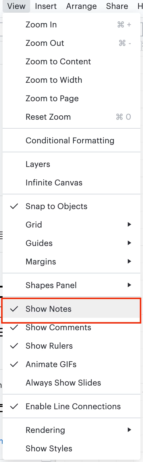
Recent ishNotes box changes were bad enough now the following as changed and still a huge frustration.  Now we have this which is literally becoming such that I personally do not want to use your tool anymore.

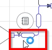
How are users supposed to efficiently navigate this when trying to move and fix items??

I have a Yes in the line


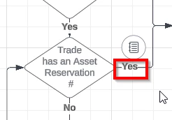
I click on the box to shape to show where I am in the diagram. the Yes disappears!

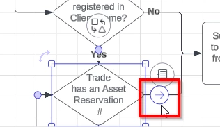
I go to edit the yes to move it

I throw down my toys and want to never use Lucid again!

The new notes box consuming real estate and making me reshape small boxes and lines to edit them was bad enough now this has been done..these unfriendly changes have to stop! or we need to have the option to use the system as it was before.  

This is also not an Idea it’s a Complaint.  Which you can make an idea to fix hopefully or explain why these changes are implemented without consideration for usability


Comments

Micah
Forum|alt.badge.img+20
  • Lucid community team
  • May 29, 2024

Hi @SarahO, thanks for taking the time to leave this feedback, and apologies for the frustration! I understand how this can make editing more difficult in the scenario you’ve shown above, and this will be very helpful for our product team when prioritizing improvements to Lucidchart. In the meantime, I did want to share one workaround with you, which is to hide the note icons in your document for easier editing. You can do this by navigating to the View menu and deselecting “Show notes.”


I hope this is helpful!


Forum|alt.badge.img+1
  • Author
  • May 31, 2024

Re Notes: Suggesting we remove notes from view is unlikely to benefit us if we have notes and now don’t know we have notes? Just a reminder this is a reference back to a previous feedback item i made which was to not have them take up so much real estate. The new circle around the note back then and the positioning of it is the problem there.

This post was about the other changes - now adding to the challenges / frustrations.  So that is around the fact that your line connectors now make it frustratingly fussing to change the word yes  when the oblong thing plonks itself in the middle of the word. The oblong blobs seems to offer not no identifiable benefit when put up against the loss of efficiency that it has introduced. What is the reasoning behind all these clumsy obnoxious like adds and can we get rid of those too?
Then the arrow pops up large, resizes randomly if don't have it perfectly positioned covers up and blocks the word on the connector line too. So when walking through a flow from box to box with someone now we can’t see the words on the lines.   personally, and I know my colleagues have mentioned it too, it is not impressing anyone.

Why is the system fussing with silly things like this that are hindering not enhancing vs improving things like find replace and not replacing something in every tab, and just where one is or gosh, i could probably list 10 things if you got me going that are much more value add than now having things hide and cover up what we are working on


Micah
Forum|alt.badge.img+20
  • Lucid community team
  • May 31, 2024

@SarahO Thanks for this comment - we take your feedback on this very seriously, and I apologize for the frustration this is causing. Your thoughts are really insightful, and I’ve shared this with our development team so they can utilize it when making improvements to this experience.