Stop assisted layout from shrinking frames and containers
Hello.
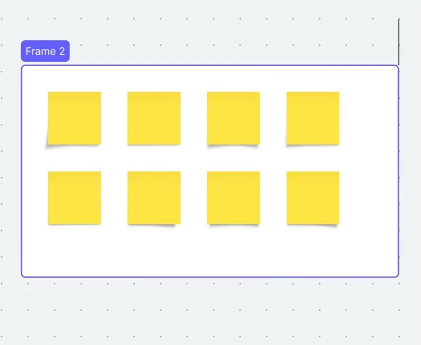
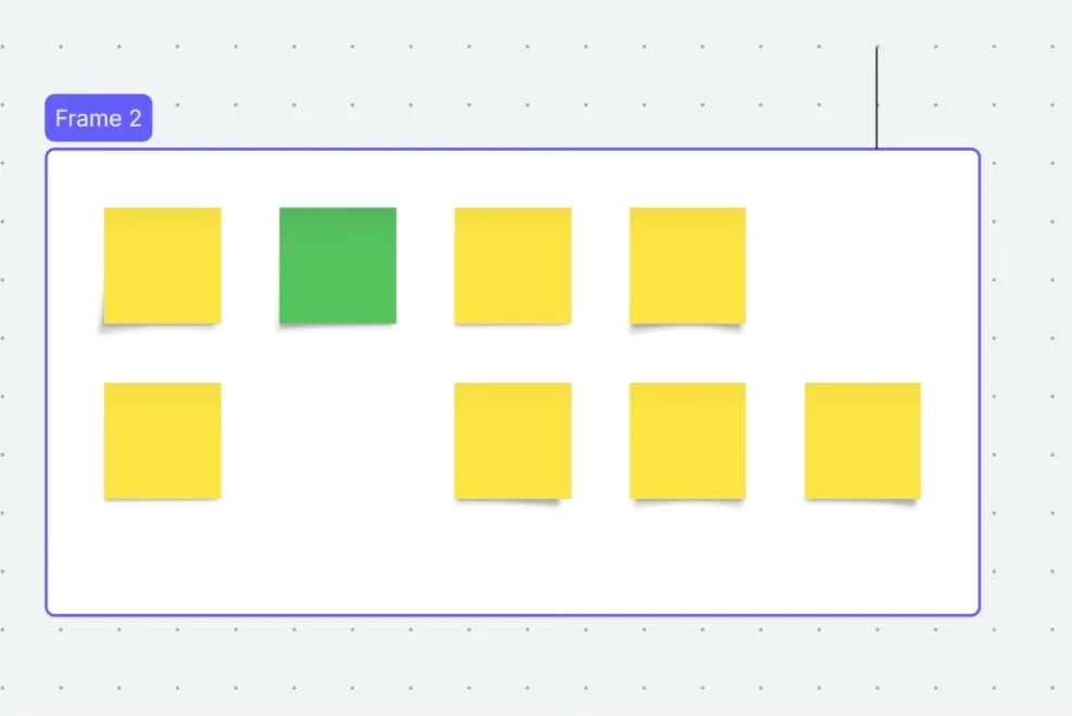
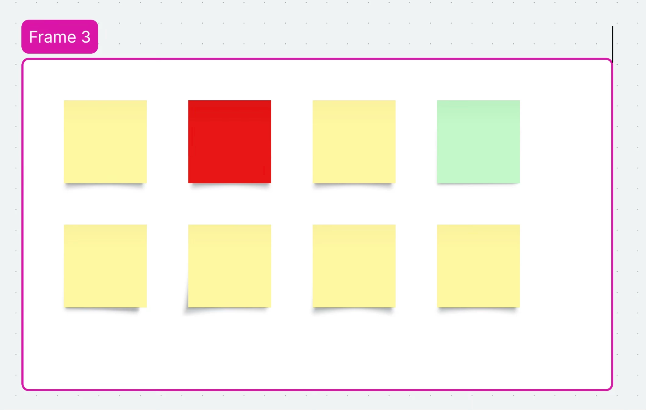
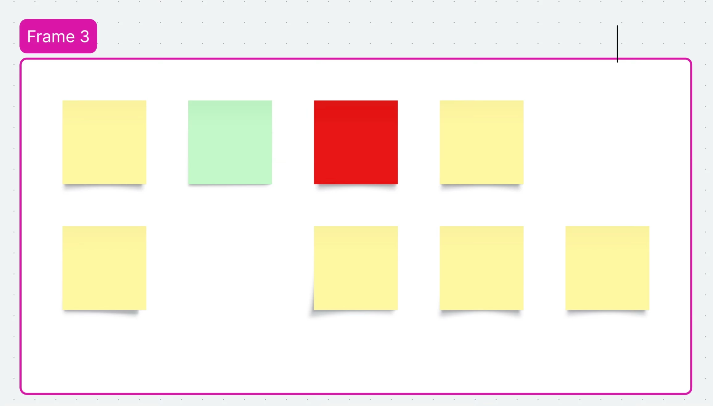
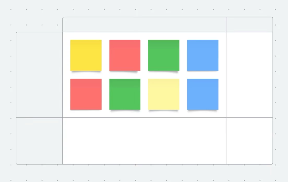
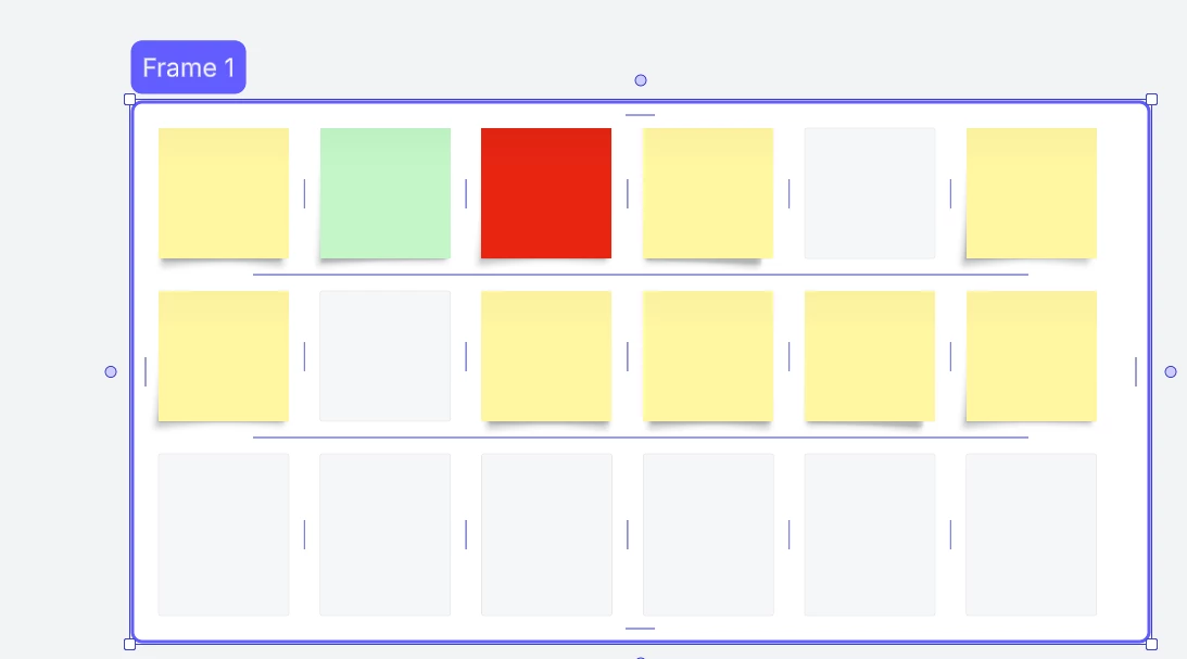
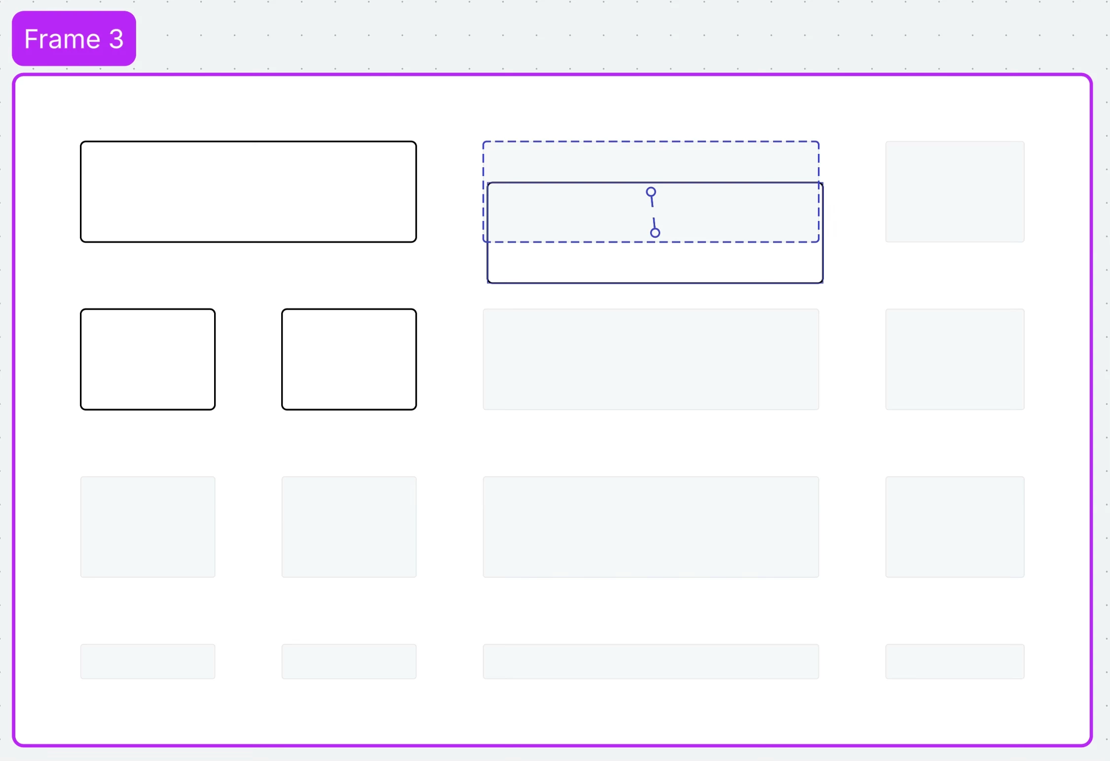
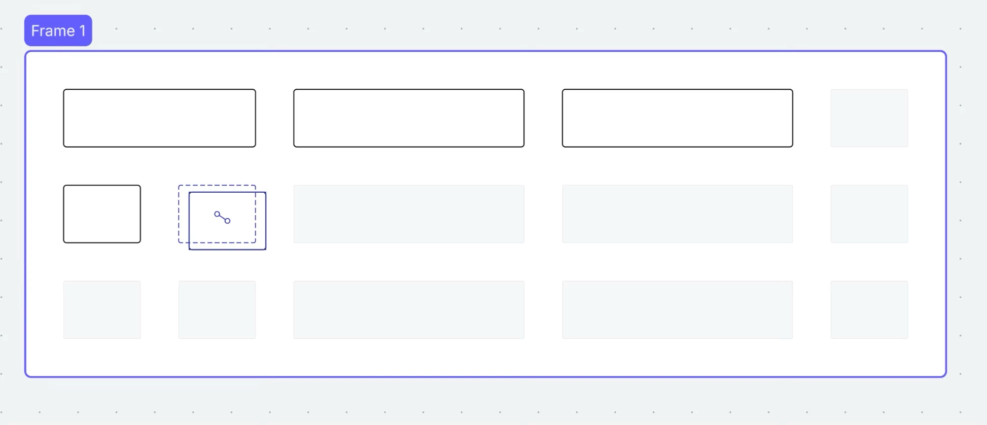
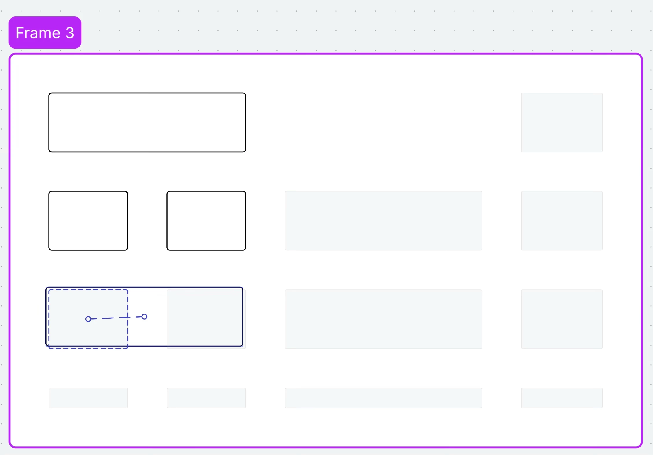
When we add a frame to a board it has a default aspect ratio. When we add a container to a board it has a default aspect ratio. When we turn on the assisted layout for both of them and then add a single sticky note they both shrink/collapse. If we choose a custom aspect ratio for the frame and adjust the border of the container we lose that work with a single sticky note. 
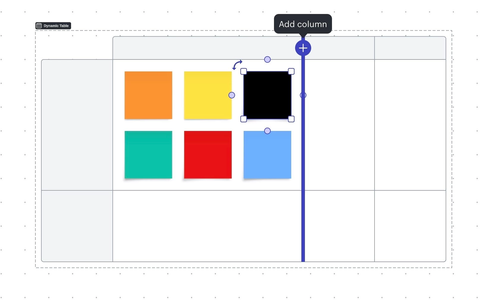
The assisted layout should allow users to rearrange sticky notes and shapes within a frame and container without affecting its aspect ratio. This is useful when we want to use frames and/or containers as kanban columns and/or swimlanes and we picked a particular size to accommodate our wip limit. I tried to lock a frame and/or container and still use the assisted layout but it doesn’t work. Locking a frame and/or container could resolve the issue if we could lock them while continuing to use the assisted layout. That way they can stop expanding and overlapping other board objects in the vicinity. Having a frame and/or container magically expand to compensate for additional shapes and sticky notes is useful when the user is control of when its on/off. 
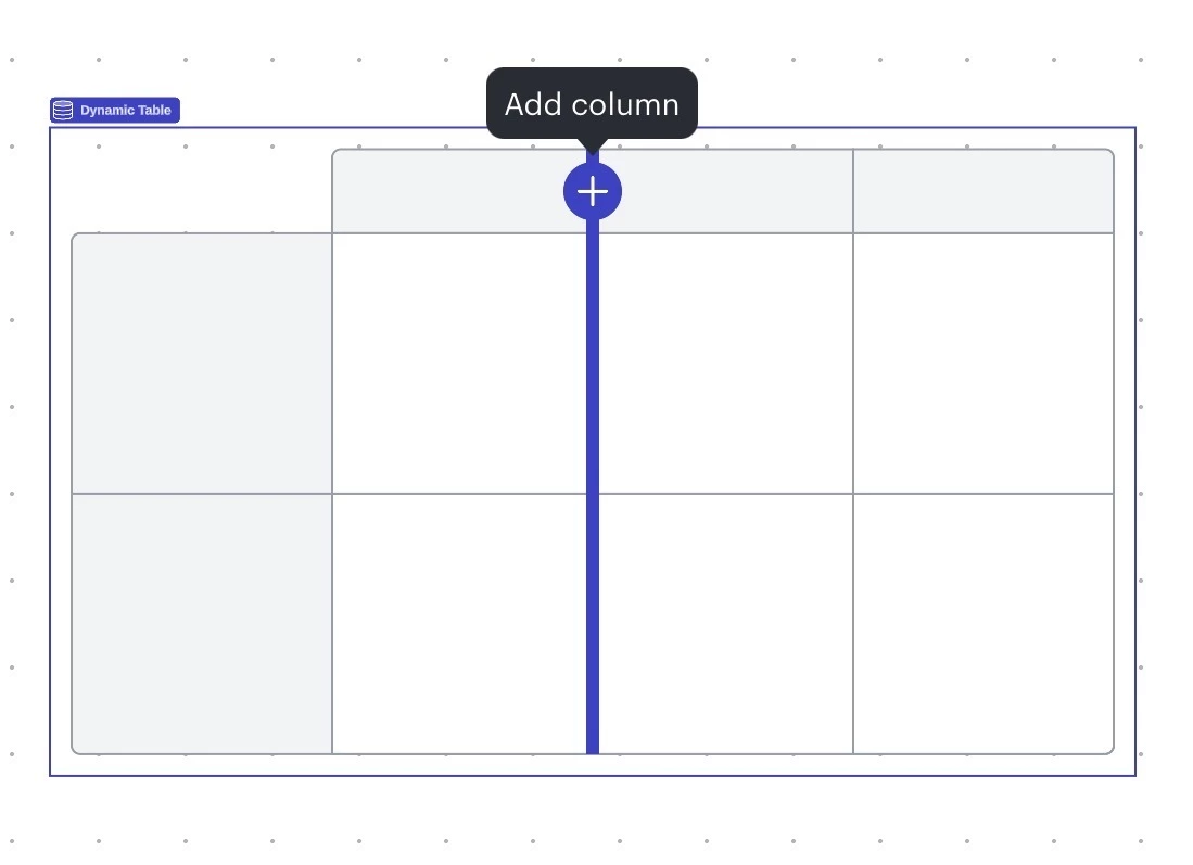
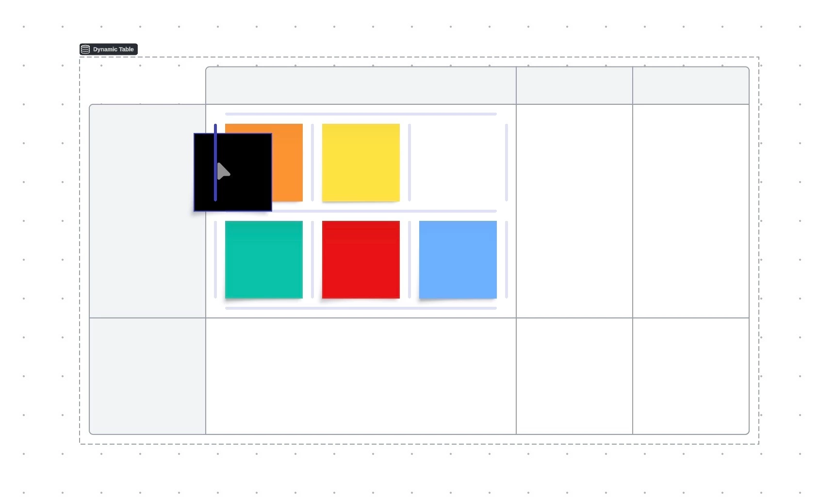
In order to resolve frames and/or containers from overlapping each other when assisted layout is turn on what if they stopped expanding when they run into a border or even have the ability to move other objects farther away to compensate for the additional space. Thank you for your time. Bye.
Page 1 / 1
Hi @patrickpereira1988, thanks for this feedback! We encourage anyone else who’s interested in this to upvote this post and share any additional details about your use case or what you’d like to see in this experience. For more information about how we manage feedback in this community, please take a look at this post:
Hi Patrick, thanks for the feedback! I’m on the team that is working on assisted layout. We’re currently experimenting with ways to make it possible to resize assisted layout frames and containers—hopefully in a way that better meets your needs. Would you be interested in participating in a user research call to try out this updated assisted layout behavior and let us know what you think?
Hi, Patrick. I’m on the same team with @Houston T and we just released a number of improvements to assisted layout last week. One improvement in particular is “manual mode”. This allows you to define the footprint of your container and place content wherever you please. The container will not shrink to fit content in this mode.
We’ve made manual mode the default experience when you turn on assisted layout for a container. Let us know if you have any other requests! We’re very interested in making this feature as good as it can possibly be!
Thank you team for the hard work introducing these improvements to the assisted layout feature.
Feedback.
When it comes to the manual option we should be able to pick the rows and columns for the grid functionality either with a new number picker or the current method of manually dragging the borders to make adjustments. After that it should stay fixed in that position. Having a manual option that doesn’t throw off the users chosen aspect ratio by shrinking but throws off the aspect ratio by expanding defeats the point. We should by able to use the grid layout functionality inside the frame or container without it expanding or collapsing. These two functionalities should be able to work independently of one another. Another reason for this is when we pick the perfect aspect ratio and the perfect row spacing for the columns and rows and stretched sticky notes horizontally to fit across two columns all it takes is one wrong move and everything is thrown off and you have to go backwards to undo it so everything is perfect again. I tried locking the frame or container and then using a sticky note quick tool off to the side but that doesn’t work because locking the frame and container turns off the grid functionality.
Thank you for your time. Bye.
One wrong move could mean you accidentally move a sticky note between two other sticky notes and now the frame expands. The grid of squares is there but so is the line between them when moving a sticky note around. Another wrong move could mean you move a sticky note and accidentally drag the side widening it- this will expand the frame as well. There is the span cell option but we can still manually drag on the sides and corners of a sticky note. This is what causes the problem. Widening the sides or corners of a sticky note will also change the grey placeholders inside the frame or container from square to rectangle. If you just using the span cells option the square placeholders stay intact. But all it takes is one accident.
I chose 16:9 aspect ratio for a frame. Assisted layout is turned on. I move the sticky note on the top row that is on the far right to between the first and second one. The indicator line appears. The assumption is the sticky note would take the second position and the current second and third sticky note would then move down and take the third and fourth spot. But instead the frame extends beyond the black divider line I added while messing up the bottom row of sticky notes that I didn’t touch. Is this a bug?
Hi @patrickpereira1988, thank you for following up! It seems like I was not able to reproduce the behaviour you are experiencing.
Would you mind providing the following information in order for me to have a better understanding of the issue?:
A screenshot of the assisted layout settings for this specific frame
A detailed description of the steps taken leading up to the issue
Thanks for your help and patience!
I am using a MacBook Pro. I am using the web app in Apple Safari. I am using Lucidspark. Zoom level 100% I add a frame to the board. I change the aspect ratio from Custom to 16:9 I click on Assisted Layout in the bottom right corner of the frame. Manual sizing is chosen. I add a banana colored sticky note to the far left side on the top row of the frame. I press Tab and duplicate three more sticky notes. I add a banana colored sticky note to the far left side on the bottom row of the frame. I press Tab and duplicate three more sticky notes. Eight banana colored sticky notes are in the frame. I take a vertical divider and align it to the top right corner of the frame so its sticking up. I take the far right sticky note on the top row of the frame and change it from banana colored to pistachio. I take the second stick note on the top row and change it to red. I take the pistachio colored sticky note and move it over the red sticky note. This move will have the two sticky notes swap places. I put everything back in its original place. Banana. Red. Banana. Pistachio. I take the pistachio colored sticky note and move it between the first banana colored sticky note and the red one. An indicator line appears. This is where the issue occurs. The pistachio colored sticky note now takes the second spot. The red one takes the third spot and the other banana colored sticky note takes the last spot. This move affects the bottom row for some reason creating an empty spot in the second spot plus extending the right side of the frame beyond the vertical divider.
Before After
The indicator line allows you to move a sticky note between two other sticky notes. But the rule on the board is that a sticky note can only adopt the space of a grey placeholder. So logically when you have four sticky notes and you want to move number 4 at the far right end between number 1 and number 2 that number 4 sticky note should take the position of number 2 and number 2 becomes number 3 and number 3 becomes number 4. The other sticky notes should technically move down the line and take up the other positions. But it creates a new spot and the fourth spot is now empty. It also creates an empty spot in position 2 on the bottom row.
This issue doesn’t exist in the dynamic table. You create two rows of sticky notes. Make each sticky note on the first row a different color. Make each sticky note on the second row a different color. Now move any color sticky note from either the top or bottom row in between two other sticky notes on the same row so the indicator line appears and the remaining ones will move down the line without affecting the other row and making the cell/grid/space extend longer.
Hi. @patrickpereira1988 ! thanks for the detailed write up :)
The behavior you’re describing in your assisted layout frame is intentional. The dark blue bar you describe is an insertion hint. Dropping a sticky note there adds a an entirely new column to your assisted layout container, which is why you also get an empty space in the row, beneath. You can read more about that in the add new content section of the assisted layout help center article
The layout behavior in assisted layout is different from the one seen in Dynamic Tables. In a dynamic table, all layout is row-based. That’s why you can rearrange or insert content into one row and it has no impact to neighboring rows.
It sounds like you’d prefer the option to insert a shape in a row and notcreate a new column. is that correct?
We don’t currently support this interaction, but I can definitely suggest it to the team. For now, the workaround is to move other contents back over to take up that new empty space.
Got it…that’s very clear instructions- its add a new column. What if you made it even more evident in-app by switching the dark blue bar with a plus sign like in the dynamic table feature?
What if you could differentiate between creating a new column and moving sticky notes down the row? The dynamic table has the ability to do both. Maybe the assisted layout could as well but in a different way…
I know the team has been thinking about this. I’ll share your feedback with them!
It doesn’t make sense to call it “assisted layout” if there are rules applied to how it works. It should be flexible. The assistance should come from the app working alongside the user to create the layout they are trying to achieve. They go hand-in-hand. So you picture a user moving a shape or sticky note from spot 4 to spot 2 in the row. As you do that the app assists you by moving the other two to spot 3 and spot 4. That’s what I picture “assisted layout” to be. The app/feature working with the user.
The other issue is that in-app there is no indication that the assisted layout feature is column-based whereas the dynamic table feature is row-based. Since the assisted layout feature came out after but looks and functions similar then moving a shape or sticky note to where a dark blue indicator line is creates that the assumption that we will get the same result. But it doesn’t. As a result it makes the user wonder if it's a bug? If there is a column-based aspect to it there should be an indication within the container or frame as we use the assisted layout feature in real-time or on the assisted layout menu.
It doesn’t make sense to call it “assisted layout” if there are rules applied to how it works. It should be flexible. The assistance should come from the app working alongside the user to create the layout they are trying to achieve. They go hand-in-hand. So you picture a user moving a shape or sticky note from spot 4 to spot 2 in the row. As you do that the app assists you by moving the other two to spot 3 and spot 4. That’s what I picture “assisted layout” to be. The app/feature working with the user.
Thanks for sharing your perspective, and I can understand your frustrations when things don’t work as one would expect.
Our perspective for naming this ‘assisted layout’ came more from the simplifying assistance that Lucid can now provide for organizing canvas content. Using your framing of the feature working with the user, we sought to assist with layout by taking care of shape alignment, spacing, and line routing. Basically offloading the manual work of tweaking things to look right so people could spend more time on the content of the diagram.
The assistance should come from the app working alongside the user to create the layout they are trying to achieve. They go hand-in-hand.
We do have this type of human-computer interaction collaboration in the form of our AI tools. For example, you can explain the type of diagram you’re wanting to create and Lucid AI will generate something to help get you started quickly.
I’d be happy to schedule time to chat if you had more suggestions or ideas for how assisted layout (or anything else!) could improve!
The other issue is that in-app there is no indication that the assisted layout feature is column-based whereas the dynamic table feature is row-based. Since the assisted layout feature came out after but looks and functions similar then moving a shape or sticky note to where a dark blue indicator line is creates that the assumption that we will get the same result. But it doesn’t. As a result it makes the user wonder if it's a bug?
100% correct, though definitely working as intended. Being built for the freeform canvas, assisted layout was designed with a grid-based layout approach to strike a balance between flexibility and control when it comes to shape spacing, alignment, and line routing.
Dynamic Tables were designed earlier with different problems to solve. Hence the differences in layout behavior.
If there is a column-based aspect to it there should be an indication within the container or frame as we use the assisted layout feature in real-time or on the assisted layout menu.
Thank you for your your previous suggestion to use dynamic table’s column insert affordance to better set expectations for assisted layout. I can take that to our team for more discussion!
A Lucid account is required to interact with the Community, and your participation is subject to the
Supplemental Lucid Community Terms.
You may not participate in the Community if you are under age 18. You will be redirected to the Lucid app to log in.
A Lucid account is required to interact with the Community, and your participation is subject to the
Supplemental Lucid Community Terms.
You may not participate in the Community if you are under age 18. You will be redirected to the Lucid app to log in.