These comments apply to the web app in Apple Safari on an iPad Pro.
Size and Shape:
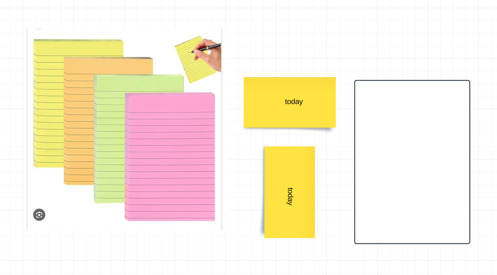
Right now there is one default shape and size for a sticky note- the square. This resembles the 3x3 post-it note. You can pull on the corner to make it bigger to make it resemble more of a 4x4 post-it note. Aside from that you can pull on the left or right side to make it wider. This doesn’t resemble any known post-it note even though the sticky note feature resembles them. This wide sticky note should be swapped out with the ability to pull on the top or bottom side to elongate it to resemble the missing post-it note the 4x6 post-it note. The wide sticky note can be rotated but that is an unnecessary step plus the text doesn’t rotate with it. By swapping out the wide sticky note with an elongated one both typical post-it notes are digitally represented in Lucidspark and now we can confidently go paperless. For those who still want the wide sticky note you could have drag handles on all four sides or once you pull on the corner then you could use a new bottom drag handle to essentially shape it back into a rectangle.
Text formatting:
Introduce checkboxes, dashed lines and bullet points. If the 4x6 sticky note is introduced then the next step would be to implement those list options since they go hand-in-hand with that type of stick note. These list options would also pair nicely with the recent line height option so we can multiple options to space out the action items on a list. After these list options should come Headings. Right now creating a list even in the web app on a MacBook converts the first line as well into a bullet point or a dashed line.
By introducing Headings we can separate the title of the list from the list itself. Whimsical is the only known whiteboarding app to accomplish this. Headings would also align the elongated sticky note with the 4x6 sticky note since there is blank space at the top to add a title before creating the list on the individual lines. By recreating this behaviour in Lucidspark with Headings and list options coupled with the line height option would give us more reason to go paperless.
Last introduce a wider range of informal font options for sticky notes that are uppercase and lowercase combined. From what I understand using uppercase exclusively is considered the equivalent of “shouting” when typing. This “shouting” on a sticky note when collaborating with others should be avoided in order to not give off the wrong impression and have to apologize and retype the sticky note properly. Sticky notes compared to a document are more informal and therefore should have a wider range of informal font options that are more aligned with handwriting or printing with a blue pen or a sharpie marker. Formal font options should be left for document creations that is printed, shared or published like on a Notion or Craft Doc.
Plus button:
Currently sticky notes have an arrow on all four sides that when using pulls out a connector line. This should be swapped out so the default is a plus button for quickly adding another sticky note. The plus button should become the exclusive default for sticky notes whereas the arrow should become the exclusive default for shapes. I understand we can press Tab or Return but that’s best for Magic Keyboard users. When you use the on-screen iPad keyboard it becomes a hassle and slows down the process. Double-tap to bring up the keyboard. Press Tab or Return. The keyboard disappears from the screen. Double-tap again to bring the keyboard back on-screen again. Press Tab or Return again. Do this over and over again as many times as you need. A simple plus button that is on all four sides of a sticky note could cut right to the chase. For those who want the arrow button perhaps there could be an option in the board settings for the user to switch between the plus button and the arrow button just like how we can switch between a dotted or grid background for the entire board background.